Benjamin Moore Serenity (2055-60) encapsulates its name perfectly—it’s a soft, refreshing blue that exudes a sense of calm and tranquility. Ideal for creating peaceful environments, this color is as versatile as it is soothing. Whether you’re designing a coastal-inspired space or simply looking to infuse a room with subtle elegance, Serenity is a timeless choice that works beautifully across a variety of design styles.
One of Serenity’s defining features is its delicate undertones. This pale blue shade carries hints of gray, which prevent it from feeling overly vibrant or saturated. The gray undertones lend a sophisticated softness to the color, making it incredibly versatile and easy to pair with other hues. It also has a slight coolness, which enhances its refreshing and relaxing qualities, making it an excellent option for spaces where you want to promote serenity and balance.
Benjamin Moore Serenity pairs beautifully with a wide range of complementary colors, allowing you to craft harmonious palettes for any room. Here are a few coordinating colors that work seamlessly with this gentle blue:
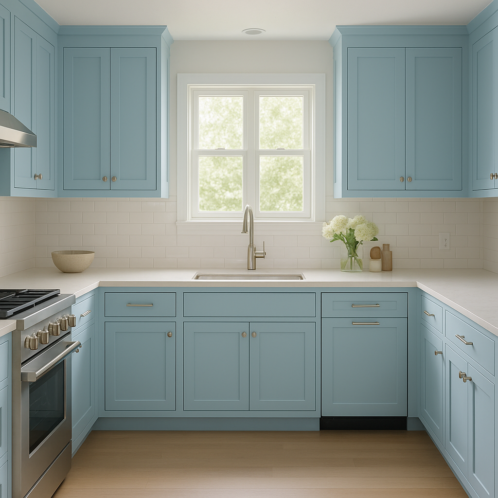
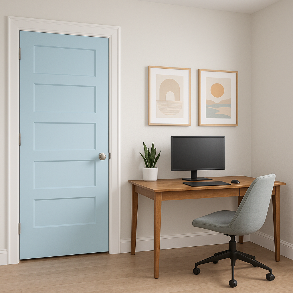
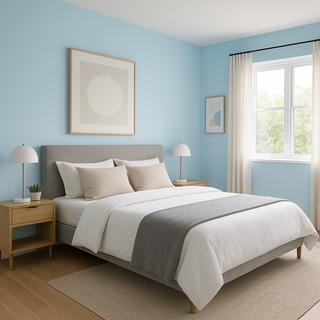
The versatility of Serenity makes it suitable for a variety of spaces and design applications. Here are some creative ways to incorporate this tranquil color into your home:
Serenity is an exceptional choice for bedrooms, where relaxation and comfort are key. Pair it with crisp white bedding and natural wood furniture to create a serene retreat. Add textured throws and soft lighting to enhance the cozy atmosphere.
In bathrooms, Serenity evokes spa-like calm. Use it on walls to complement white or marble tiles, and accent with polished nickel or chrome fixtures for a clean, sophisticated look.
Serenity can bring a subtle coastal vibe or a modern refresh to living areas. Combine it with neutral tones like taupe or gray for understated elegance, or introduce pops of coral or teal for a more playful aesthetic.
This gentle blue is an ideal choice for nurseries or children’s rooms, as it promotes tranquility without feeling overly cold or sterile. Incorporate soft pastels like blush pink or mint green for a whimsical touch.
For home offices, Serenity provides a calming backdrop that enhances focus and productivity. Pair it with sleek, minimalist furniture and muted metallic accents to create a clean, inspiring workspace.
Serenity is equally stunning outdoors. Use it as a main exterior paint color for a coastal cottage or pair it with crisp white trim for a classic look. It can also be used for shutters or doors to add a pop of personality to your home’s facade.
Benjamin Moore Serenity (2055-60) is more than just a paint color—it’s an invitation to create spaces that feel peaceful, balanced, and refined. Its cool undertones and soft, muted quality make it easy to layer with other hues, whether you’re aiming for a monochromatic palette or exploring complementary contrasts. Serenity is a versatile and timeless shade that works beautifully in both contemporary and traditional design contexts.
Whether you’re revamping a bedroom, refreshing a bathroom, or adding charm to your home’s exterior, Serenity is a color that effortlessly blends beauty and functionality, making it a favorite among homeowners and designers alike.
View Colors Only by Brand (No Imagery):
Sherwin-Williams
|
Benjamin-Moore
|
Behr
|
Valspar
Live on the Eastern Slope of Colorado and looking for a local painting professional, check out all our painting services and reach out for a free estimate.
Copyright © 2026 : Wild Fox Painting Inc. : 12435 Mead Way, Littleton, CO 80125


