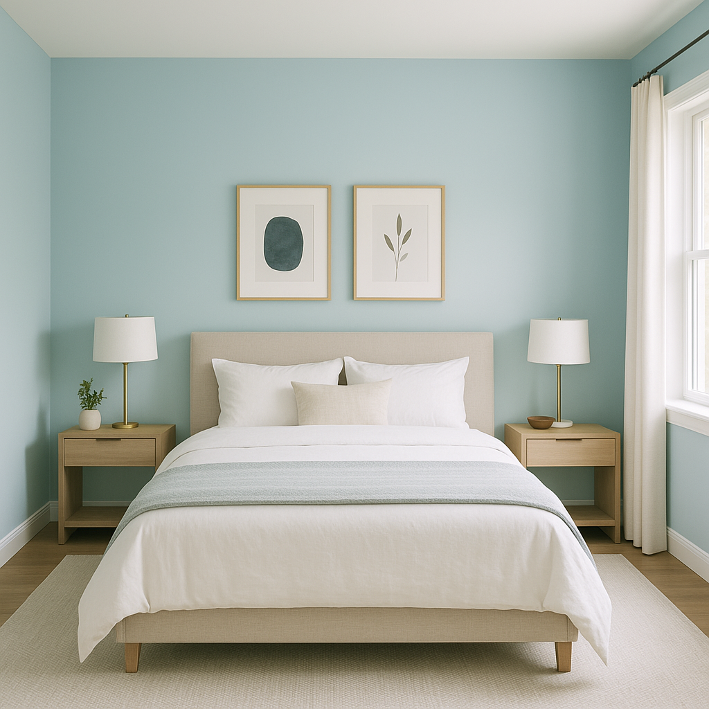
Benjamin Moore Blue (2056-60) is a crisp and breezy light blue that exudes tranquility and effortless charm. This delicate hue brings to mind clear summer skies and the refreshing serenity of coastal waters. Ideal for creating an airy, uplifting atmosphere, Benjamin Moore Blue is perfect for those seeking a versatile color that blends modern sophistication with timeless appeal.
One of the most captivating aspects of Benjamin Moore Blue is its soft undertones. This color leans slightly cool, with a whisper of gray that tempers the brightness and keeps it from feeling overly vibrant. These subtle gray undertones add depth and maturity, ensuring the shade remains serene and refined. While predominantly cool, Benjamin Moore Blue maintains a delicate balance, making it adaptable to a variety of design aesthetics.
Benjamin Moore Blue’s gentle nature makes it a highly versatile choice for pairing with other colors. Here are some expert suggestions for coordinating hues:
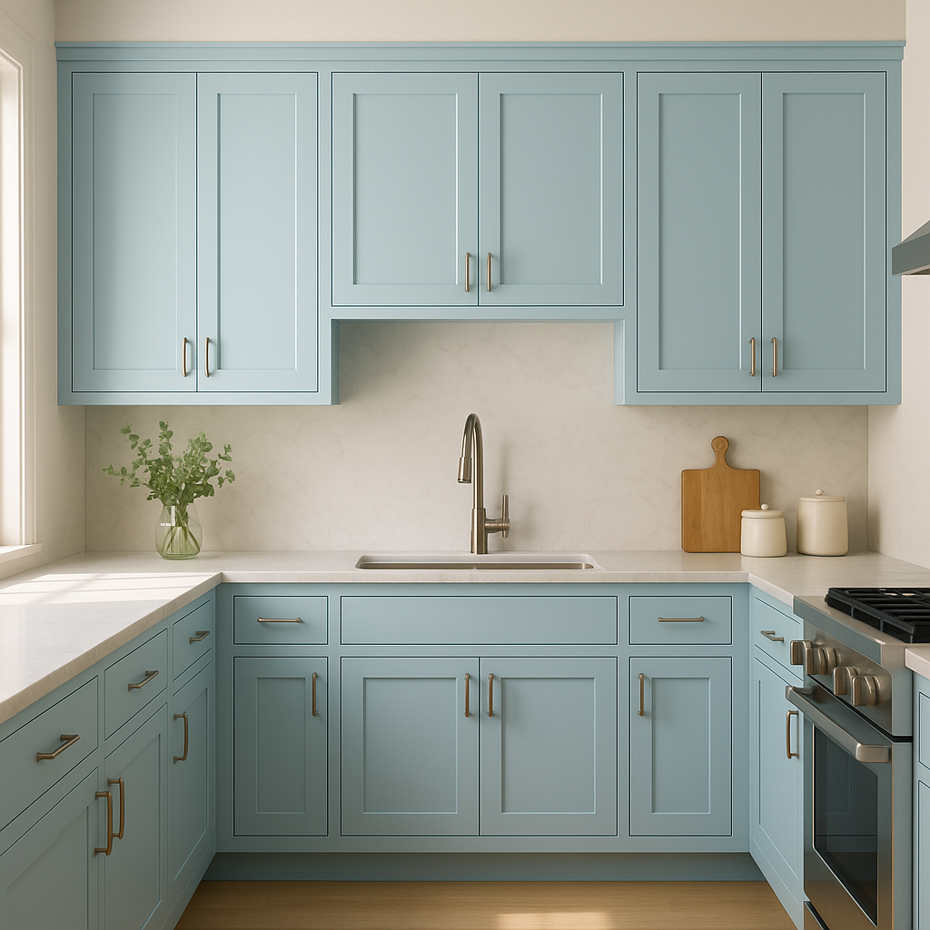
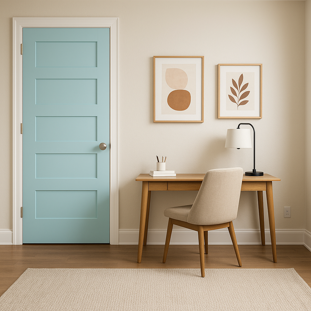
Benjamin Moore Blue (2056-60) is a versatile shade that can transform a variety of spaces, from calm retreats to lively gathering areas. Here are some design ideas:
Benjamin Moore Blue channels a sense of calm, making it an excellent choice for creating peaceful environments that promote relaxation. Its crisp and clean appearance fits seamlessly into a variety of design styles, including coastal, modern farmhouse, Scandinavian, and transitional decor. Whether used as a standalone feature or as part of a layered palette, this color has the versatility to adapt to your vision effortlessly.
Benjamin Moore Blue (2056-60) is a timeless shade that strikes the perfect balance between playful and composed. Its airy charm, soothing undertones, and adaptability make it a go-to choice for anyone looking to infuse their home with a sense of lightness, calm, and sophistication.
View Colors Only by Brand (No Imagery):
Sherwin-Williams
|
Benjamin-Moore
|
Behr
|
Valspar
Live on the Eastern Slope of Colorado and looking for a local painting professional, check out all our painting services and reach out for a free estimate.
Copyright © 2026 : Wild Fox Painting Inc. : 12435 Mead Way, Littleton, CO 80125


