Benjamin Moore’s Turquoise (2057-50) is a bold, invigorating hue that instantly captivates with its lively and refreshing presence. This vibrant shade of turquoise is perfect for adding personality to your space, whether you’re aiming for a tropical vibe, a playful pop of color, or a sophisticated coastal retreat. Its versatility makes it suitable for a variety of design styles and spaces, from accent walls to furniture makeovers.
Turquoise (2057-50) boasts cool blue-green undertones, which lend the color its distinctive, ocean-inspired feel. The blue side of the spectrum dominates slightly, giving the shade a refreshing and crisp quality, while the green undertones soften the overall look, adding warmth and depth. These undertones make Benjamin Moore Turquoise a balanced choice that works well in both bright and subdued settings. It is ideal for spaces that crave energy and vibrancy without overwhelming the senses.
Benjamin Moore Turquoise is a versatile shade that pairs beautifully with a range of complementary, neutral, and contrasting colors. Here are some ideas for coordinating colors that can elevate your design:
Neutrals: Pair Turquoise with warm neutrals like White Dove (OC-17) or cool neutrals like Gray Owl (2137-60) for a balanced, harmonious look. These tones allow the turquoise to shine while maintaining a grounding effect.
Earthy Tones: Combine Turquoise with sandy beiges such as Manchester Tan (HC-81) or soft browns like Kendall Charcoal (HC-166) to create a beachy, natural vibe.
Bright Contrasts: For a high-energy palette, pair Turquoise with bold yellows like Yellow Highlighter (2022-40) or coral tones like Sunset Pink (2003-50).
Deep Colors: If you're seeking a more dramatic aesthetic, Turquoise works beautifully alongside deep navy blues such as Hale Navy (HC-154) or rich emerald greens like Hunter Green (2041-10).
These combinations allow you to tailor the mood of your space, whether you’re aiming for something tranquil and serene or daring and dynamic.
Turquoise is a show-stopping color that can transform any space when used thoughtfully. Here are some creative ways to incorporate this shade into your home or design project:
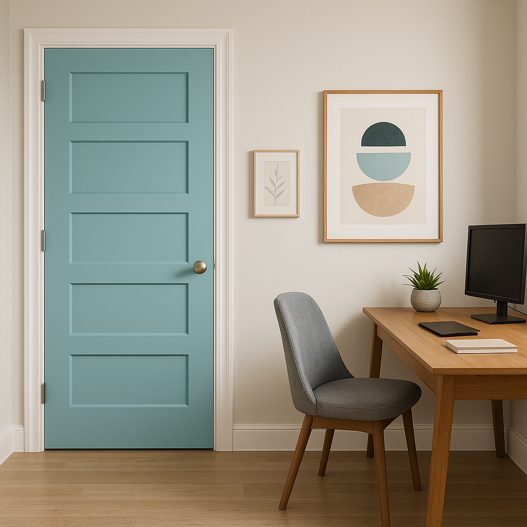
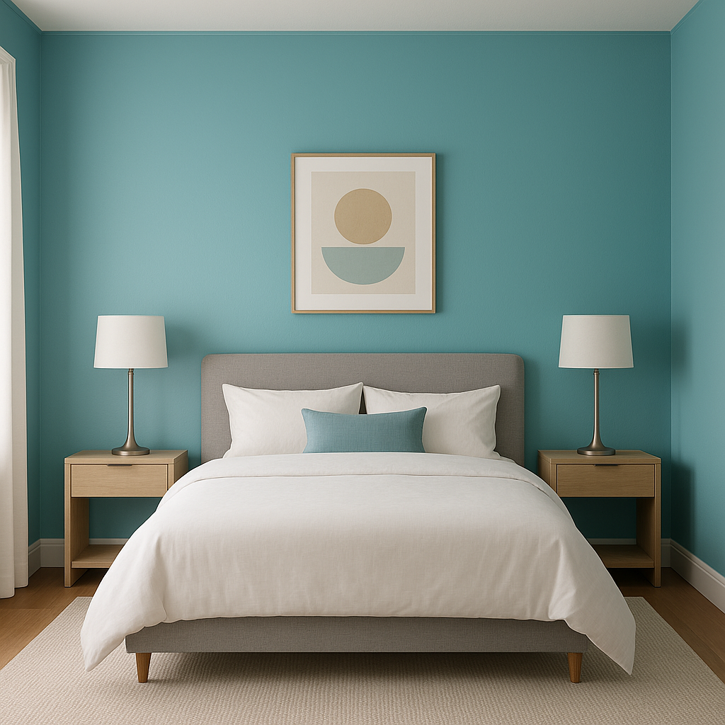
Accent Walls: Use Turquoise as an accent wall in living rooms, bedrooms, or home offices to add a sense of energy and focus. Pair it with crisp white trim for a clean, polished look.
Furniture Makeovers: Revive outdated furniture by painting it in Turquoise. A dresser or bookshelf in this color becomes a statement piece that can anchor a room's design.
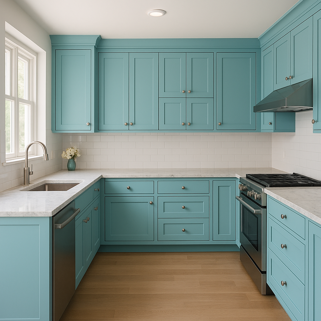
Kitchens: Add vibrancy to your kitchen by using Turquoise on cabinetry or as a backsplash. Pair it with brass or gold hardware for a luxe and stylish touch.
Bathrooms: Create a spa-like oasis by incorporating Turquoise on the walls, vanity, or even accessories. Complement it with natural materials, like wood or stone, for added texture and warmth.
Outdoor Spaces: Turquoise is equally at home outdoors. Use it for patio furniture, planters, or shutters to create a cheerful and inviting exterior.
Benjamin Moore Turquoise (2057-50) is undeniably versatile, offering endless possibilities for elevating your home's color palette. Its balanced undertones, dynamic pairings, and adaptability make it a go-to choice for anyone seeking to infuse their space with energy, charm, and sophistication. Whether you use it sparingly or generously, Turquoise is guaranteed to bring a fresh and revitalizing vibe to your design.
View Colors Only by Brand (No Imagery):
Sherwin-Williams
|
Benjamin-Moore
|
Behr
|
Valspar
Live on the Eastern Slope of Colorado and looking for a local painting professional, check out all our painting services and reach out for a free estimate.
Copyright © 2026 : Wild Fox Painting Inc. : 12435 Mead Way, Littleton, CO 80125


