
Benjamin Moore Twilight (2058-10) is a deep, rich shade of navy blue that exudes sophistication and mystery. Perfect for creating dramatic interiors, this color embodies elegance with its velvety depth and timeless appeal. Whether used as an accent or as the primary hue in a space, Twilight is a statement-making choice that transforms any room into a haven of style and character.
Twilight boasts cool undertones that lean toward indigo, giving it a slightly moody and atmospheric quality. These undertones provide a luxurious sense of depth without veering into black. Unlike more muted navy shades, Twilight carries a subtle vibrancy, making it a versatile choice for spaces that demand drama without overwhelming the senses. The cool tones help balance its richness, making it suitable for both modern and traditional design schemes.
To fully embrace the beauty of Benjamin Moore Twilight, pair it with complementary shades that enhance its boldness or soften its intensity. Consider these coordinating colors:
Warm Neutrals:
Colors like Benjamin Moore White Dove (OC-17) or Simply White (OC-117) create a crisp contrast, brightening the space and allowing Twilight to stand out beautifully. These creamy whites balance the cool undertones of Twilight and add warmth to the overall palette.
Greys:
Pair Twilight with Benjamin Moore Silver Chain (1472) or Chelsea Gray (HC-168) for a sophisticated monochromatic look. These greys complement the blue undertones while maintaining a polished, cohesive feel.
Earthy Greens:
Shades like Benjamin Moore Sagebrush (CC-548) or Soft Fern (2144-40) provide an organic contrast that grounds Twilight, adding depth without feeling overly heavy.
Metallic Accents:
Twilight pairs beautifully with metallic finishes such as brushed gold, antique brass, or polished chrome. Incorporate these through hardware, lighting fixtures, or decor for an elevated look.
Twilight’s bold and enigmatic nature makes it a versatile choice for various applications in interior design:
Accent Walls:
Create a focal point by using Twilight on an accent wall in living rooms, dining spaces, or bedrooms. Its dramatic depth draws attention, making it ideal for spaces where you want to highlight architectural features or statement pieces like artwork or furniture.
Cozy Bedrooms:
Twilight is a perfect choice for bedrooms seeking a cocoon-like atmosphere. Pair it with soft textiles in neutral tones and warm lighting to create a serene yet luxurious retreat.
Statement Furniture:
Use Twilight on furniture pieces such as bookshelves, cabinets, or dining chairs to add a bold pop of color that complements the rest of the room’s design.
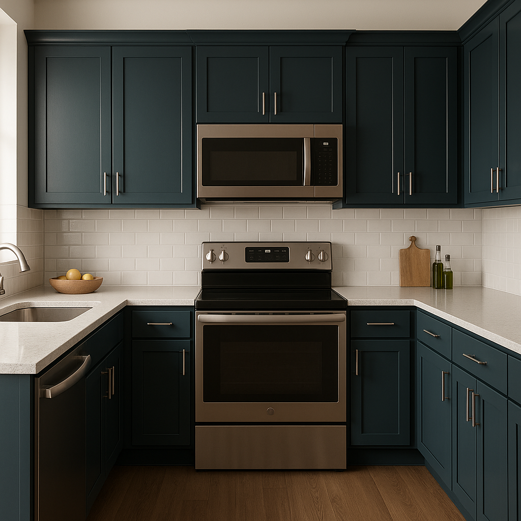
Kitchen Cabinets:
For a modern and sophisticated kitchen, consider Twilight for cabinetry. Pair it with marble countertops and metallic hardware to create a striking yet balanced palette.
Ceilings:
Twilight can be used on ceilings to create an unexpected design element. This works particularly well in rooms with high ceilings or crown molding, adding depth and drama to the space.
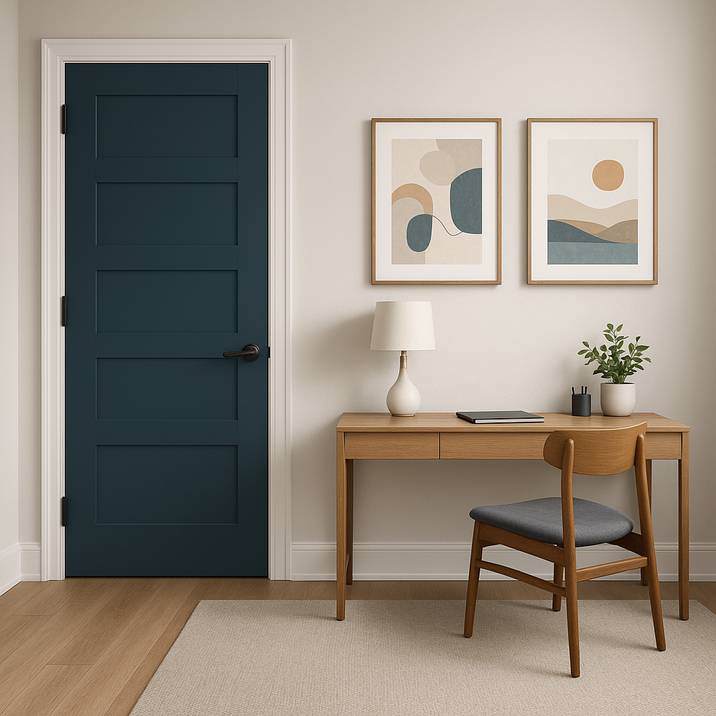
Exteriors:
Twilight is equally striking for exterior applications. Use it as a front door color or for shutters to give your home a modern and bold curb appeal.
Benjamin Moore Twilight lends itself well to a variety of design styles:
Modern:
Pair Twilight with minimalist furniture in neutral tones and sleek metallic accents for a contemporary look.
Traditional:
Complement Twilight with classic wood finishes and rich textures such as velvet or leather for a timeless aesthetic.
Eclectic:
Combine Twilight with vibrant jewel tones like emerald green or deep burgundy for a bold and artistic vibe.
Coastal:
Twilight works beautifully in coastal-inspired spaces when paired with light sandy tones, crisp whites, and natural textures like woven baskets or driftwood.
Benjamin Moore Twilight (2058-10) is more than just a color—it's a design tool that can transform your space into a bold yet inviting environment. Its richness, versatility, and ability to pair seamlessly with a wide range of tones make it a favorite among interior designers seeking drama and elegance. Whether you’re looking to create a moody retreat or a refined statement, Twilight is a timeless choice that delivers unparalleled style.
View Colors Only by Brand (No Imagery):
Sherwin-Williams
|
Benjamin-Moore
|
Behr
|
Valspar
Live on the Eastern Slope of Colorado and looking for a local painting professional, check out all our painting services and reach out for a free estimate.
Copyright © 2026 : Wild Fox Painting Inc. : 12435 Mead Way, Littleton, CO 80125


