Benjamin Moore Slate (2058-20) is a refined and versatile paint color that offers a deep, moody blue-gray tone with subtle complexity. Perfect for creating a serene yet dramatic ambiance, this shade is an exceptional choice for interiors that demand sophistication and depth. Whether used as an accent or a primary wall color, Slate brings a harmonious balance of cool elegance and timeless appeal to any space.
One of the standout features of Benjamin Moore Slate is its nuanced undertones. While the dominant impression is a rich blue-gray, it carries slight hints of green in certain lighting conditions. These undertones allow Slate to adapt beautifully to different environments, making it a chameleon-like color that shifts between cool and warm depending on surrounding hues and light sources. This subtle complexity makes Slate highly versatile and ideal for layering with other colors.
Benjamin Moore Slate pairs effortlessly with a variety of complementary and contrasting colors, enabling you to craft a cohesive design scheme. Here are some suggestions for coordinating colors:
Neutral Pairings: To enhance Slate’s cool sophistication, pair it with crisp whites like Benjamin Moore Chantilly Lace (OC-65) or Simply White (OC-117). These bright, clean neutrals create a striking contrast and allow Slate to take center stage.
Earthy Complements: For a warmer, grounded feel, consider pairing Slate with soft taupes like Edgecomb Gray (HC-173) or greiges such as Revere Pewter (HC-172). These tones balance Slate’s coolness and create a welcoming atmosphere.
Bold Accents: Add drama and depth by incorporating rich jewel tones like Benjamin Moore Black Forest Green (2040-10) or deep burgundy hues such as Dinner Party (AF-300). These bold colors heighten the richness of Slate and create a luxurious vibe.
Metallic and Natural Finishes: To accentuate Slate’s dynamic undertones, pair it with brushed gold fixtures, polished nickel accents, or dark-stained woods. These finishes complement the color's cool sophistication and emphasize its versatility.
Benjamin Moore Slate is a versatile shade that can be used in a variety of spaces and design styles. Below are some ideas to inspire your next project:
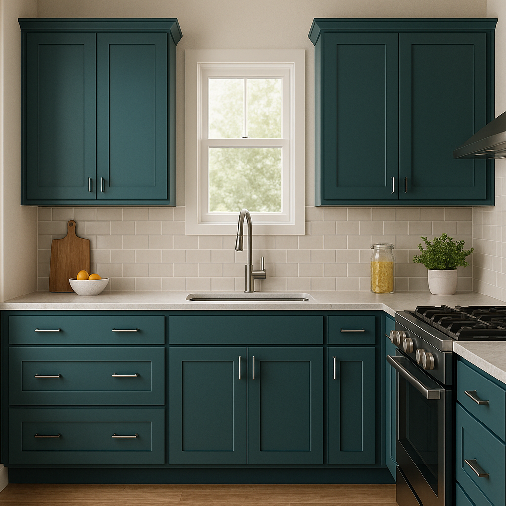
Slate is an excellent choice for creating cozy yet dramatic living spaces. Use it on walls to anchor the room’s design and pair it with plush textiles, such as velvet or chenille, in coordinating tones. Layering with light-colored furniture and metallic accents can bring balance to the richness of the color.
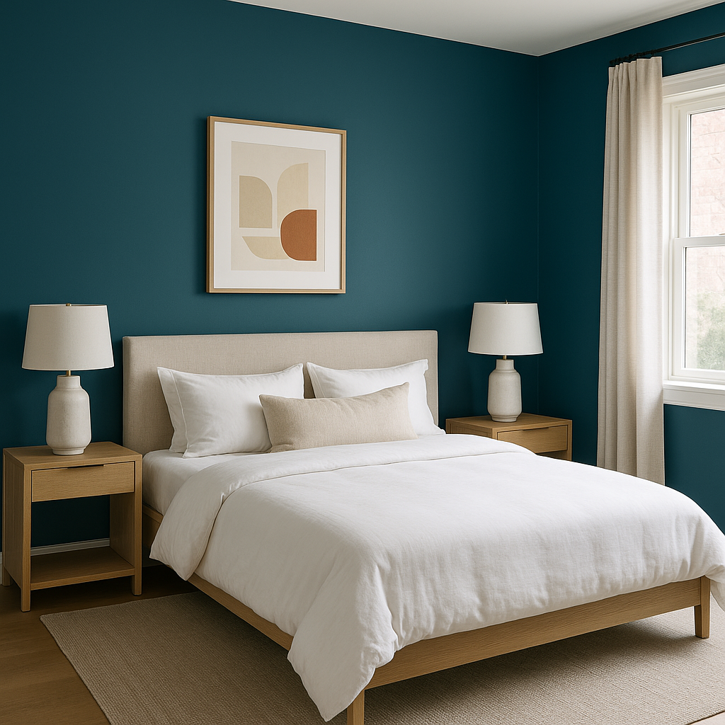
Transform your bedroom into a tranquil retreat with Slate as the main wall color. Its calming blue-gray tones are perfect for promoting relaxation. Pair it with soft, neutral bedding and warm wood furniture for a serene atmosphere.
Create a spa-like ambiance by using Slate on cabinetry or walls. Pair it with white marble countertops and chrome fixtures for a clean, modern look. This color’s depth can make even small bathrooms feel luxurious.
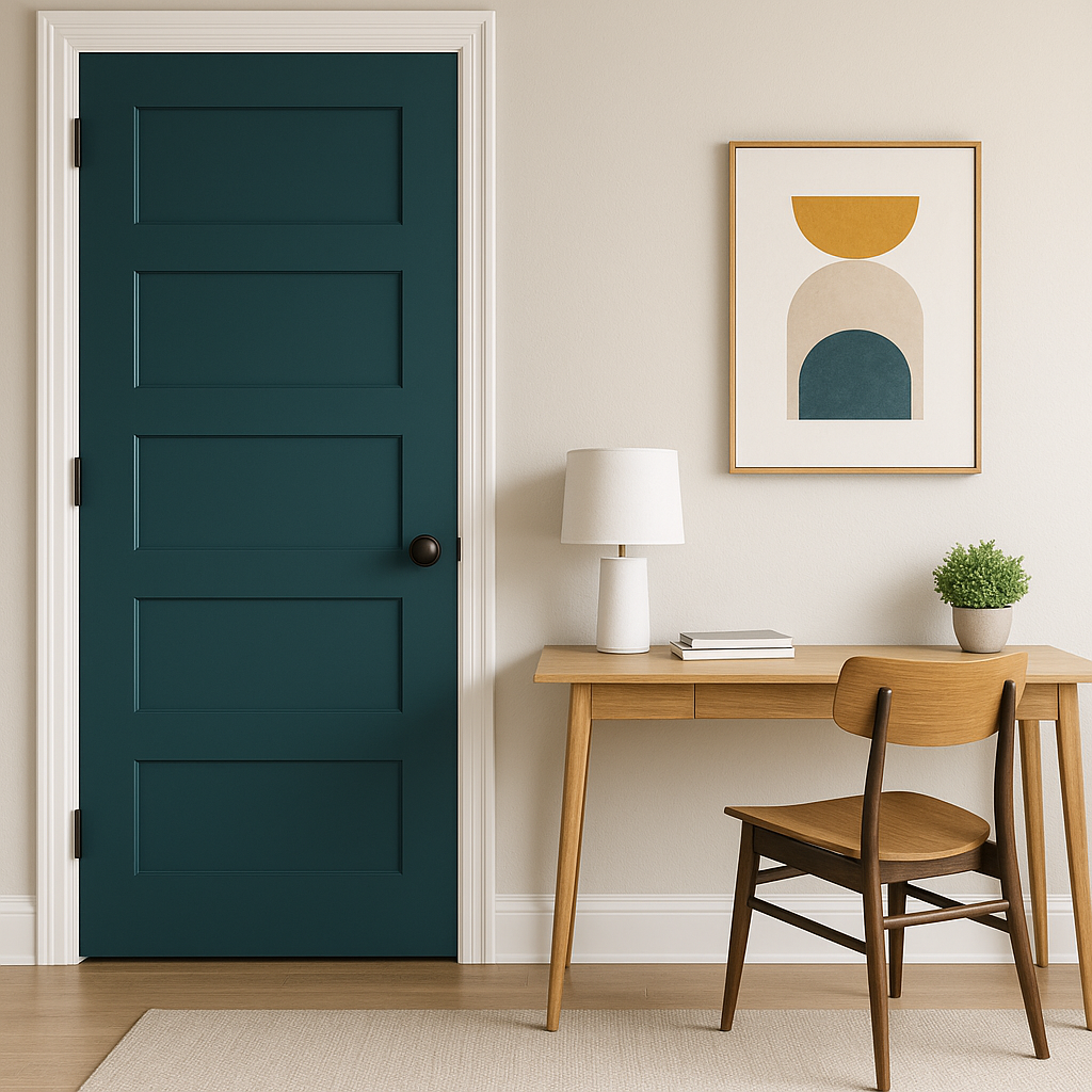
If you’re not ready to commit to Slate for an entire room, consider using it as an accent color. Its bold yet understated presence works beautifully behind a statement piece, such as a fireplace, bed frame, or gallery wall.
Slate isn’t limited to interiors—it’s an elegant choice for exterior applications as well. Use it on siding or shutters for a sophisticated look that complements a variety of architectural styles, from traditional to modern.
Lighting plays a crucial role in how Benjamin Moore Slate appears in a space. In rooms with ample natural light, its blue undertones become more pronounced, offering a vibrant yet soothing effect. In dimly lit spaces, the deeper gray tones take center stage, creating a moodier, more dramatic ambiance. To ensure the color works for your intended design, test it in different lighting conditions before committing.
Benjamin Moore Slate (2058-20) is more than just a paint color—it’s a statement of style and sophistication. With its rich undertones, versatility, and ability to effortlessly coordinate with other shades, Slate is a timeless choice for both interiors and exteriors. Whether you’re designing a serene retreat or a bold, dramatic space, this color is guaranteed to elevate your environment to new heights.
View Colors Only by Brand (No Imagery):
Sherwin-Williams
|
Benjamin-Moore
|
Behr
|
Valspar
Live on the Eastern Slope of Colorado and looking for a local painting professional, check out all our painting services and reach out for a free estimate.
Copyright © 2026 : Wild Fox Painting Inc. : 12435 Mead Way, Littleton, CO 80125


