Benjamin Moore Turquoise 2060-60 is a striking and captivating shade that effortlessly merges the refreshing qualities of blue and green. This vibrant turquoise brings a sense of energy and vitality, making it an excellent choice for those who want to infuse personality and liveliness into their spaces. Whether used as a statement color or an accent, this versatile hue can transform a room into a bold yet harmonious retreat.
One of the standout characteristics of Benjamin Moore Turquoise 2060-60 is its refined balance of undertones. It leans slightly more towards blue, giving it a cool, crisp edge, but the green undertones provide warmth and depth, preventing the color from feeling overly stark. This duality makes Turquoise 2060-60 adaptable to a variety of lighting conditions. In natural light, the shade appears bright and uplifting, while in artificial light, the green undertones emerge, creating a softer and more grounded effect.
Benjamin Moore Turquoise 2060-60 is versatile and pairs beautifully with a range of complementary and contrasting colors. Here are some suggestions to help you create a cohesive palette:
The bold yet adaptable nature of Turquoise 2060-60 makes it suitable for a variety of applications throughout your home or workspace. Here are some creative ways to incorporate this stunning hue:
Turquoise 2060-60 works beautifully as a feature wall in a living room, adding a burst of color while maintaining a sense of sophistication. Pair it with neutral furniture and metallic accents for a balanced and modern look.
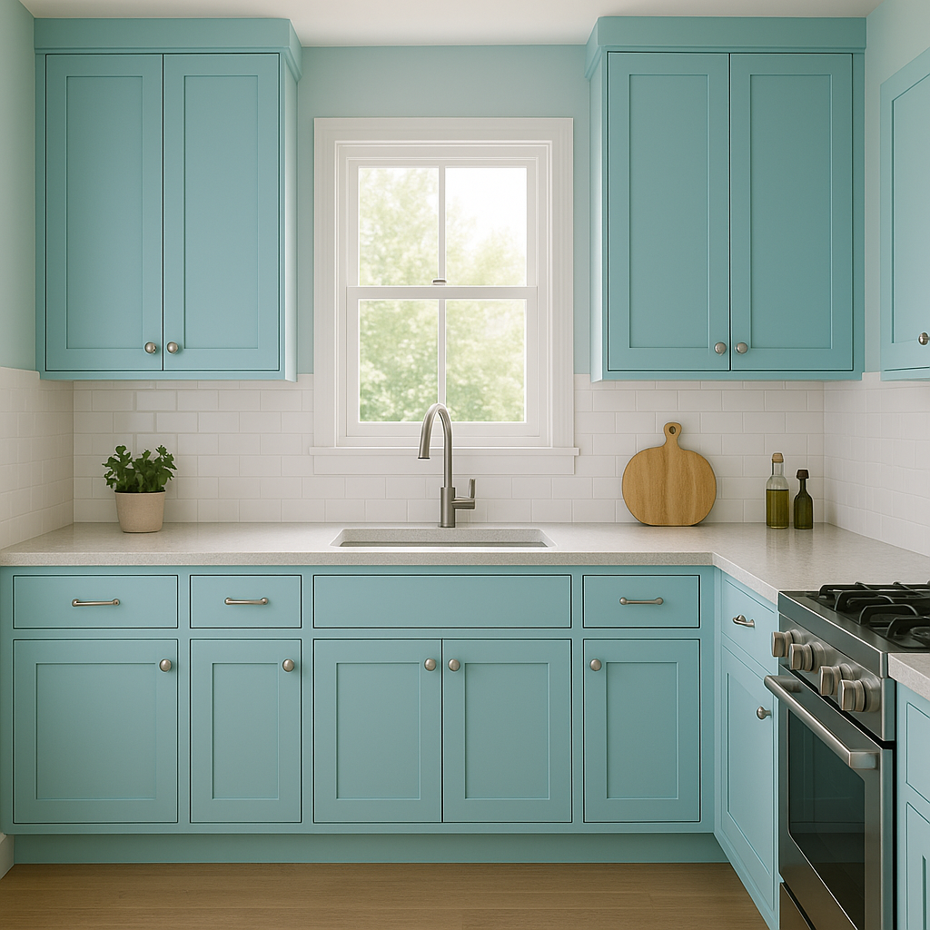
This energizing shade can bring life to cabinetry or an accent wall in the kitchen. It pairs wonderfully with white countertops, stainless steel appliances, and natural wood finishes for a fresh and inviting feel. In dining spaces, Turquoise 2060-60 fosters a lively and conversational atmosphere.
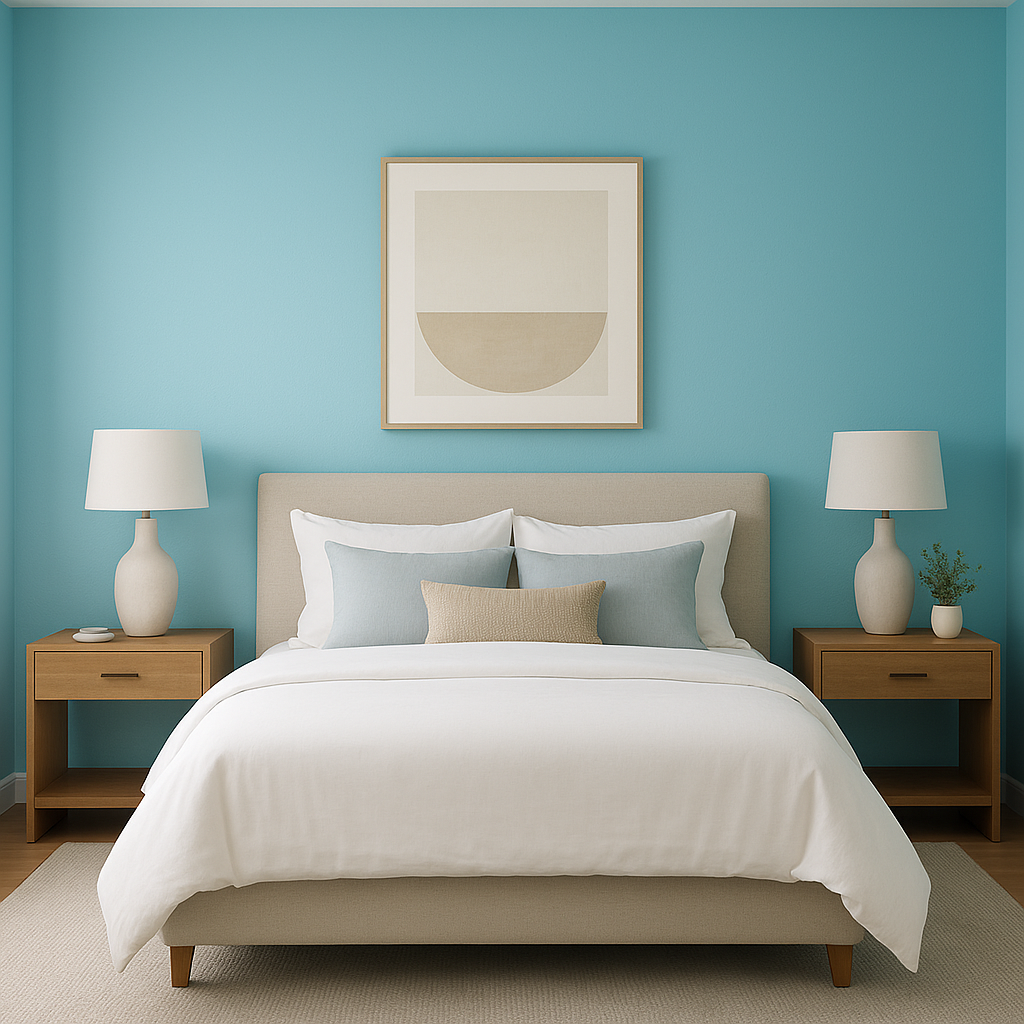
For a bedroom, Turquoise 2060-60 can be used to create a tranquil, coastal-inspired retreat. Use it on the walls and pair it with soft whites, sandy beiges, and nautical blues to evoke a relaxing and serene environment.
This turquoise shade is ideal for adding a spa-like ambiance to bathrooms. Use it on the walls or as a backsplash color, paired with crisp whites, polished chrome fixtures, and natural stone elements.
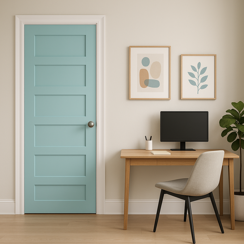
In a home office, Turquoise 2060-60 can inspire creativity and focus. Use it as an accent wall behind your desk or bookshelf, and complement it with neutral furniture and decor for a balanced and productive space.
View Colors Only by Brand (No Imagery):
Sherwin-Williams
|
Benjamin-Moore
|
Behr
|
Valspar
Live on the Eastern Slope of Colorado and looking for a local painting professional, check out all our painting services and reach out for a free estimate.
Copyright © 2026 : Wild Fox Painting Inc. : 12435 Mead Way, Littleton, CO 80125


