Benjamin Moore Downpour 2063-20 is a stunning, deep blue that commands attention and brings a sense of drama and sophistication to any space. With its rich saturation and velvety finish, this bold color is perfect for creating a statement, whether used as an accent or as the main color in a room. Downpour is versatile and timeless, making it a favorite among interior designers looking to add character and depth to their projects.
At its core, Downpour is a vibrant, true blue with subtle indigo undertones. These undertones give the color a luxurious depth that shifts slightly depending on lighting conditions. Under warm lighting, the indigo undertones become more pronounced, lending a cozy and enveloping feel to the space. In cooler, natural light, the color appears more crisp and modern, showcasing its rich blue vibrancy. This dynamic quality allows Downpour to work beautifully in a variety of settings.
Creating a harmonious palette with Downpour 2063-20 is easy when paired with complementary and neutral tones. Here are some suggestions for coordinating colors:
Downpour’s bold and versatile nature makes it suitable for an array of design applications. Whether you're looking to make a statement or add a touch of sophistication, this color can adapt to your vision:
Downpour is an ideal choice for a dramatic feature wall. It works well in living rooms, dining rooms, or bedrooms, drawing the eye and creating a focal point. Pair it with lighter neutral walls to allow the bold blue to truly pop.
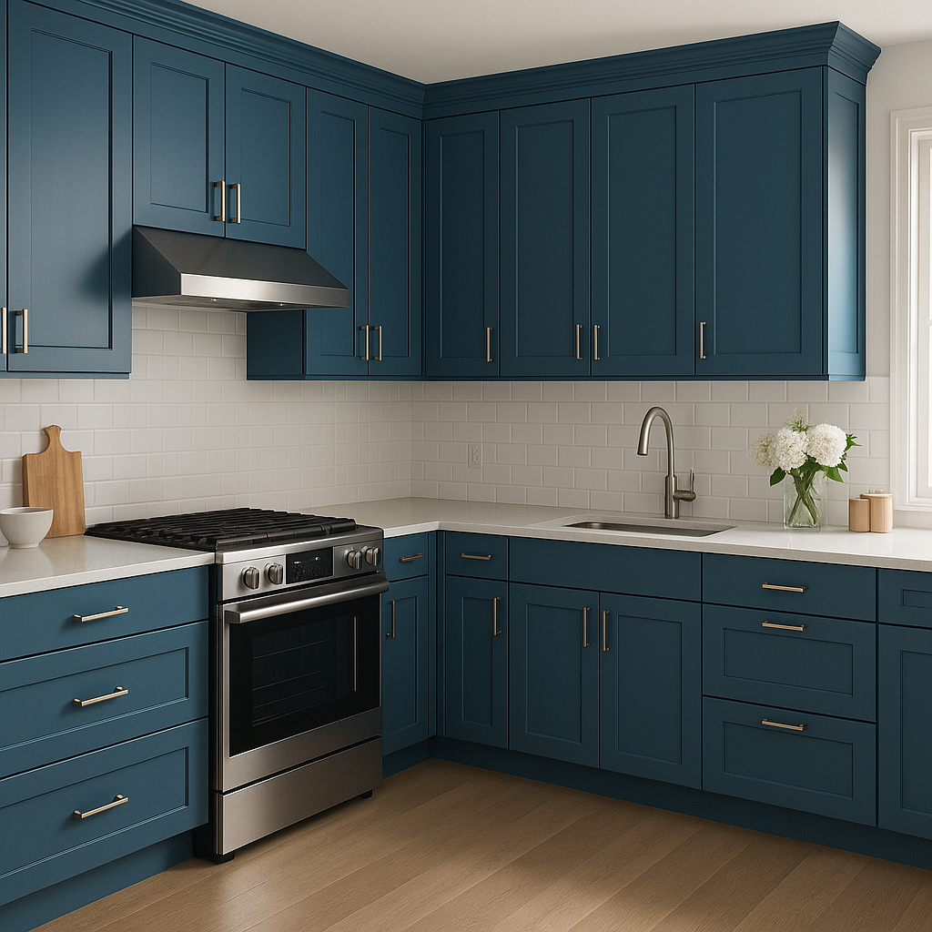
For kitchens, bathrooms, or home offices, Downpour can be used on cabinetry or built-ins to add a sense of luxury and modernity. Pair it with brass or gold hardware for a striking, upscale look.
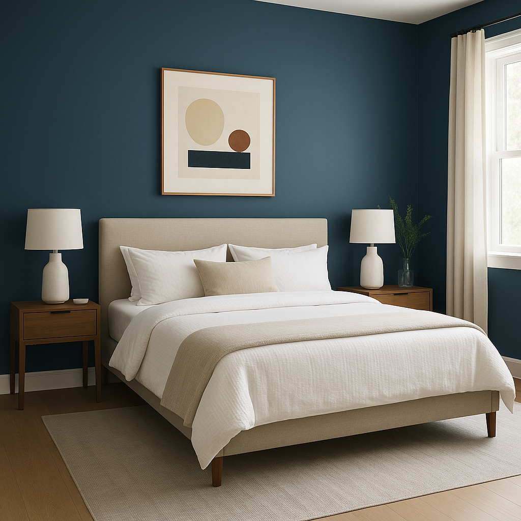
Transform a bedroom or reading nook into a cozy haven by painting all four walls in Downpour. The rich blue creates an enveloping and serene atmosphere, perfect for relaxation.
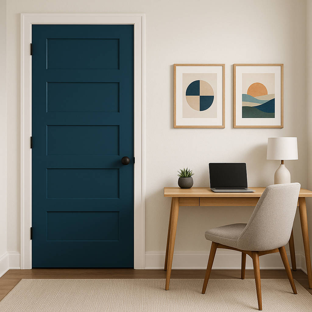
Downpour also shines as an exterior paint color. Use it for front doors, shutters, or siding to create a bold and unforgettable curb appeal. Pair it with a crisp white trim for contrast or a soft gray for a more subdued look.
As with any bold color, lighting plays a critical role in how Downpour 2063-20 is perceived. In spaces with ample natural light, the color will appear more vibrant and lively. In dimly lit areas, its deep, moody tones will come to the forefront. To ensure the best results,
View Colors Only by Brand (No Imagery):
Sherwin-Williams
|
Benjamin-Moore
|
Behr
|
Valspar
Live on the Eastern Slope of Colorado and looking for a local painting professional, check out all our painting services and reach out for a free estimate.
Copyright © 2026 : Wild Fox Painting Inc. : 12435 Mead Way, Littleton, CO 80125


