Benjamin Moore Sapphireberry (2063-60) is an energetic and uplifting paint color that instantly adds personality to any interior or exterior space. This striking mid-tone blue leans toward the cooler side of the spectrum, offering a refreshing and modern vibe that feels both playful and sophisticated. Its bold nature makes it an ideal choice for those who want to make a statement without overwhelming a room.
Sapphireberry carries subtle violet undertones that give it a slightly whimsical and unique character. These undertones add depth to the hue, making it more versatile and dynamic than a standard blue. The purple influence softens the vibrancy of the color, creating an elegant balance that works beautifully in a variety of design styles—from eclectic and bohemian to clean and contemporary.
Finding the right complementary colors for Sapphireberry can help you craft a cohesive and harmonious space. Here are some suggestions for coordinating hues:
Sapphireberry’s bold yet versatile nature allows it to shine in various applications, from small accents to expansive walls.
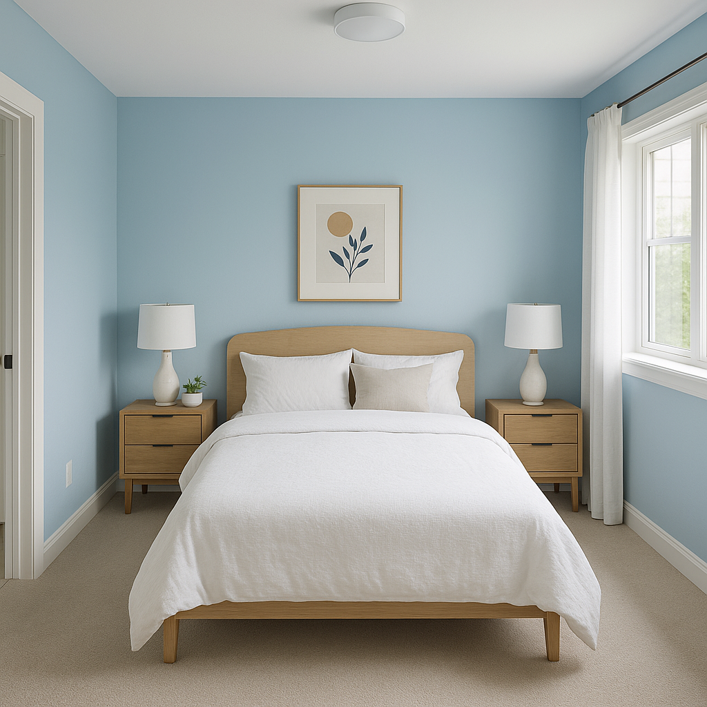
This hue is perfect for creating a feature wall that draws attention without overwhelming the rest of the room. Use it in living rooms, bedrooms, or dining areas to add a sense of energy and focus.
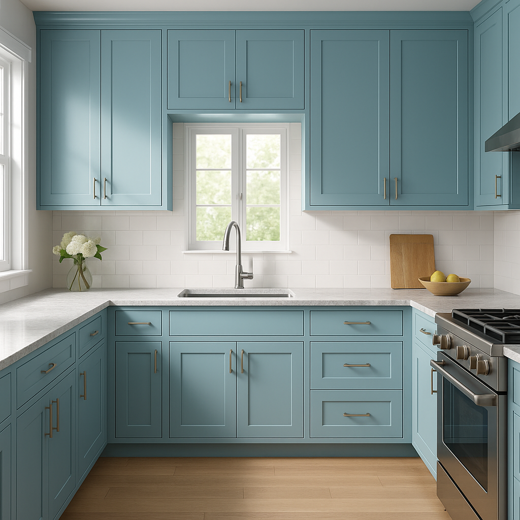
Sapphireberry can transform furniture pieces or kitchen cabinetry into standout elements. This color works particularly well on bathroom vanities or built-in bookcases, adding a playful yet refined touch to functional spaces.
The lively and cheerful vibe of Sapphireberry makes it ideal for kids’ spaces. Pair it with fun, coordinating colors to create a vibrant and imaginative environment.
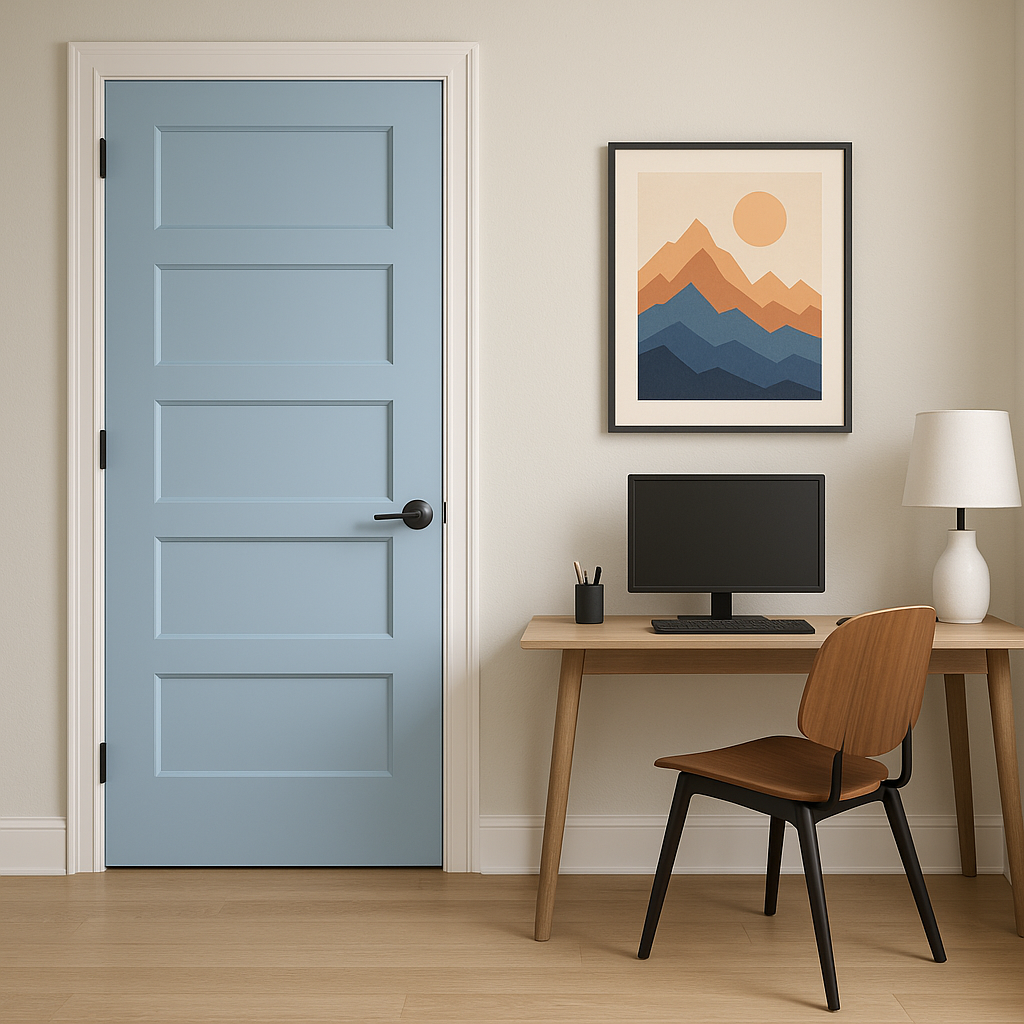
Consider Sapphireberry for exterior doors, shutters, or patio furniture to infuse personality and charm into your home’s curb appeal. Its bold yet cool tone is perfect for making a welcoming statement.
In home offices or studios, Sapphireberry can serve as an energizing backdrop to fuel creativity and focus. Pair it with clean whites and metallic accents for a modern, productive atmosphere.
The way Sapphireberry appears can shift depending on the lighting in your space. In rooms with ample natural light, the color will feel brighter and more vibrant, while in spaces with artificial or dim lighting, its violet undertones may become more pronounced. To ensure the perfect look, test the color on your walls at different times of day and under various lighting conditions.
Benjamin Moore Sapphireberry (2063-60) is ideal for those seeking a bold, refreshing color that adds energy to any space. Its versatile undertones and ability to pair beautifully with neutrals, darker shades, or vibrant accents make it a favorite among homeowners and designers alike. Whether you’re looking to inject vibrancy into a room or create a calming yet dynamic environment, Sapphireberry is a color that delivers charm, sophistication, and personality.
View Colors Only by Brand (No Imagery):
Sherwin-Williams
|
Benjamin-Moore
|
Behr
|
Valspar
Live on the Eastern Slope of Colorado and looking for a local painting professional, check out all our painting services and reach out for a free estimate.
Copyright © 2026 : Wild Fox Painting Inc. : 12435 Mead Way, Littleton, CO 80125


