Benjamin Moore Bluebelle (2064-60) is a captivating mid-tone blue that exudes elegance and tranquility. This color strikes a beautiful balance between vibrant energy and soothing calm, making it an excellent choice for a wide range of interior design styles. Whether you're seeking a serene backdrop for a bedroom or a lively accent for a living space, Bluebelle delivers a timeless and versatile aesthetic.
One of the defining characteristics of Bluebelle is its subtle undertones. This shade carries a soft hint of periwinkle, blending blue with a whisper of violet. The delicate interplay of these cooler tones ensures Bluebelle feels fresh and inviting without overwhelming the senses. Its understated complexity makes it adaptable to various lighting conditions, appearing more vibrant in natural daylight and slightly muted under artificial lighting. This versatility makes it a favorite for both modern and traditional interiors.
Benjamin Moore Bluebelle pairs beautifully with a curated range of coordinating colors, allowing you to create a cohesive and well-balanced palette for your home. Here are some suggested color combinations:
Bluebelle’s versatility makes it ideal for a variety of applications throughout the home. Here are some creative ways to integrate this stunning shade into your space:
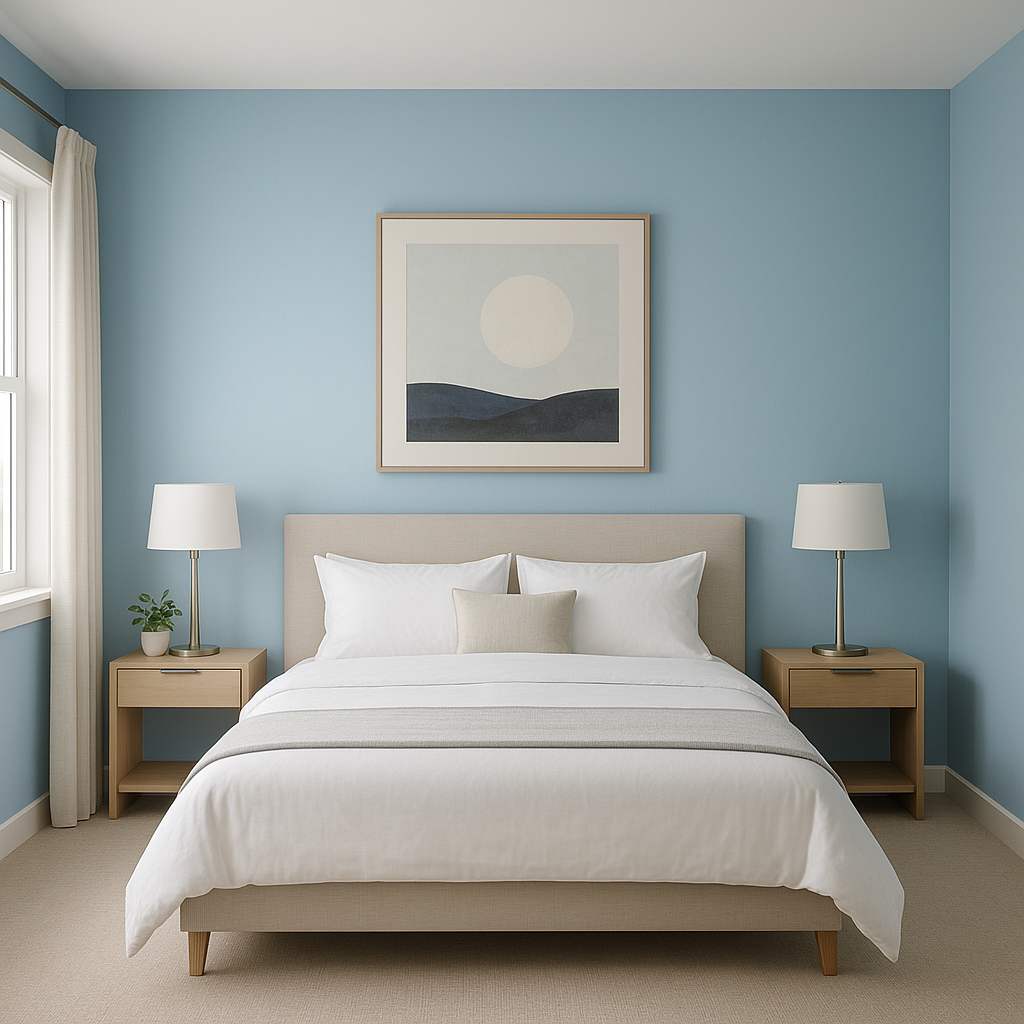
Bluebelle is a perfect choice for bedrooms and bathrooms, where a calming atmosphere is essential. Paint the walls in Bluebelle to create a serene retreat, and pair it with crisp white trim for a classic look. Add soft gray or lavender accents in your bedding or towels to enhance the color’s soothing undertones.
In living rooms, Bluebelle serves as a sophisticated backdrop for both traditional and modern decor. Use it on an accent wall to highlight architectural features or artwork, or paint the entire room for a bold yet serene effect. Pair it with rich wood furniture and metallic finishes like brass or chrome for a touch of luxury.
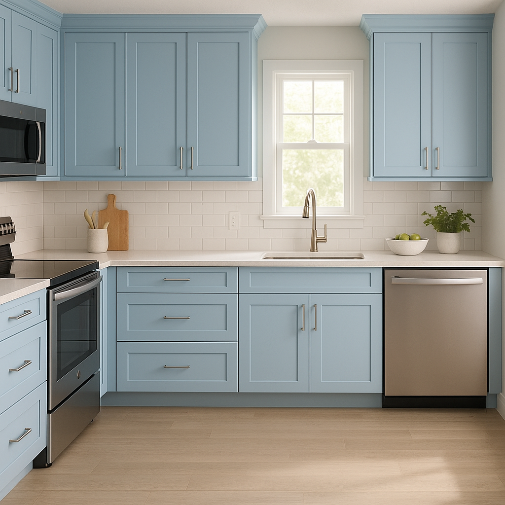
Bluebelle brings a refreshing energy to kitchens and dining areas. Use it on cabinetry or a feature wall to create visual interest, especially when paired with white countertops and backsplash tiles. Add pops of warm colors like mustard or coral in your tableware or decor to create a dynamic, welcoming space.
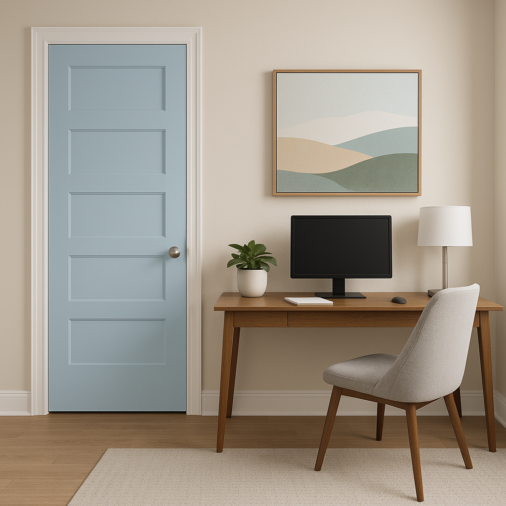
Create a productive yet peaceful environment in your home office with Bluebelle. Its cool undertones promote focus and clarity, making it an ideal choice for walls or even painted furniture. Pair it with earthy tones like taupe or olive green for a grounded, inspiring workspace.
Bluebelle’s playful undertones make it a delightful choice for children’s rooms. It’s vibrant enough to spark creativity yet soft enough to provide a comforting atmosphere. Pair it with pastel accents in pink, yellow, or mint green for a whimsical vibe.
The appearance of Bluebelle can shift depending on the lighting conditions in your space. In bright, natural light, the periwinkle undertones become more pronounced, giving it a cheerful and airy feel. In dim or warm lighting, the color deepens slightly, taking on a richer and more sophisticated look. Be sure to test this shade in your home to see how it interacts with your specific lighting environment.
Benjamin Moore Bluebelle (2064-60) is more than just a paint color—it’s a statement of style and serenity. Its soothing undertones, adaptability, and harmonious pairing possibilities make it an exceptional choice for homeowners and designers alike. Whether you’re crafting a relaxing escape or an energetic focal point, Bluebelle offers the versatility and charm needed to elevate your interior spaces.
View Colors Only by Brand (No Imagery):
Sherwin-Williams
|
Benjamin-Moore
|
Behr
|
Valspar
Live on the Eastern Slope of Colorado and looking for a local painting professional, check out all our painting services and reach out for a free estimate.
Copyright © 2026 : Wild Fox Painting Inc. : 12435 Mead Way, Littleton, CO 80125


