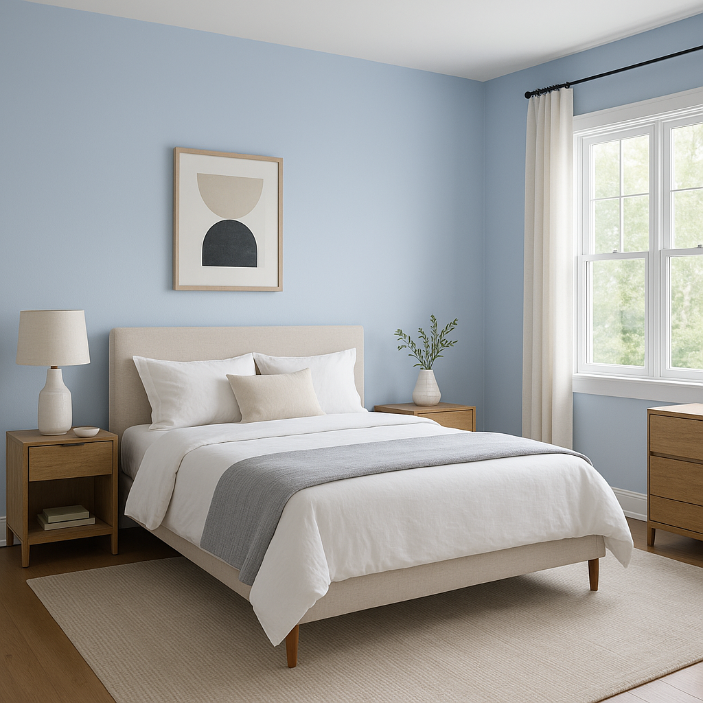
Benjamin Moore Windmill (2067-60) is a stunning medium-toned blue that exudes calmness and elegance. This timeless hue brings a sense of tranquility into any space while maintaining a contemporary vibe. Whether you're designing a coastal retreat, a modern living area, or a serene bedroom, Windmill’s versatility makes it an ideal choice for a variety of design aesthetics.
Windmill boasts a clean blue base with subtle gray undertones, giving it a sophisticated edge. These gray undertones prevent the color from feeling overly bright or saturated, allowing it to work seamlessly in both well-lit and dimly lit spaces. The undertones contribute to its versatility, as they help the blue adapt to different lighting conditions without overpowering the room.
Benjamin Moore Windmill pairs beautifully with a range of complementary hues, making it easy to create a cohesive and stylish interior palette. Consider these coordinating colors to enhance its charm:
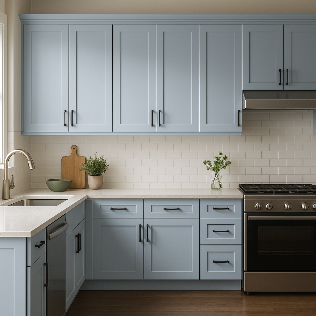
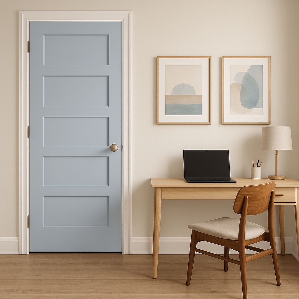
Benjamin Moore Windmill is a versatile color that works well across various rooms and design styles. Below are some ideas for using this serene blue in your home:
Windmill creates a welcoming ambiance in living rooms and family spaces, particularly when paired with neutral furniture and warm wood tones. The gray undertones keep the blue grounded, making it suitable for both traditional and modern interiors.
Transform your bedroom into a peaceful retreat by painting the walls in Windmill. Pair it with crisp white linens and soft gray accents to achieve a soothing and restful vibe.
Windmill is an excellent choice for bathrooms, bringing a spa-like feel to the space. Combine it with white subway tiles, chrome fixtures, and cool-toned accessories for a clean and refreshing look.
This calming hue fosters focus and creativity, making it a fantastic option for home offices. Pair it with minimalistic furniture and natural wood finishes for a balanced and productive workspace.
If you’re looking to add depth to a room, Windmill works beautifully as an accent wall color. Combine it with lighter neutrals or whites for a subtle yet impactful effect.
Windmill isn't limited to indoor use—it can also add curb appeal to your home when used for exterior siding, shutters, or doors. Its balanced tone stands out against natural surroundings while maintaining a classic, sophisticated look.
Lighting plays a crucial role in how Benjamin Moore Windmill appears in a space. In rooms with ample natural light, the blue will feel lighter and airier, while in dimly lit areas, its gray undertones will become more pronounced, lending a cozy and intimate feel. We recommend testing Windmill in your space to see how it interacts with your lighting conditions before committing.
Benjamin Moore Windmill (2067-60) is a versatile and stylish color that can elevate any interior or exterior project. With its serene blue tone and subtle gray undertones, it strikes the perfect balance between calmness and sophistication, making it a favorite among homeowners and designers alike. Pair it with coordinating colors like whites, grays, and taupes to create a harmonious and inviting atmosphere that feels both timeless and modern.
View Colors Only by Brand (No Imagery):
Sherwin-Williams
|
Benjamin-Moore
|
Behr
|
Valspar
Live on the Eastern Slope of Colorado and looking for a local painting professional, check out all our painting services and reach out for a free estimate.
Copyright © 2026 : Wild Fox Painting Inc. : 12435 Mead Way, Littleton, CO 80125


