Benjamin Moore Crocus (2071-40) is a captivating shade that strikes the perfect balance between playful and refined. This enchanting lavender hue is both soothing and elegant, making it a versatile choice for a variety of interior design styles. Whether used as a statement color or as part of a harmonious palette, Crocus brings a touch of charm and sophistication to any space.
Crocus has a distinctly purple base with soft, cool undertones of gray and blue. These undertones give the shade a modern and slightly muted appearance, preventing it from veering into overly vibrant or sugary territory. The presence of gray lends Crocus a grounded quality, while the subtle blue adds a calming and serene feel. Together, these undertones make Crocus an adaptable choice that works beautifully across different lighting conditions, from natural daylight to warm artificial light.
Crocus can be paired with an array of complementary and contrasting colors to create stunning visual effects. Below are some suggestions for coordinating colors:
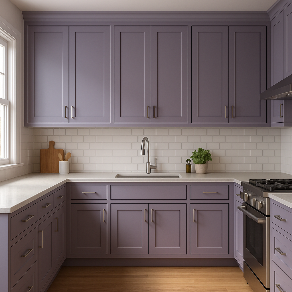
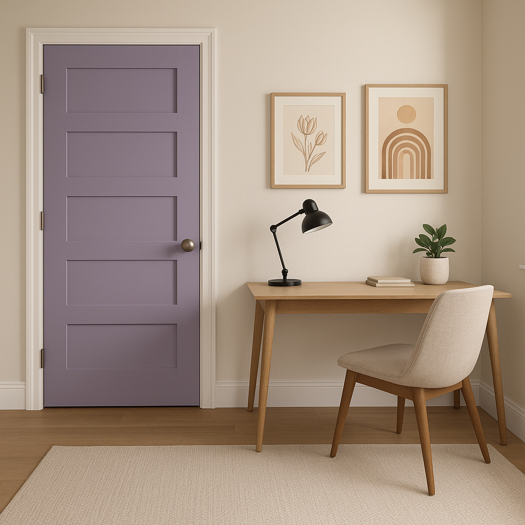
Benjamin Moore Crocus is incredibly versatile and can be used in a variety of applications throughout the home. Here are some ideas to inspire your next design project:
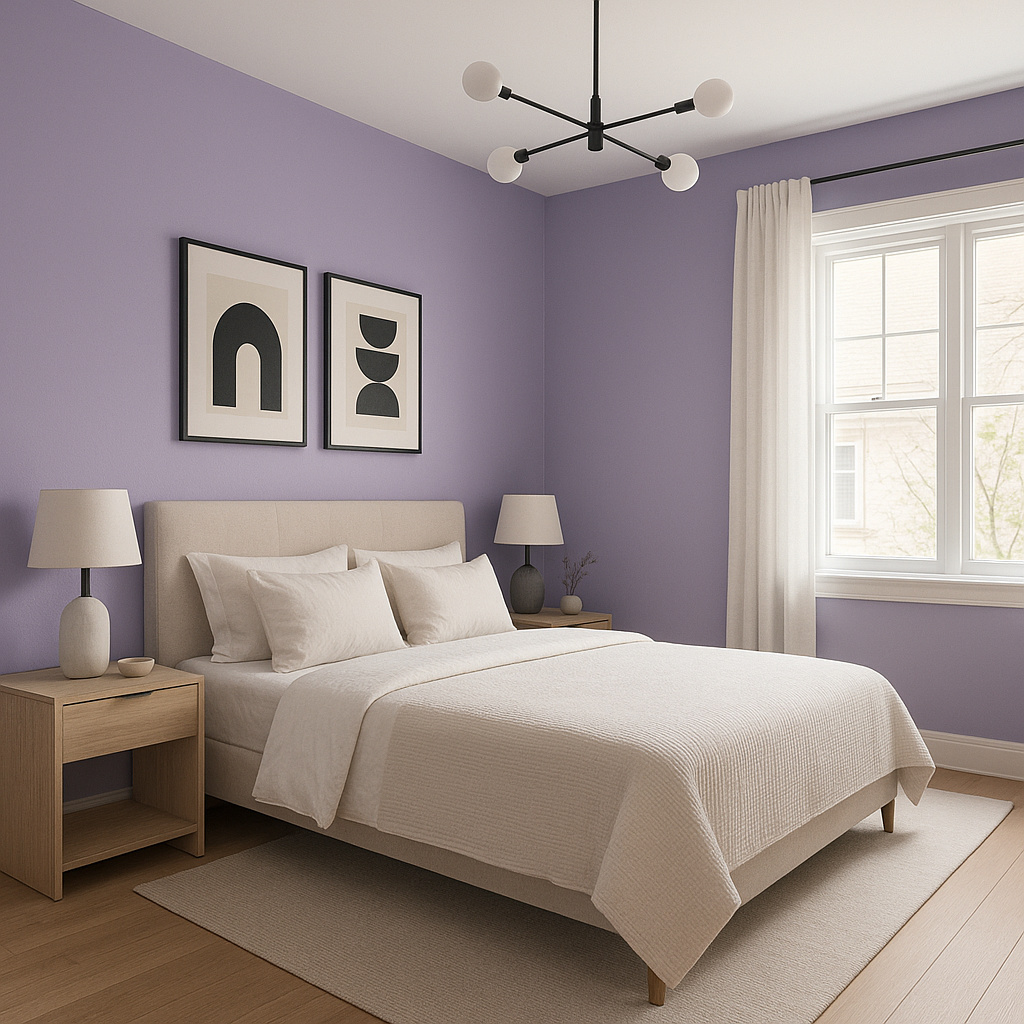
Crocus is an ideal choice for bedrooms, where its soothing lavender tones create a calming and restful atmosphere. Pair it with crisp white bedding and soft gray accents for a serene retreat, or incorporate metallic finishes like brushed silver or gold for a luxe touch.
In living rooms, Crocus can serve as an accent wall or be paired with neutral furniture to create a subtle yet stylish ambiance. Introduce textures like plush velvet or natural wood to add depth and dimension to the space.
This inviting lavender hue is perfect for children’s rooms, offering a playful yet sophisticated alternative to traditional pinks or blues. Pair it with pastel accents and whimsical decor for a fun and welcoming environment.
Crocus brings a spa-like vibe to bathrooms, making it an excellent choice for walls or cabinetry. Combine it with clean whites, silver fixtures, and marble textures for an effortlessly chic and calming sanctuary.
As a calming color, Crocus works beautifully in home offices, promoting focus and reducing stress. Pair it with neutral furniture and subtle pops of color for a productive yet stylish workspace.
The appearance of Crocus can shift depending on the lighting in the room. In spaces with ample natural light, its lavender tones will appear fresh and vibrant. In dimmer settings or under warm artificial light, Crocus leans into its muted gray undertones, creating a more subdued and cozy atmosphere. Always test a sample on your walls before committing to ensure the shade works perfectly in your specific environment.
Benjamin Moore Crocus (2071-40) is more than just a color—it’s a statement of elegance, tranquility, and timeless design. Its adaptable nature and sophisticated undertones make it a standout choice for creating spaces that feel both welcoming and refined. Whether you’re designing a cozy bedroom, a chic living room, or a serene bathroom, Crocus is a hue that brings personality and style to your home.
View Colors Only by Brand (No Imagery):
Sherwin-Williams
|
Benjamin-Moore
|
Behr
|
Valspar
Live on the Eastern Slope of Colorado and looking for a local painting professional, check out all our painting services and reach out for a free estimate.
Copyright © 2026 : Wild Fox Painting Inc. : 12435 Mead Way, Littleton, CO 80125


