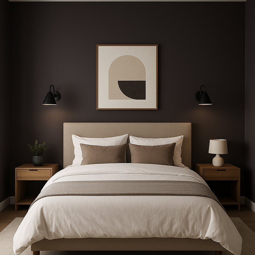
Benjamin Moore Dark (2072-10) is a commanding, deep purple that radiates sophistication and elegance. This striking hue, part of Benjamin Moore’s rich color palette, is perfect for adding drama and depth to any interior space. Its bold nature makes it a favorite choice for accent walls, statement furniture pieces, and luxurious interiors designed to leave a lasting impression.
Dark (2072-10) is not your average purple—it carries subtle yet powerful undertones of black and plum. These undertones give the color a moody, almost mysterious vibe, making it ideal for spaces that need a sense of intrigue and refinement. The black undertones balance the richness of the purple, ensuring it doesn’t feel overly vibrant but rather grounded and mature. Meanwhile, the plum undertones add a touch of warmth, keeping the color from appearing too cold or stark.
Benjamin Moore Dark pairs beautifully with a variety of shades, allowing you to create harmonious and visually stunning color schemes. Here are some suggestions for coordinating colors:
Neutral Pairings:
Pair Dark with soft neutrals such as Halo (AF-680) or White Dove (OC-17). These shades balance the boldness of the deep purple by introducing light, airy elements that brighten the overall design.
Metallic Accents:
Metallic tones like brushed gold or antique brass work exceptionally well with Dark, lending a luxurious feel to the space. Consider incorporating these tones in hardware, light fixtures, or decorative accents.
Warm Complementary Colors:
For a warm, inviting palette, pair Dark with earthy hues like Rich Clay (2084-20) or Golden Straw (2152-50). These colors highlight the plum undertones and create a cozy, layered look.
Cool Contrast:
If you prefer a cooler aesthetic, pair Dark with icy blues like Iceberg (2122-50) or steely grays such as Coventry Gray (HC-169). This combination emphasizes the black undertones and creates a sleek, contemporary feel.
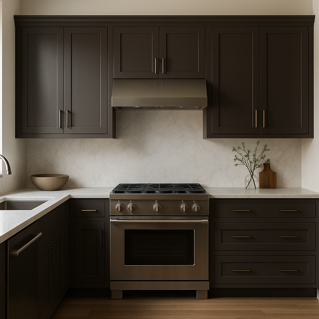
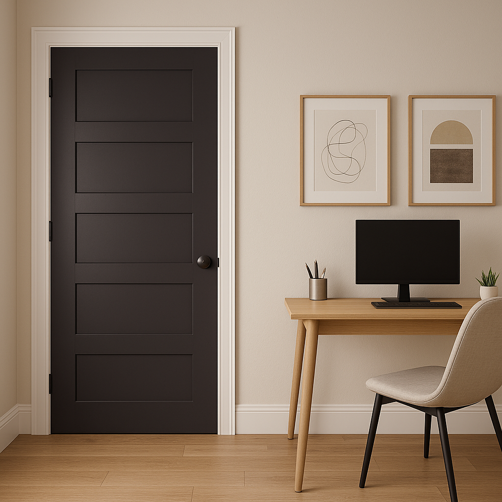
Dark (2072-10) is versatile despite its boldness, making it suitable for various applications across residential and commercial spaces. Below are some ideas for incorporating this stunning color into your designs:
Accent Walls:
Use Dark as an accent wall in bedrooms, dining rooms, or living areas to create a sense of drama and intimacy. Pair it with lighter walls for contrast and balance.
Statement Furniture:
Upholstered furniture in Dark adds character and richness to spaces. Consider velvet chairs or sofas in this hue to create a luxurious focal point.
Powder Rooms and Bathrooms:
Dark works wonderfully in small spaces like powder rooms, where its depth adds intrigue. Pair with marble finishes or metallic fixtures for a polished look.
Home Offices:
Create a sophisticated and focused atmosphere by using Dark in a home office. Combine it with wood tones and brass accents for a timeless aesthetic.
Art and Accessories:
Incorporate this hue into art pieces, cushions, or rugs to add dimension without overwhelming the space.
When working with Benjamin Moore Dark (2072-10), balance is key. Since it’s a bold and intense color, pairing it with lighter or softer shades can prevent the space from feeling too heavy. Ensure good lighting—whether natural or artificial—to highlight the richness of the hue and maintain a welcoming ambiance. Textures such as velvet, leather, or matte finishes complement Dark beautifully, allowing you to play with depth and interest.
Benjamin Moore Dark is a color choice that takes risks and rewards those willing to embrace its boldness. Whether used sparingly or throughout a room, its luxurious and moody presence ensures your space will stand out with timeless character.
View Colors Only by Brand (No Imagery):
Sherwin-Williams
|
Benjamin-Moore
|
Behr
|
Valspar
Live on the Eastern Slope of Colorado and looking for a local painting professional, check out all our painting services and reach out for a free estimate.
Copyright © 2026 : Wild Fox Painting Inc. : 12435 Mead Way, Littleton, CO 80125


