Benjamin Moore Pale (2073-60) is a subtly enchanting lavender-gray that effortlessly blends softness with sophistication. This ethereal color is part of Benjamin Moore’s expansive color palette and is perfect for creating serene and elegant spaces. With its muted undertones and versatile nature, Pale is a choice that works equally well in modern, transitional, and even classic interiors.
One of the most striking features of Pale is its unique undertones. While it is categorized as a lavender-gray, it carries soft hints of violet and blue that provide a cool and calming ambiance. These undertones prevent the color from feeling overly feminine or sweet, giving it a balanced and subdued character. The gray base tempers the lavender, making Pale a versatile choice that adapts beautifully to different lighting conditions.
In spaces with ample natural light, Pale leans slightly cooler, enhancing its lavender and gray notes. However, in dim or artificial lighting, the warmer undertones subtly emerge, adding depth and intrigue to the hue. This dynamic quality makes Pale a fantastic option for spaces where lighting changes throughout the day.
Pairing complementary colors with Pale can elevate its charm and create a cohesive design. Here are some suggestions for coordinating colors:
Thanks to its versatile undertones and understated elegance, Benjamin Moore Pale is a color that can work in various rooms and design styles. Here are some ideas for incorporating this shade into your home:
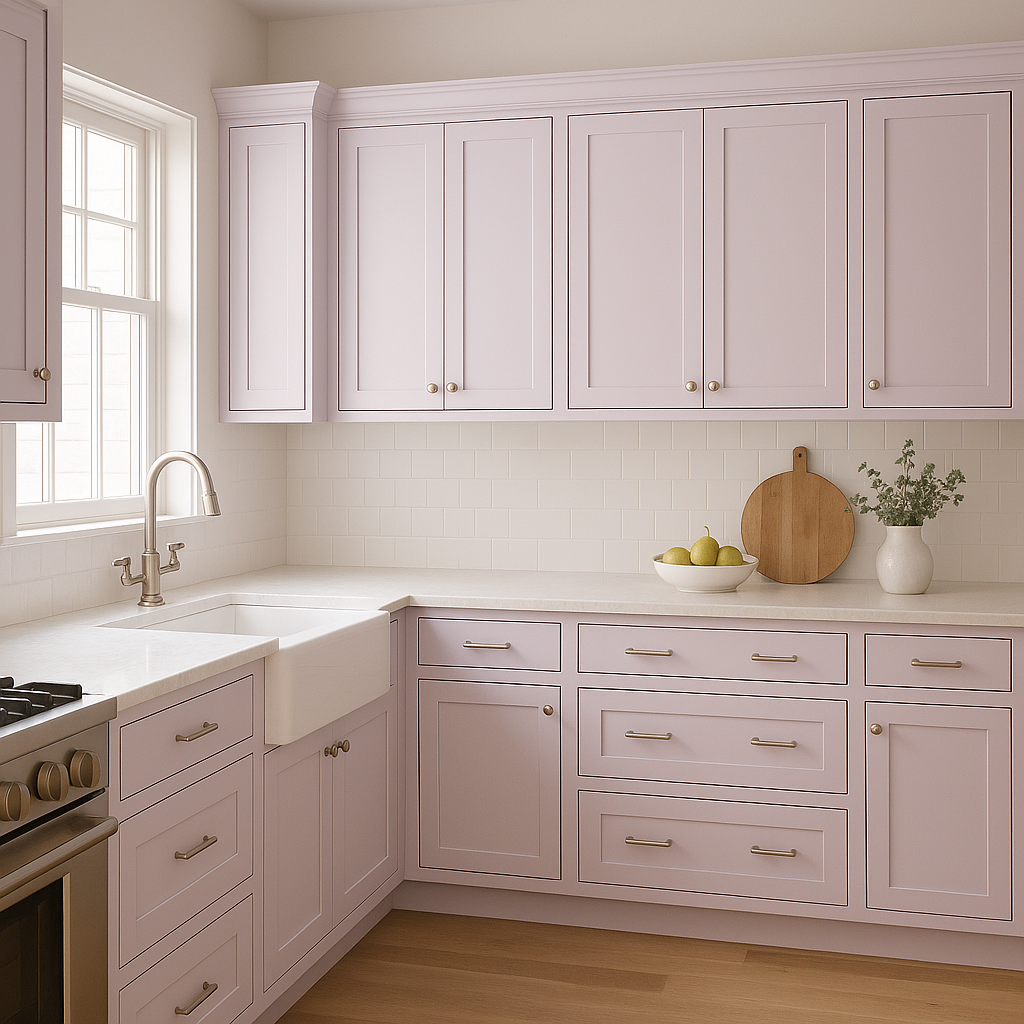
Pale creates a welcoming and tranquil environment for living rooms. Pair it with plush gray or navy furniture, soft white trim, and metallic accents in silver or brushed nickel to achieve a polished look. Add throw pillows or rugs in coordinating lavender shades for textural interest.
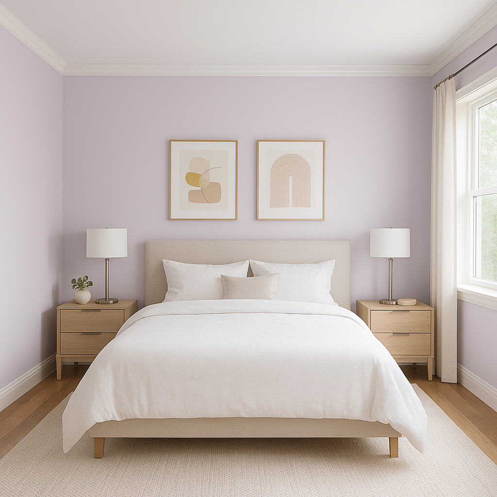
As a calming color, Pale is perfect for bedrooms. It encourages relaxation and pairs beautifully with crisp white bedding or soft pastel accents. Introduce textures like linen curtains or a velvet headboard to amplify its luxurious feel.
Transform your bathroom into a spa-like retreat with Pale on the walls. Coordinate it with white subway tiles, brushed nickel hardware, and soft gray towels for a serene and modern aesthetic.
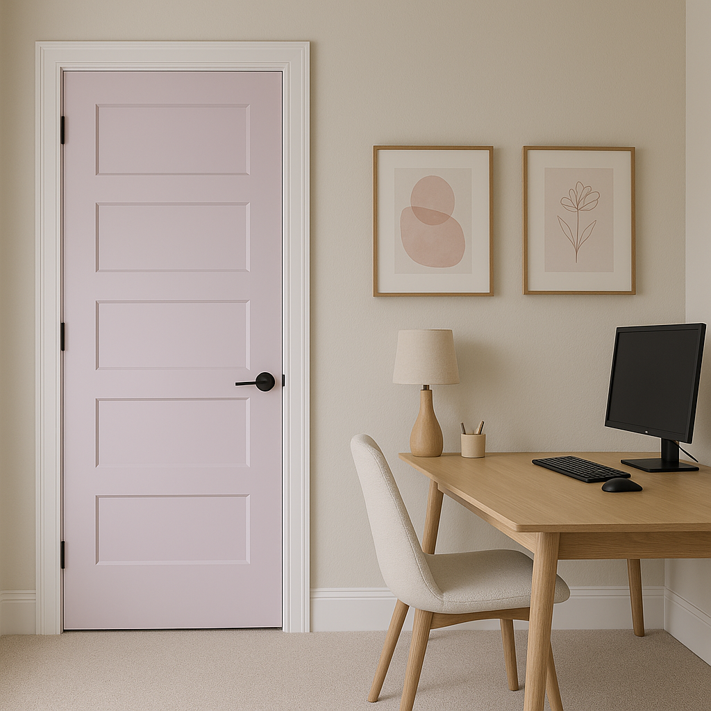
Pale can invigorate your workspace without overpowering it. Its gentle tone fosters focus and clarity, making it ideal for home offices. Pair it with sleek black furniture and contrasting accessories to achieve a professional yet inviting atmosphere.
If you’re hesitant to commit to Pale for an entire room, use it as an accent wall. Its muted elegance adds depth without overwhelming the design, making it an excellent choice for spaces like entryways, dining rooms, or alcoves.
Benjamin Moore Pale strikes the perfect balance between softness and sophistication. Its subtle lavender-gray tones, dynamic undertones, and versatility make it an ideal choice for a wide variety of spaces. Whether you’re designing a cozy bedroom, an upscale living room, or a serene bathroom, Pale provides the perfect backdrop for a timeless and refined aesthetic. Pair it with complementary colors, textures, and finishes to bring your design vision to life.
View Colors Only by Brand (No Imagery):
Sherwin-Williams
|
Benjamin-Moore
|
Behr
|
Valspar
Live on the Eastern Slope of Colorado and looking for a local painting professional, check out all our painting services and reach out for a free estimate.
Copyright © 2026 : Wild Fox Painting Inc. : 12435 Mead Way, Littleton, CO 80125


