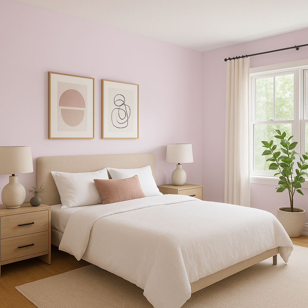
Benjamin Moore Charming (2075-70) is a whimsical and serene shade of lavender that brings a touch of elegance and personality to any space. This delicate, pastel hue is reminiscent of blooming lilac petals in spring, offering a soft and calming ambiance. Whether you're looking to create a soothing retreat or infuse a subtle pop of color into your design, Charming is a versatile choice that feels both fresh and sophisticated.
The beauty of Benjamin Moore Charming lies in its nuanced undertones. It features a gentle balance of lavender with subtle gray and pink influences. The gray undertone lends the color a refined, modern edge, preventing it from feeling overly sweet or juvenile. Meanwhile, the pink undertone adds warmth and softness, making it feel approachable and comforting. This perfect harmony of cool and warm tones ensures that Charming adapts beautifully to both contemporary and traditional interiors.
Charming pairs effortlessly with a variety of shades, making it a flexible choice for diverse color palettes. Here are some coordinating colors to consider:
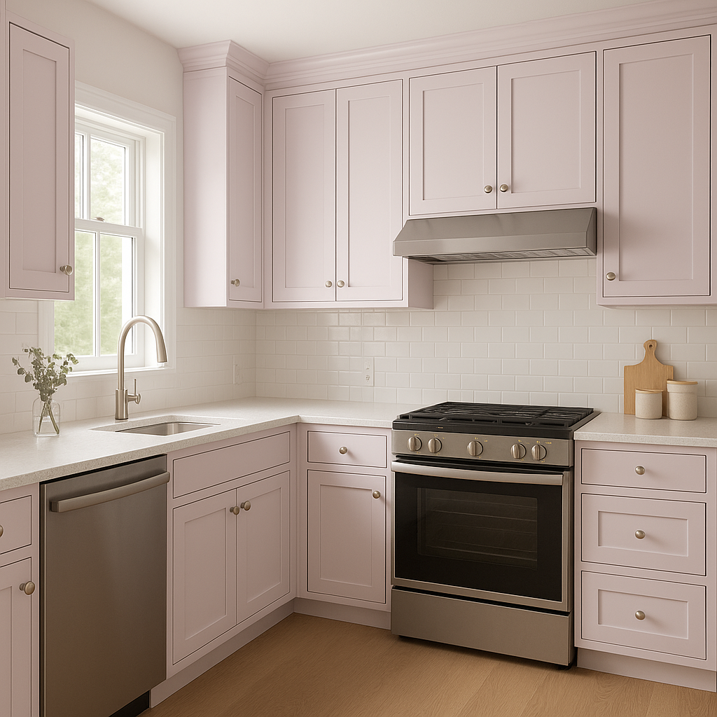
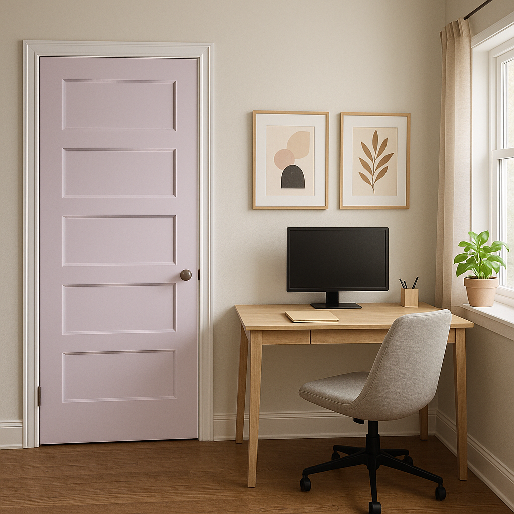
Charming is a versatile color that works beautifully in a variety of settings. Its soft, calming presence makes it an excellent choice for spaces where relaxation and tranquility are key.
Like all pastel colors, Benjamin Moore Charming can appear slightly different depending on the lighting in your space. In natural light, its lavender tone shines through with a soft, ethereal glow, making the room feel open and inviting. In artificial lighting, the undertones may shift slightly, with the gray becoming more pronounced in cooler light and the pink emerging in warmer light. Testing the color in your specific space is always recommended to ensure it achieves the desired effect.
Benjamin Moore Charming (2075-70) is a sophisticated lavender that offers endless possibilities for both bold and understated designs. Its subtle undertones, flexibility with coordinating colors, and calming presence make it a standout choice for homeowners and designers alike. Whether you're revamping a bedroom, adding personality to a living area, or refreshing your bathroom, this color brings a timeless charm that feels effortlessly stylish.
View Colors Only by Brand (No Imagery):
Sherwin-Williams
|
Benjamin-Moore
|
Behr
|
Valspar
Live on the Eastern Slope of Colorado and looking for a local painting professional, check out all our painting services and reach out for a free estimate.
Copyright © 2026 : Wild Fox Painting Inc. : 12435 Mead Way, Littleton, CO 80125


