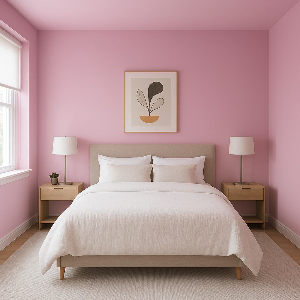
Benjamin Moore Pretty (2077-50) is a mesmerizing shade of pink that exudes charm, warmth, and a touch of playful sophistication. This medium-toned pink is ideal for creating a statement in your interiors, offering a balance between vibrancy and subtlety. Whether you’re designing a chic bedroom, a lively powder room, or a cheerful accent wall, Pretty is sure to infuse your space with personality and energy.
Pretty (2077-50) features warm undertones that lean slightly toward coral, giving it a soft yet radiant glow. These undertones make it feel inviting and approachable, avoiding the overly cool or stark nature of some pinks. The warm base allows this color to pair beautifully with other hues, whether you're going for a cozy ambiance or a playful aesthetic.
Benjamin Moore Pretty (2077-50) stands out beautifully on its own, but it truly shines when paired with complementary colors. Consider incorporating the following shades for a harmonious palette:
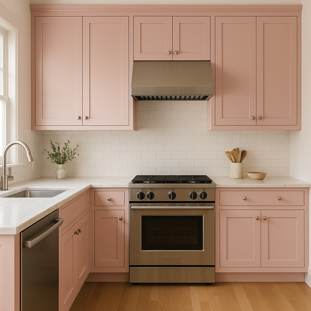
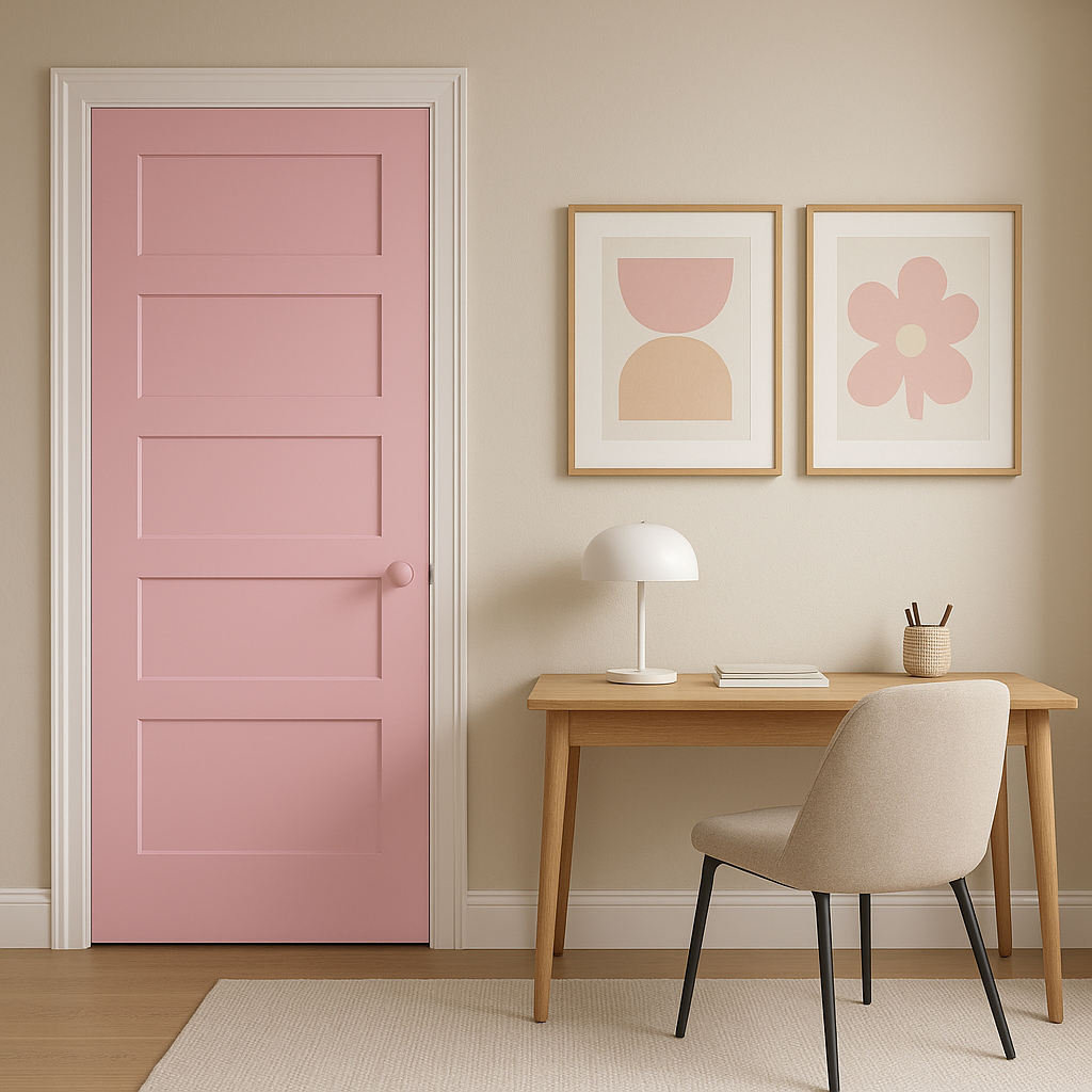
Benjamin Moore Pretty (2077-50) is a versatile shade that works beautifully in a variety of applications. Here are some creative ways to use this delightful color:
The appearance of Pretty (2077-50) can vary depending on lighting. Under natural daylight, its warm undertones shine through, making it feel fresh and vibrant. In dimmer, artificial lighting, it takes on a softer and cozier vibe, which can enhance its coral-inspired warmth. To ensure the best results, test Pretty in your space before committing to placement, as surrounding finishes and lighting conditions can affect how the color reads.
Benjamin Moore Pretty (2077-50) is a versatile, optimistic shade that brings joy and sophistication to any interior. With its warm undertones, stunning coordinating options, and adaptability across different spaces, this delightful pink is a powerful choice for homeowners and designers alike looking to make a statement.
View Colors Only by Brand (No Imagery):
Sherwin-Williams
|
Benjamin-Moore
|
Behr
|
Valspar
Live on the Eastern Slope of Colorado and looking for a local painting professional, check out all our painting services and reach out for a free estimate.
Copyright © 2026 : Wild Fox Painting Inc. : 12435 Mead Way, Littleton, CO 80125


