Benjamin Moore Valentine’s (2077-60) is a captivating shade of pink that exudes charm, romance, and a touch of playful energy. This color is ideal for creating spaces that feel warm, inviting, and full of personality. Its delicate balance between vibrancy and softness makes it versatile for both bold statements and subtle accents. Whether you're designing a whimsical bedroom, a cheerful nursery, or an energetic workspace, Valentine’s is a hue that sparks joy and creativity.
Valentine’s is a medium pink with a well-balanced mix of undertones that lean toward red, while also maintaining a cool freshness. These undertones prevent it from feeling overly sweet or juvenile, giving it a refined and modern edge. The slight red base adds a touch of warmth, while hints of coolness keep the color feeling light and airy. This nuanced blend allows Valentine’s to adapt beautifully to various lighting conditions, appearing slightly warmer under incandescent lights and cooler in natural daylight.
Benjamin Moore Valentine’s pairs beautifully with a variety of complementary and contrasting hues. For a cohesive and sophisticated look, consider these coordinating colors:
Neutrals:
Bold Contrasts:
Soft Accents:
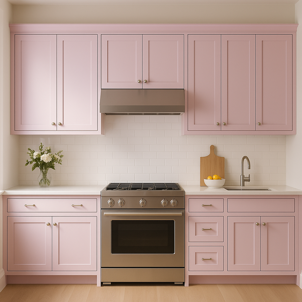
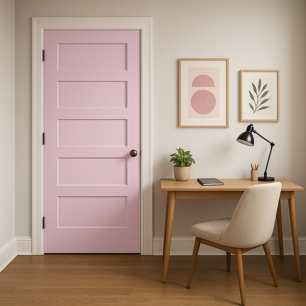
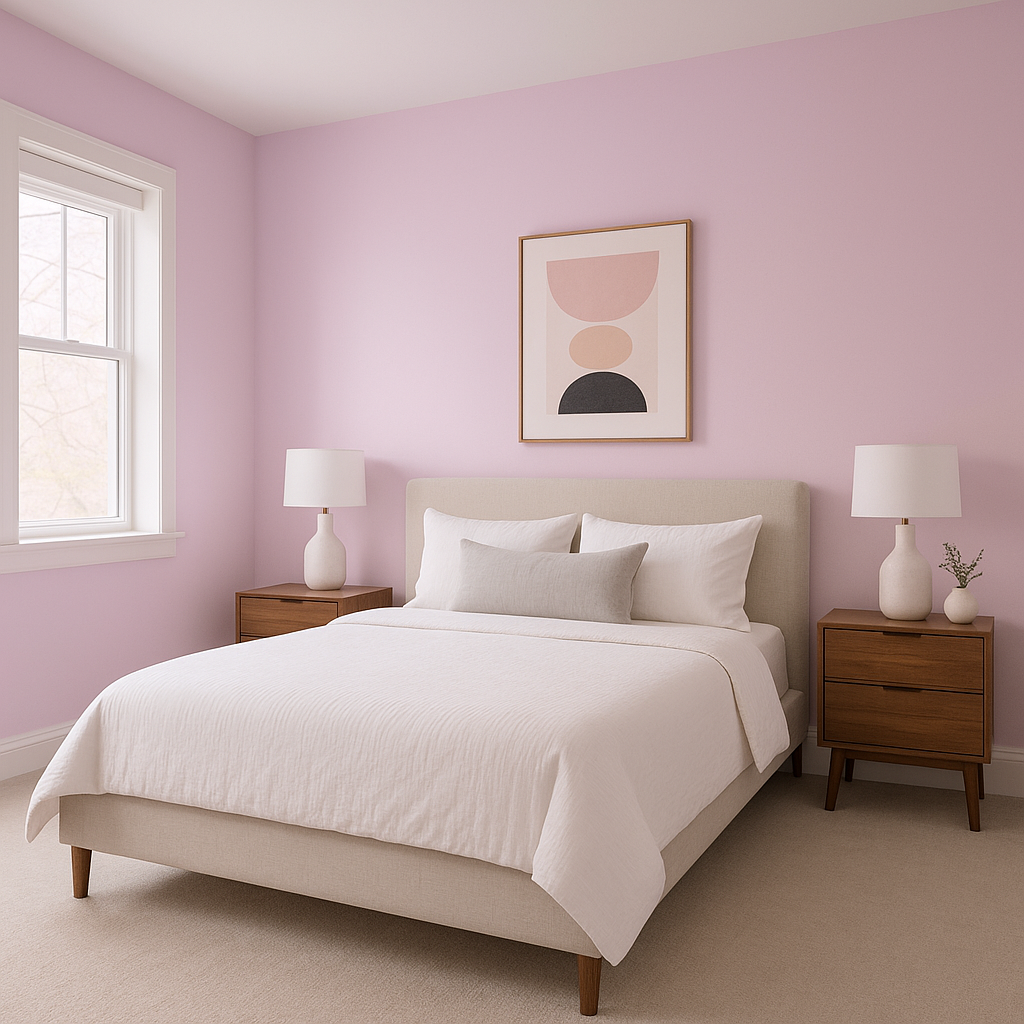
Valentine’s is a versatile pink that can be used in a variety of spaces and design styles. Here are some suggestions for incorporating this color into your home or office:
Bedrooms:
Its romantic and soothing qualities make Valentine’s a perfect choice for bedrooms. Pair it with crisp whites and soft grays for a tranquil retreat, or layer in metallic accents like gold or brass for a touch of glamour.
Nurseries:
Valentine’s is ideal for a cheerful and welcoming nursery. Combine it with pastel shades like mint green or powder blue for a playful yet balanced palette.
Home Offices:
Add an energetic yet calming touch to your workspace with Valentine’s. Pair it with neutral furniture and bold abstract artwork to inspire productivity and creativity.
Accent Walls:
Use Valentine’s as a statement color for an accent wall in living rooms or dining areas. Its vibrant yet sophisticated tone adds personality without overwhelming the space.
Bathrooms:
Create a spa-like atmosphere by using Valentine’s on cabinetry or walls, paired with marble finishes and polished chrome fixtures.
The appearance of Valentine’s (2077-60) can shift depending on the lighting in your space. Under warm, incandescent lighting, its red undertones become more prominent, creating a cozy and inviting vibe. In spaces with abundant natural light, the cooler undertones shine through, making it feel fresh and airy. To ensure the best results, test the color in your space during different times of the day and under various light sources.
Benjamin Moore Valentine’s (2077-60) is more than just a pink—it’s a hue that brings personality and charm to any space. Its refined undertones, versatility, and ability to coordinate beautifully with other colors make it a standout choice for homeowners and designers alike. Whether you're aiming to evoke romance, playfulness, or modern sophistication, Valentine’s is a timeless color that will elevate your interiors with its unique flair.
View Colors Only by Brand (No Imagery):
Sherwin-Williams
|
Benjamin-Moore
|
Behr
|
Valspar
Live on the Eastern Slope of Colorado and looking for a local painting professional, check out all our painting services and reach out for a free estimate.
Copyright © 2026 : Wild Fox Painting Inc. : 12435 Mead Way, Littleton, CO 80125


