Benjamin Moore I (2077-70) is a delicate and ethereal paint color that exudes a soft elegance, perfect for creating serene and sophisticated spaces. This shade is part of Benjamin Moore’s Color Preview collection and is characterized by its pale lavender hue with subtle undertones that bring a sense of calm and refinement to any interior.
Benjamin Moore I (2077-70) carries gentle lavender tones with understated gray undertones, making it a versatile choice for both cool and warm color palettes. The faint whisper of gray tempers its purple essence, ensuring the color remains soft and unobtrusive rather than overly bold or saturated. In certain lighting, you may even notice hints of blue peeking through, adding to its layered complexity. This adaptability allows it to shift beautifully depending on the time of day and the light source, making it an enchanting choice for various spaces.
To maximize the beauty of Benjamin Moore I (2077-70), consider pairing it with complementary or coordinating colors that enhance its subtle charm:
Benjamin Moore I (2077-70) is versatile enough to suit a variety of spaces and design styles. Here are some of its best applications:
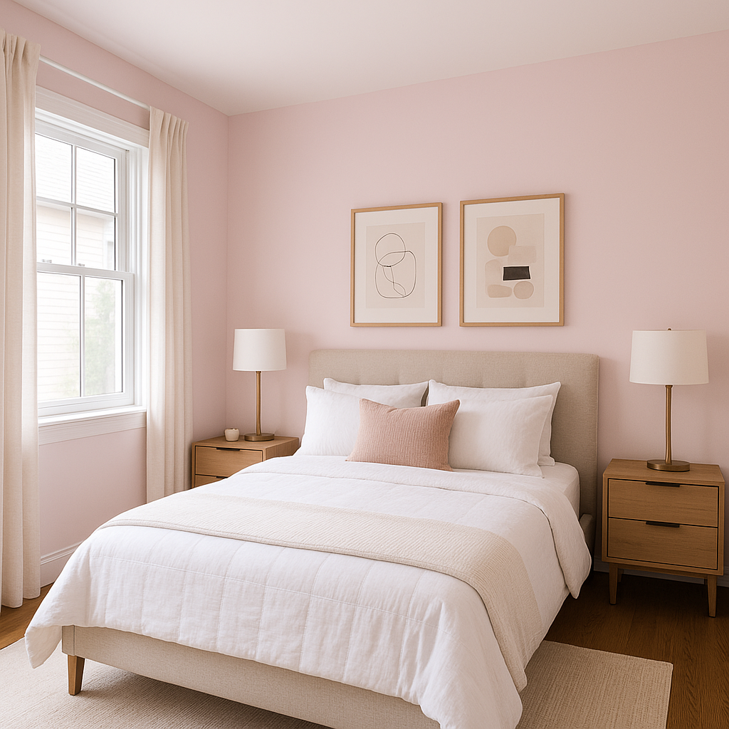
Its delicate lavender hue fosters a tranquil and restful environment, making it ideal for bedrooms. Pair it with soft linens and plush textures to create a cozy, dreamlike retreat.
Benjamin Moore I brings a spa-like quality to bathrooms, especially when paired with crisp whites and polished chrome fixtures. The gray undertones ensure elegance without overwhelming the space.
This gentle shade is perfect for nurseries, offering a soothing backdrop that works beautifully for both traditional and modern designs. Pair it with pastel accents for a whimsical yet serene feel.
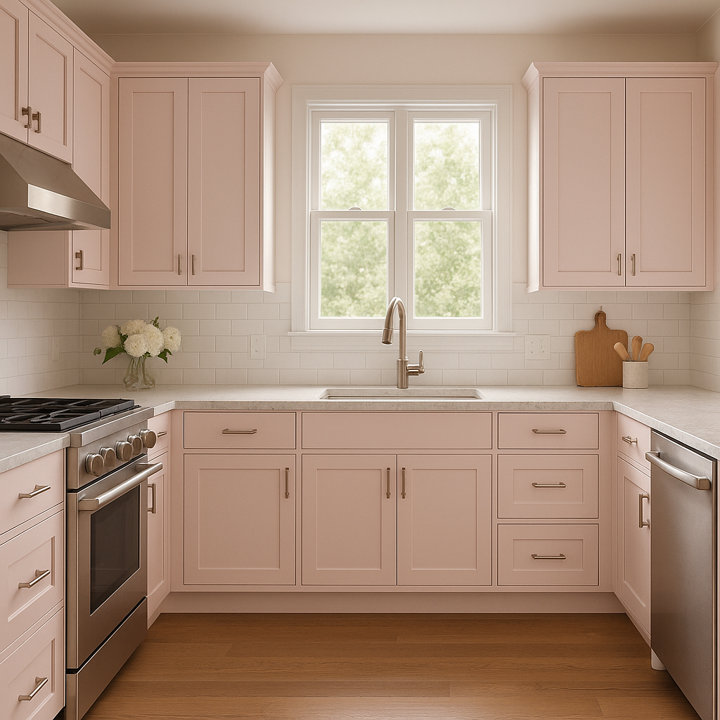
For a sophisticated touch in living areas, Benjamin Moore I can be used as a main wall color or an accent. Pair it with neutral furniture and metallic accessories to create a balanced and inviting space.
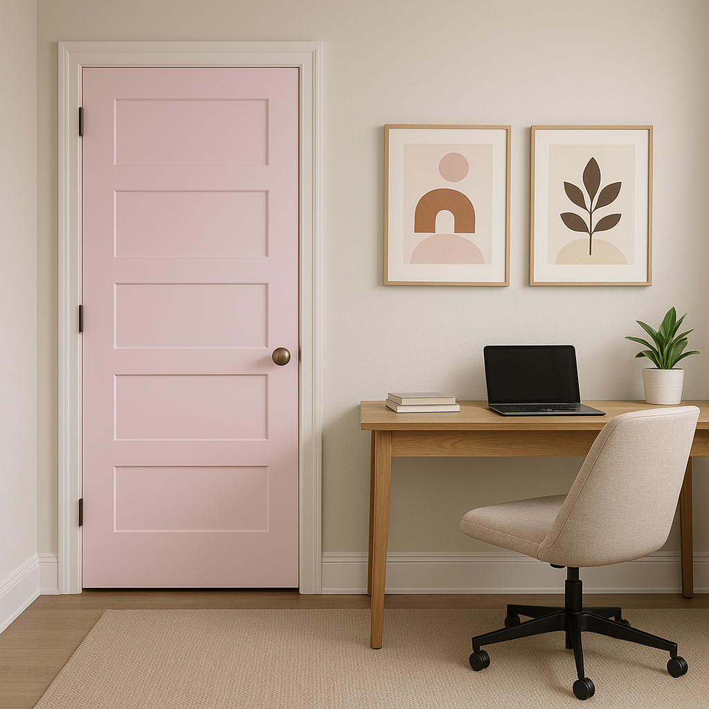
If you’re looking to introduce a subtle pop of color without overpowering a room, Benjamin Moore I works wonderfully as an accent wall. It pairs well with neutral palettes, offering a soft yet noticeable contrast.
Keep in mind that Benjamin Moore I (2077-70) responds beautifully to lighting. In natural light, its lavender tones feel airy and fresh, while in artificial lighting, the gray undertones emerge, providing a more subdued and sophisticated vibe. To fully appreciate its versatility, test the color in different lighting conditions before committing.
Benjamin Moore I (2077-70) is a color that whispers sophistication and serenity. Its versatility, delicate undertones, and ability to harmonize with a variety of palettes make it an excellent choice for those seeking to create timeless and tranquil interiors. Whether as a primary wall color or an accent, this shade is sure to elevate your space with its graceful charm.
View Colors Only by Brand (No Imagery):
Sherwin-Williams
|
Benjamin-Moore
|
Behr
|
Valspar
Live on the Eastern Slope of Colorado and looking for a local painting professional, check out all our painting services and reach out for a free estimate.
Copyright © 2026 : Wild Fox Painting Inc. : 12435 Mead Way, Littleton, CO 80125


