Benjamin Moore Rhododendron (2079-50) is a stunning and sophisticated color that commands attention with its rich, deep presence. This captivating hue is a medium to dark red, infused with subtle berry undertones, creating a warmth and vibrancy that feels both timeless and modern. Rhododendron strikes a perfect balance between boldness and elegance, making it an exceptional choice for those seeking to add drama and depth to their spaces.
The undertones in Rhododendron are a mix of soft plum and cranberry, which lend the color a luxurious and refined quality. These undertones make it more versatile than a traditional red, allowing it to transition beautifully between different lighting environments. In daylight, Rhododendron may appear slightly brighter and more energetic, while in dim indoor lighting, the berry undertones emerge, offering a moodier and more intimate ambiance. This dynamic quality makes Rhododendron truly unique among red paint colors.
Pairing Rhododendron with complementary colors can highlight its depth while maintaining a balanced palette. Here are some coordinating colors to consider:
Neutrals: Soft, warm neutrals like Benjamin Moore White Dove (OC-17) or Ballet White (OC-9) can create stunning contrast, allowing Rhododendron to shine as the focal point of the space. For cooler tones, consider Gray Owl (2137-60) or Simply White (OC-117) to balance its warmth.
Earthy Tones: Rich browns or taupes such as Kendall Charcoal (HC-166) and Edgecomb Gray (HC-173) pair beautifully with Rhododendron, creating a cozy and grounded feel.
Greens: Muted greens like Saybrook Sage (HC-114) or Silken Pine (2144-50) offer a natural complement, echoing the botanical inspiration behind the color’s name. These shades create a harmonious and organic palette.
Metallics: Accents of gold or copper can elevate Rhododendron’s luxurious quality, making it perfect for glamorous, high-impact designs. Consider incorporating metallic finishes through lighting fixtures, hardware, or décor.
Rhododendron works exceptionally well in spaces where you want to evoke a sense of drama, intimacy, or sophistication. Here are some ideas for incorporating this bold color into your home:
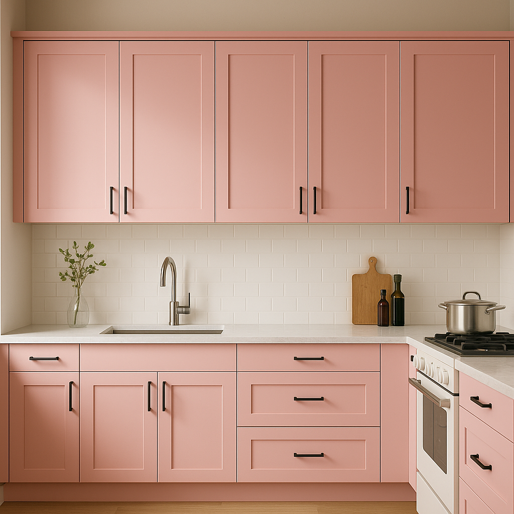
Rhododendron makes a striking choice for an accent wall in living rooms, dining areas, or bedrooms. Pair it with neutral walls or furnishings to create contrast and keep the space balanced. This approach allows you to enjoy the boldness of the color without overwhelming the room.
As a rich, inviting hue, Rhododendron is ideal for dining rooms. It creates a warm and intimate atmosphere that encourages conversation and enhances the overall dining experience. Pair it with wooden furniture and metallic accents for a regal, timeless look.
For smaller spaces like powder rooms, Rhododendron can make a big impact. Its deep berry tones add a sense of luxury and sophistication, especially when paired with crisp white trim and elegant fixtures.
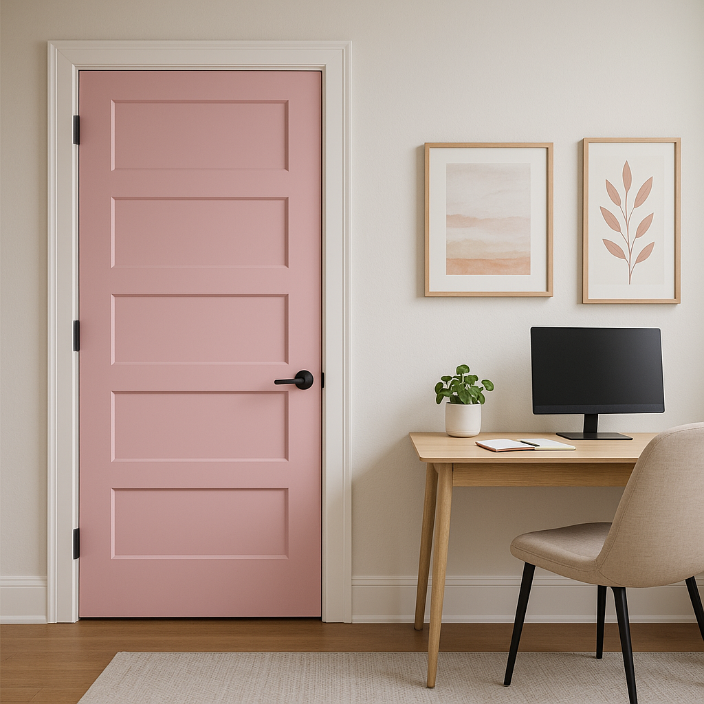
Make a bold first impression by using Rhododendron in your entryway or foyer. This color introduces warmth and personality, setting the tone for the rest of your home.
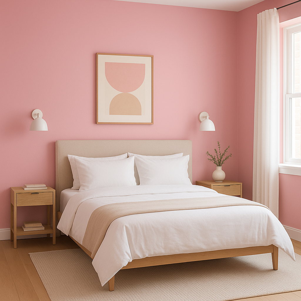
Rhododendron’s berry undertones can create an intimate, cocoon-like feeling in bedrooms. Pair it with plush textiles like velvet or satin and soft lighting to enhance the cozy atmosphere.
Benjamin Moore Rhododendron is a color that bridges the gap between bold and refined. Its berry undertones and rich, red base make it an incredibly versatile choice for interiors. Whether used as an accent or as the primary wall color, Rhododendron transforms spaces into works of art. Pair it with coordinating colors like warm neutrals, earthy tones, and muted greens to create a palette that feels balanced and intentional. With its adaptability, this color is perfect for creating both high-impact designs and cozy, intimate spaces.
View Colors Only by Brand (No Imagery):
Sherwin-Williams
|
Benjamin-Moore
|
Behr
|
Valspar
Live on the Eastern Slope of Colorado and looking for a local painting professional, check out all our painting services and reach out for a free estimate.
Copyright © 2026 : Wild Fox Painting Inc. : 12435 Mead Way, Littleton, CO 80125


