Benjamin Moore Bayberry 2080-50 is an elegant and versatile shade of green that strikes a beautiful balance between timeless sophistication and modern vibrancy. With its rich depth and subtle undertones, this color is a stunning choice for both residential and commercial spaces. Whether you're aiming to create a cozy and inviting atmosphere or a statement-making focal point, Bayberry offers a unique charm that is hard to resist.
Bayberry is a medium-to-dark green with warm undertones that infuse it with a sense of comfort and approachability. Its earthy nature leans slightly toward olive, yet it retains a brightness that keeps it from feeling too heavy or muted. Depending on the lighting—whether natural or artificial—it may reveal hints of golden undertones, lending a dynamic quality to its appearance. This chameleon-like ability makes Bayberry adaptable to a variety of design styles and color schemes.
Bayberry 2080-50 pairs beautifully with an array of coordinating colors, making it a flexible choice for any palette.
Bayberry’s rich and versatile hue makes it a standout choice for a variety of applications across your home or workspace. Here's how to incorporate this color into your design:
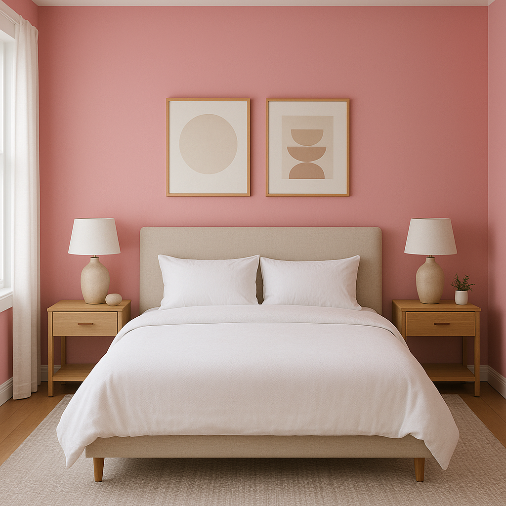
Use Bayberry as a feature wall color to add depth and drama to living rooms, bedrooms, or dining areas. Its bold yet inviting tone draws attention without overpowering the rest of the decor.
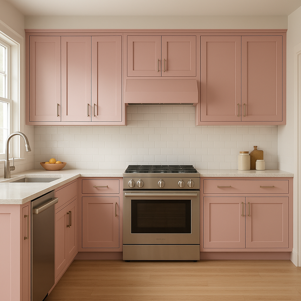
For kitchens, bathrooms, or built-in furniture, Bayberry is an excellent option for cabinetry. It adds a sophisticated touch, especially when paired with brass or matte black hardware.
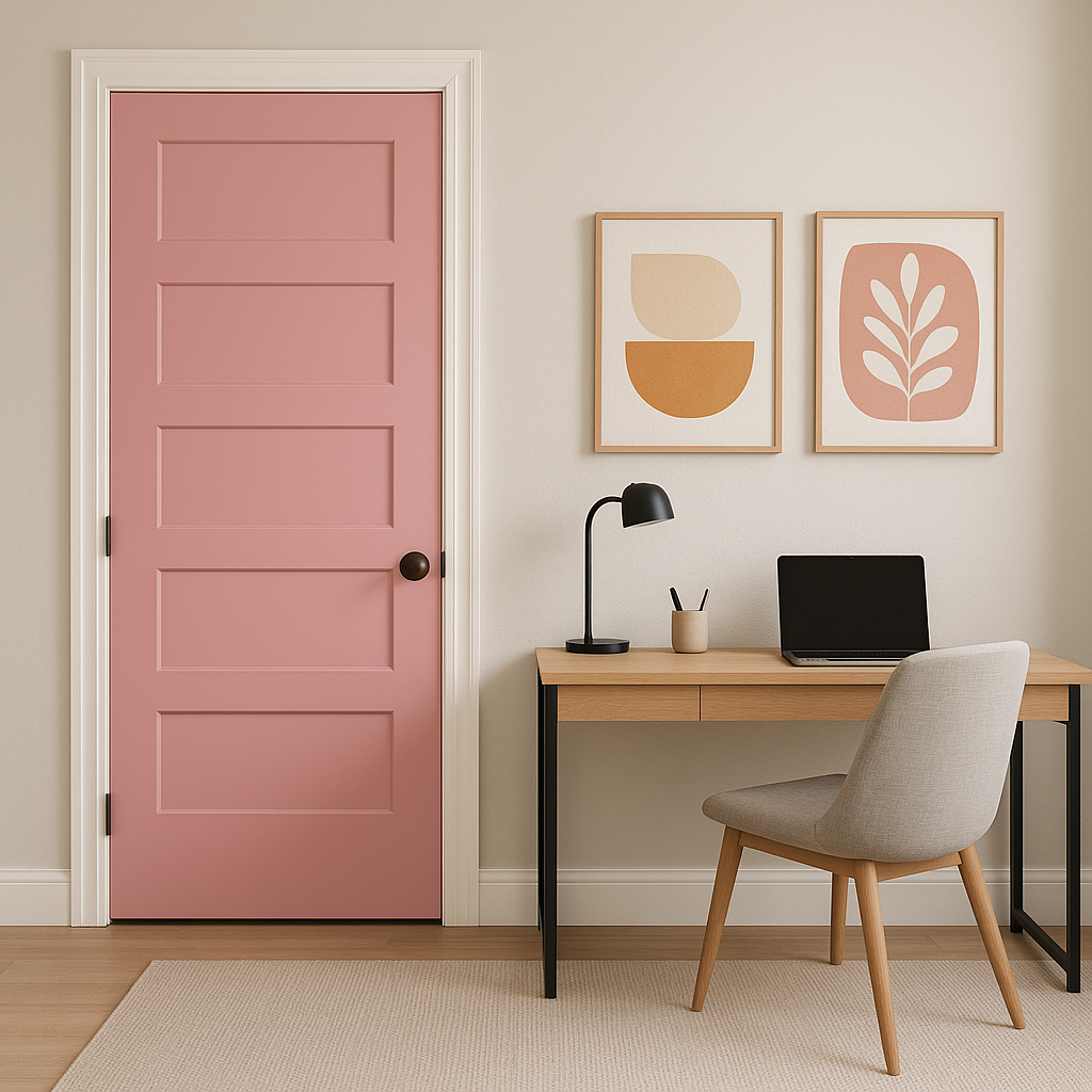
Make a memorable first impression by painting your front door in Bayberry. The rich green creates a welcoming and stately entrance that works beautifully with both traditional and modern exteriors.
For a subtler use of Bayberry, incorporate it into smaller elements like side tables, chairs, or even picture frames. This allows the color to shine without committing to a full room transformation.
Bayberry isn’t just for interiors—it works beautifully on outdoor shutters, fences, or garden furniture. Its earthy undertones complement natural surroundings, blending seamlessly with greenery and landscapes.
Lighting plays a significant role in how Bayberry 2080-50 is perceived. Under warm lighting, its golden undertones become more pronounced, creating a cozy and intimate feel.
View Colors Only by Brand (No Imagery):
Sherwin-Williams
|
Benjamin-Moore
|
Behr
|
Valspar
Live on the Eastern Slope of Colorado and looking for a local painting professional, check out all our painting services and reach out for a free estimate.
Copyright © 2026 : Wild Fox Painting Inc. : 12435 Mead Way, Littleton, CO 80125


