Benjamin Moore Flush 2081-70 is a soft and delicate pink that exudes charm and refinement. With its understated elegance, this color is perfect for creating serene and inviting spaces while offering just the right amount of warmth. Whether you’re looking to add a touch of romance to your interiors or want to complement bolder palettes, Flush 2081-70 is a versatile shade that delivers timeless beauty.
Flush 2081-70 carries gentle undertones of peach and cream, making it a warm pastel pink with a hint of softness. These undertones give it a more natural and organic feel compared to cooler pinks, ensuring that it doesn’t veer into overly saccharine territory. Its delicate balance of warmth and lightness makes it an excellent choice for spaces where you want to maintain an airy, uplifting atmosphere.
Flush 2081-70 is a versatile shade that works beautifully with both neutrals and more saturated tones. Here are some coordinating color suggestions to help you create a harmonious palette:
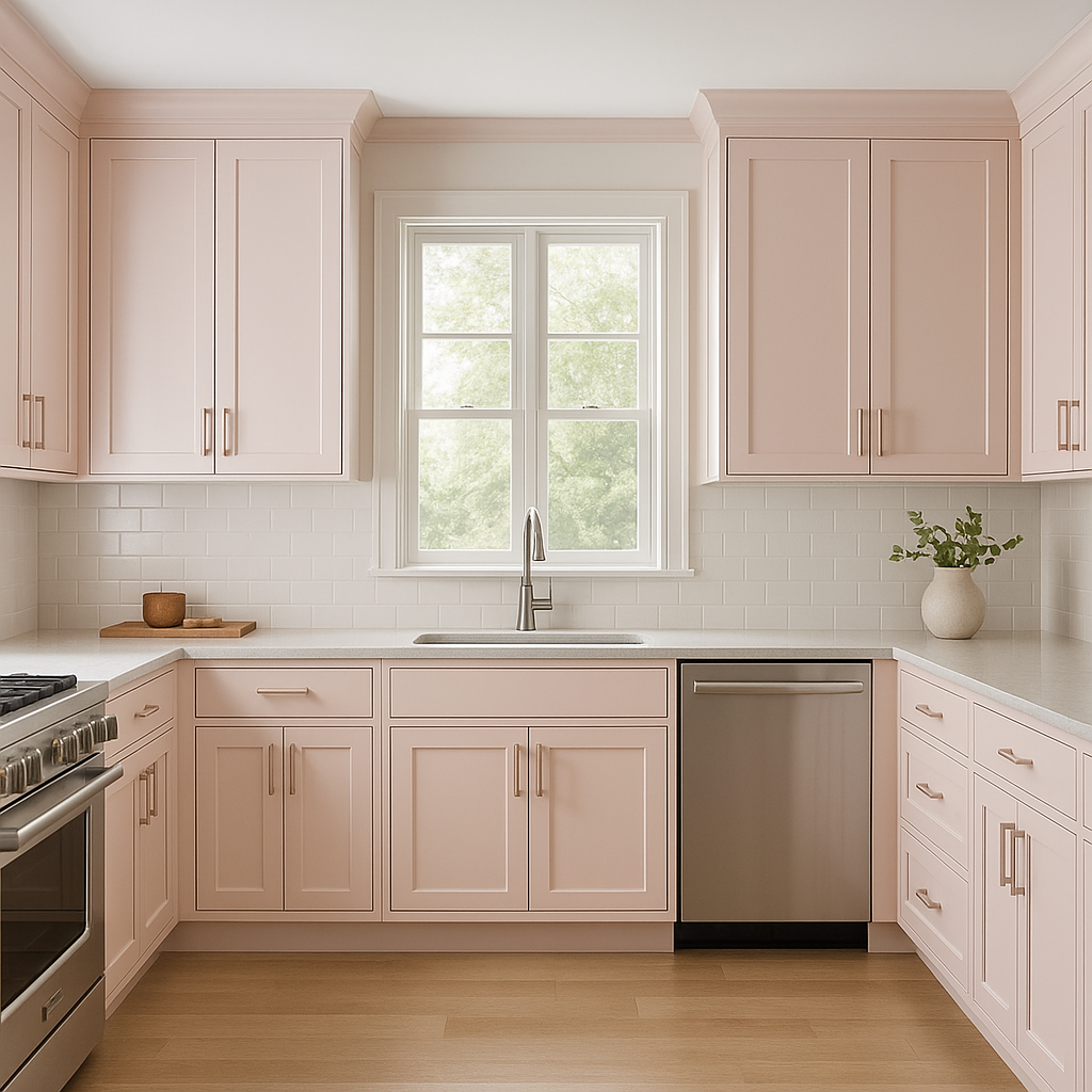
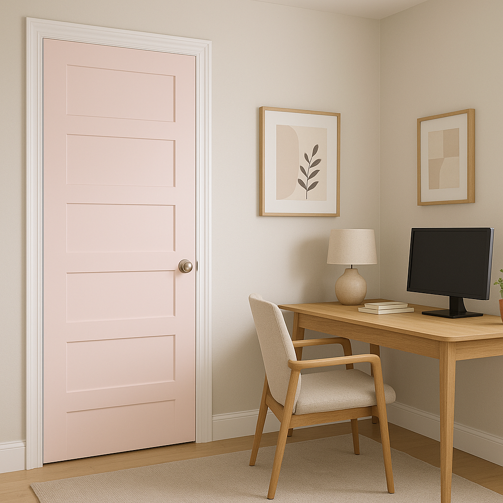
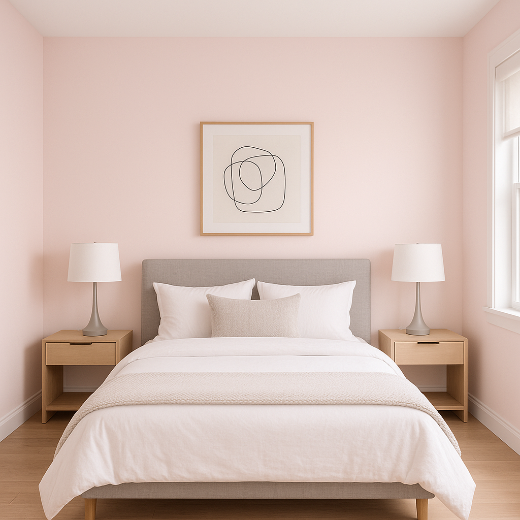
Flush 2081-70 is a highly adaptable hue that works well in a variety of settings. Its graceful undertones and soft presence make it ideal for creating a soothing environment without being overly bold. Here are some of the top ways to incorporate this color into your home or office:
Flush 2081-70’s gentle warmth makes it an excellent choice for bedrooms and nurseries. The soft pink creates a calming atmosphere that promotes relaxation and comfort. Use it as the primary wall color and pair it with crisp white trim for a clean, classic aesthetic.
For a touch of elegance, use Flush 2081-70 as an accent wall in a living room or dining area. Its subtle warmth pairs wonderfully with metallic accents like gold or brass, as well as plush textures like velvet and linen. It can also serve as a sophisticated backdrop for gallery walls or statement furniture.
Flush 2081-70 can transform a bathroom into a serene retreat. Its soft pink tone feels fresh and inviting, especially when paired with white tile, marble, or brushed nickel fixtures. Add greenery or natural wood elements to enhance its organic appeal.
Pink tones have been shown to inspire creativity, and Flush 2081-70 is no exception. Use it in a home office or studio space to encourage focus and imagination. Pair it with light woods, modern furniture, and minimalist décor for a contemporary look.
While less common,
View Colors Only by Brand (No Imagery):
Sherwin-Williams
|
Benjamin-Moore
|
Behr
|
Valspar
Live on the Eastern Slope of Colorado and looking for a local painting professional, check out all our painting services and reach out for a free estimate.
Copyright © 2026 : Wild Fox Painting Inc. : 12435 Mead Way, Littleton, CO 80125


