Benjamin Moore Cranberry (2083-20) is a rich, dramatic shade that exudes warmth, elegance, and character. This deep, saturated red is reminiscent of ripe cranberries, making it a striking choice for spaces where boldness and sophistication are desired. Perfect for creating a statement, Cranberry is versatile enough to work in both traditional and modern settings, offering a sense of depth and luxury.
Cranberry (2083-20) has subtle blue undertones, giving it a cooler edge that distinguishes it from warmer reds. These undertones provide a refined balance, ensuring the color feels rich and vibrant without becoming overwhelming. The cool base lends this shade a jewel-like quality, making it particularly well-suited for spaces that need a touch of drama while maintaining a polished appearance.
Pairing Benjamin Moore Cranberry with complementary shades enhances its beauty and creates a cohesive design. Here are a few suggestions for coordinating colors:
Thanks to its bold personality, Benjamin Moore Cranberry is a versatile shade that can be incorporated into a variety of interior spaces and design styles. Here are some creative ways to use this striking hue:
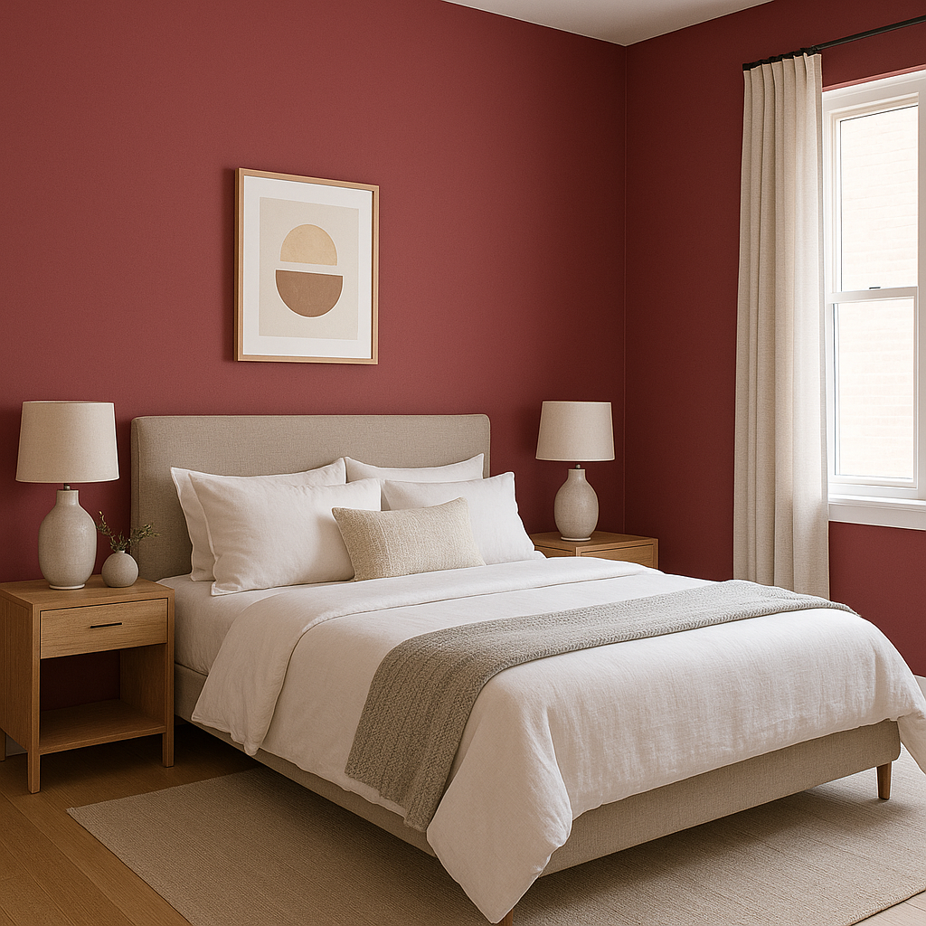
Cranberry is ideal for an accent wall in living rooms, dining rooms, or bedrooms. Its deep, luxurious tone draws attention without overpowering the space, making it a focal point that adds depth and character.
The richness of Cranberry creates a cozy, inviting atmosphere in dining rooms, making it perfect for spaces where family and friends gather. Pair it with a chandelier in warm metal tones or dark wood furniture to elevate the ambiance.
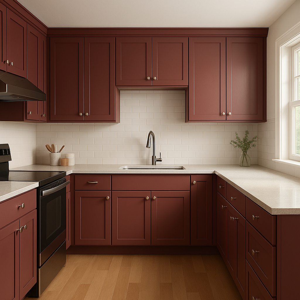
For a unique twist, consider using Cranberry on kitchen or bathroom cabinetry. It adds a pop of color while maintaining a sophisticated feel, especially when paired with marble countertops and brass hardware.
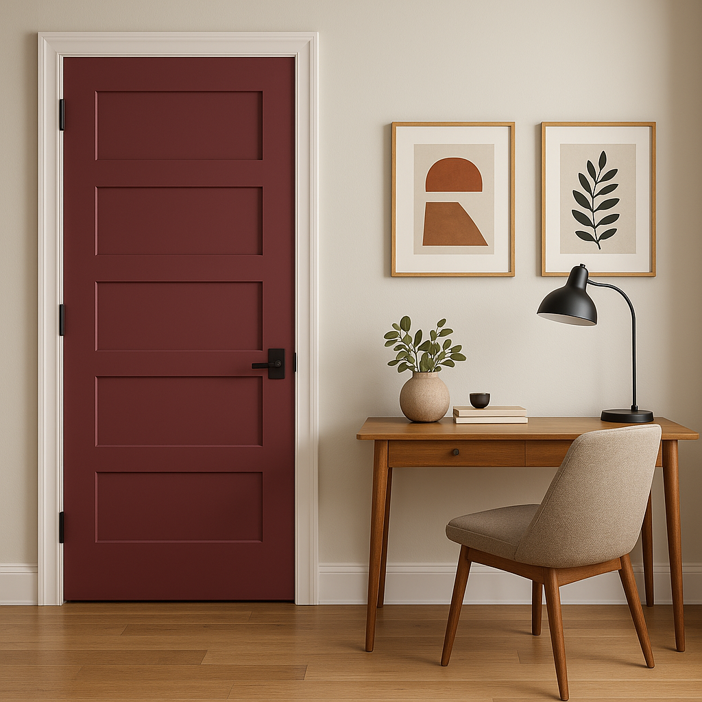
Make a bold first impression by incorporating Cranberry in your entryway. Whether used on walls, doors, or trim, this color sets the tone for a warm, welcoming space.
For those seeking a more unexpected application, Cranberry works beautifully on ceilings or trim. When combined with lighter walls, this creates an eye-catching contrast that brings dimension and interest to the room.
Cranberry's rich tone fosters a sense of focus and refinement, making it the perfect choice for home offices or libraries. Pair with dark wood furniture and leather accents for a timeless, sophisticated look.
Lighting plays a crucial role in how Benjamin Moore Cranberry appears in a space. In natural light, its cooler blue undertones may become more pronounced, giving it a slightly deeper feel. In artificial or warm lighting, the tone softens and reveals its warmer, redder side. Always test a sample in your space to see how it interacts with your specific lighting conditions.
Benjamin Moore Cranberry (2083-20) is more than just a color—it's a statement. Its deep, inviting hue has the power to transform any room into a space that feels dramatic, elegant, and timeless. Whether used as an accent or a primary color, Cranberry brings a sense of warmth and personality that few other shades can match. Paired with the right coordinating colors and lighting, it offers endless possibilities for creating a home that's stylish, unique, and unforgettable.
View Colors Only by Brand (No Imagery):
Sherwin-Williams
|
Benjamin-Moore
|
Behr
|
Valspar
Live on the Eastern Slope of Colorado and looking for a local painting professional, check out all our painting services and reach out for a free estimate.
Copyright © 2026 : Wild Fox Painting Inc. : 12435 Mead Way, Littleton, CO 80125


