Benjamin Moore Pottery (2085-20) is a striking and earthy shade that exudes warmth, confidence, and depth. This deep terracotta-inspired tone is reminiscent of sunbaked clay and the rich, natural pigments found in handcrafted pottery. With its bold presence and versatile appeal, Pottery offers a stunning balance of rustic charm and refined sophistication, making it a standout choice for creating inviting interiors.
Pottery (2085-20) is a dynamic color with complex undertones that enhance its dimensionality. It carries warm red and burnt orange undertones, softened by subtle brown hues, which give it a grounded and organic feel. These earthy undertones create a cozy and welcoming ambiance while adding a sense of depth and richness to any space. The balance of warmth and muted vibrancy makes Pottery a versatile choice for both modern and traditional design styles.
The versatility of Pottery (2085-20) makes it easy to pair with a variety of colors, whether you’re aiming for a complementary palette or a high-contrast look. Here are some coordinating colors to consider:
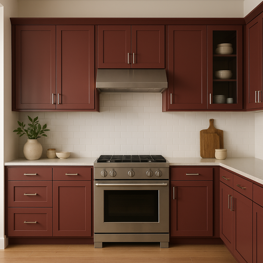
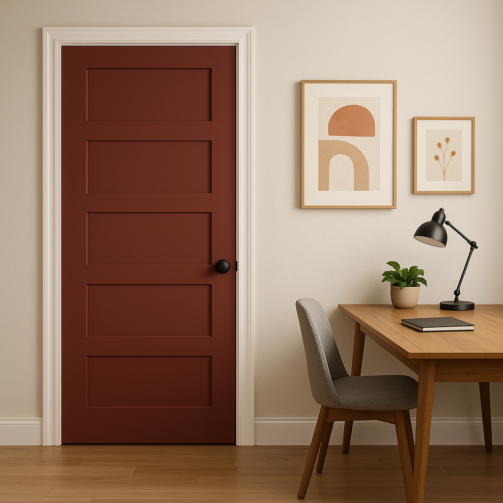
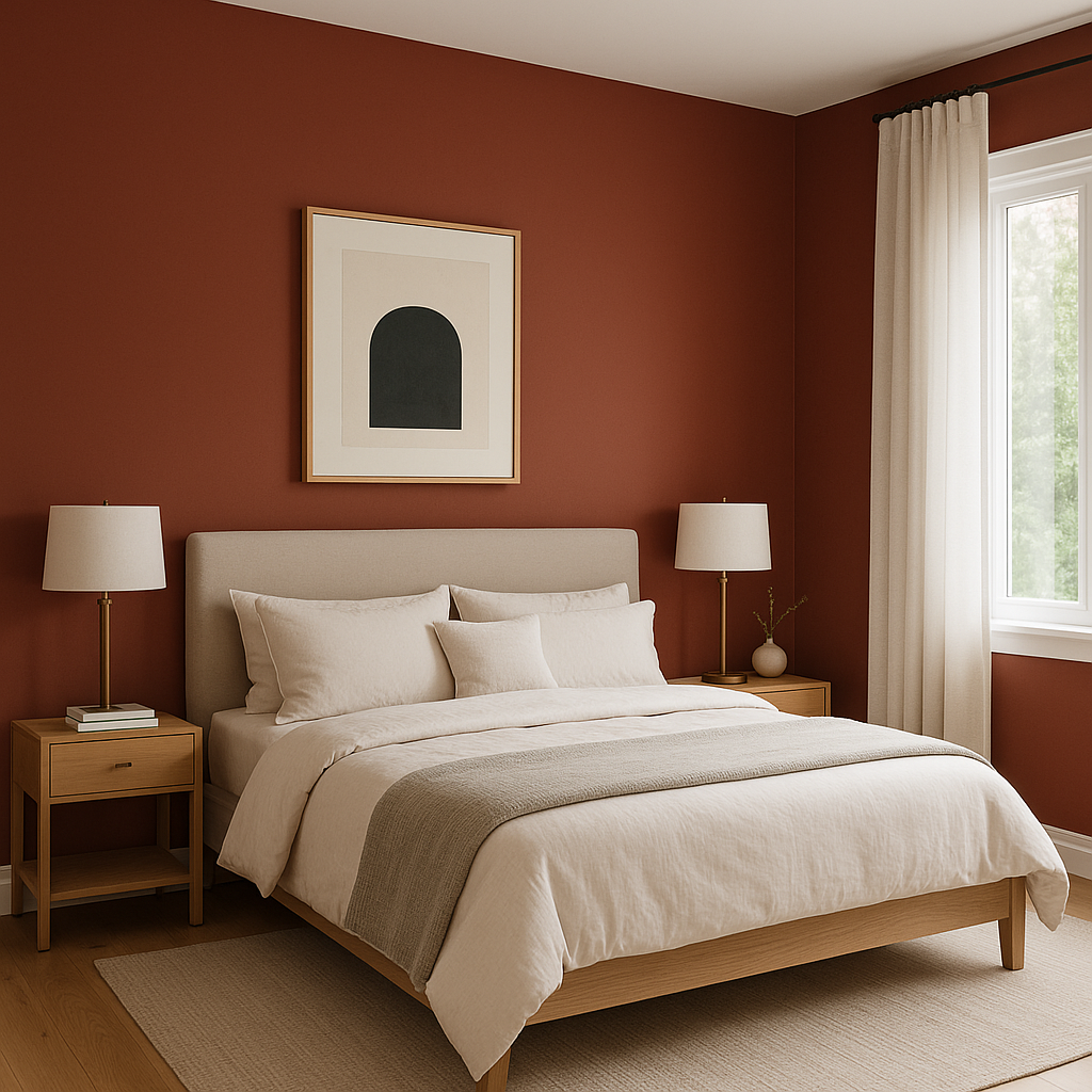
Pottery’s bold and earthy character makes it a versatile choice for a variety of design applications. Here are some of the best ways to incorporate this stunning hue into your home:
As with any bold color, lighting plays a crucial role in how Pottery (2085-20) is perceived. In spaces with ample natural light, the red and orange undertones will appear more vibrant and energizing. In dimmer environments or under artificial lighting, the brown undertones will take center stage, creating a moodier and more subdued effect. Be sure to test this color in your space under different lighting conditions to find the perfect balance for your design.
Pottery (2085-20) is an exceptional choice for those looking to infuse their interiors with warmth, character, and a connection to nature. Its rich undertones and versatile appeal make it an excellent option for creating spaces that feel both grounded and stylish. Whether you use it to make a bold statement or as part of a layered palette, Pottery offers timeless charm and enduring beauty.
View Colors Only by Brand (No Imagery):
Sherwin-Williams
|
Benjamin-Moore
|
Behr
|
Valspar
Live on the Eastern Slope of Colorado and looking for a local painting professional, check out all our painting services and reach out for a free estimate.
Copyright © 2026 : Wild Fox Painting Inc. : 12435 Mead Way, Littleton, CO 80125


