Benjamin Moore Pink 2085-60 is a delicate, rosy shade that exudes warmth, elegance, and subtle sophistication. This pastel pink is light and airy, making it a versatile choice for a variety of interior design styles, from feminine and romantic to modern and playful. Whether you’re looking to create a dreamy bedroom retreat, a cheerful nursery, or an inviting living space, this hue’s gentle, uplifting quality makes it an ideal candidate.
What makes Pink 2085-60 truly unique is its soft undertones. It carries a slight warmth with a hint of peach, which balances its sugary sweetness. These warm undertones prevent it from feeling overly cool or stark, making it a well-rounded pink that feels natural and inviting. The peachy undertones also add a subtle glow, allowing the color to change beautifully based on the lighting in your space.
When paired with natural light, Pink 2085-60 radiates a sunny, cheerful vibe. Under artificial light, its warmth comes forward, creating a cozy and intimate atmosphere.
To create a cohesive and harmonious palette, consider pairing Benjamin Moore Pink 2085-60 with the following:
Neutrals
Neutral tones like White Dove (OC-17) or Chantilly Lace (OC-65) provide a crisp, clean contrast that allows Pink 2085-60 to shine as the focal point. For a warmer neutral, try Edgecomb Gray (HC-173) or Simply White (OC-117).
Soft Blues and Greens
Complementary pastel shades like Palladian Blue (HC-144) or Hollingsworth Green (HC-141) create a serene and balanced look. These gentle colors bring out the subtle peach undertones in Pink 2085-60, enhancing its softness.
Darker Accents
For a bold and dramatic contrast, pair with colors like Hale Navy (HC-154) or Kendall Charcoal (HC-166). These deeper tones ground the space, adding dimension and sophistication.
Metallics
Gold and rose-gold accents beautifully enhance Pink 2085-60’s warmth, while silver tones offer a cooler, contemporary edge.
Pink 2085-60 is an incredibly versatile color that can be incorporated into various parts of your home:
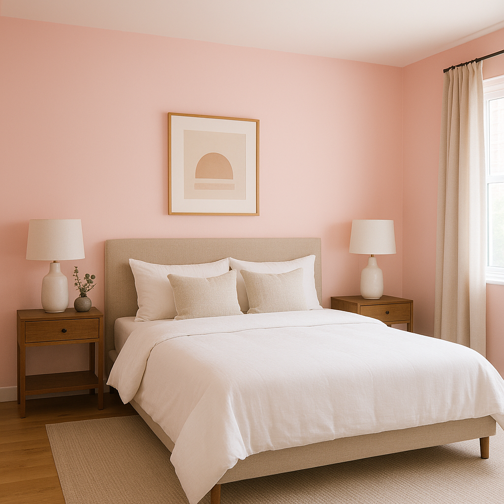
This soft pink is a natural fit for bedrooms, creating a soothing and romantic environment. Pair it with plush textiles like velvet or linen to amplify the cozy factor.
Pink 2085-60 is a popular choice for nurseries due to its calming and cheerful nature. It works well with white furniture and whimsical decor to create a serene space for little ones.
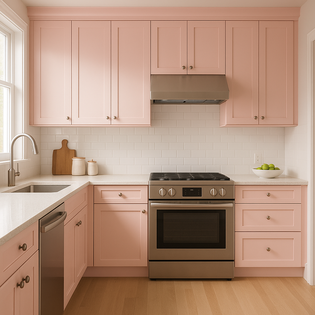
When used in living rooms, Pink 2085-60 adds a playful yet elegant touch. Combine it with mid-century modern furniture or rustic wooden accents for a balanced aesthetic.
Pink 2085-60 can bring a spa-like feel to bathrooms, especially when paired with white tiles and brushed gold fixtures. Its warm undertones prevent it from feeling too cold in smaller spaces.
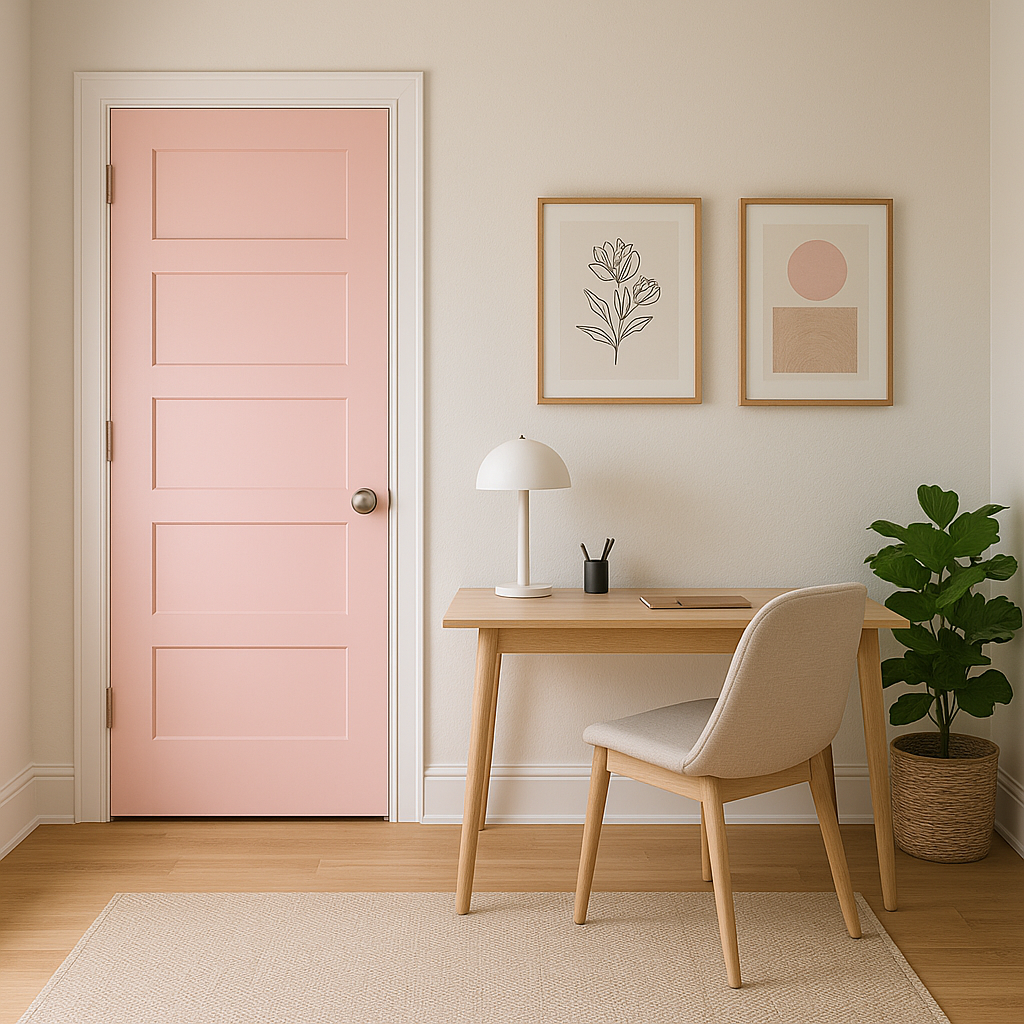
If you’re hesitant to commit to a full room of pink, use it as an accent wall or integrate it through accessories like throw pillows, drapery, or artwork. Pink 2085-60 provides just the right pop of color without overwhelming a space.
View Colors Only by Brand (No Imagery):
Sherwin-Williams
|
Benjamin-Moore
|
Behr
|
Valspar
Live on the Eastern Slope of Colorado and looking for a local painting professional, check out all our painting services and reach out for a free estimate.
Copyright © 2026 : Wild Fox Painting Inc. : 12435 Mead Way, Littleton, CO 80125


