Benjamin Moore Blushing (2086-50) is a delightful shade of pink that exudes charm, sophistication, and subtle romance. This soft, muted hue balances a playful energy with refined elegance, making it an excellent choice for spaces where you want to evoke warmth and comfort without overwhelming the senses. Whether you're designing a cozy bedroom retreat or adding a touch of personality to a living space, Blushing is a versatile color that can transform your interiors into an inviting haven.
Blushing features gentle peachy undertones that give it a warm and welcoming quality. These undertones make the color incredibly versatile, as they soften the pink and prevent it from feeling overly vibrant or juvenile. The slight warmth in the undertones ensures the shade remains sophisticated while adding depth and richness to the overall palette. This delicate balance allows Blushing to complement a wide range of interiors, whether modern, transitional, or classic.
The peachy undertones also make Blushing a natural fit for spaces that benefit from a touch of warmth, as it feels cozy without being heavy. Light conditions can subtly affect the way Blushing appears; in brighter spaces, it may lean toward a fresh, airy pink, while in dimmer settings, its warm undertones become more pronounced.
Blushing pairs beautifully with a variety of complementary and contrasting hues, allowing you to create a cohesive and curated design. Here are some ideas for coordinating colors:
Neutrals: To keep the look soft and understated, pair Blushing with warm neutrals like Benjamin Moore’s White Dove (OC-17) or Swiss Coffee (OC-45). These creamy whites enhance the warmth of Blushing without overpowering its subtle charm.
Greys: Cool greys like Silver Chain (1472) or Stonington Gray (HC-170) provide a modern contrast, creating a balanced and sophisticated palette. This pairing works particularly well in contemporary spaces.
Earthy Tones: For a grounded and organic look, consider muted greens like Saybrook Sage (HC-114) or soft taupes like Revere Pewter (HC-172). These earthy shades bring out the warmth in Blushing for a harmonious and serene atmosphere.
Accent Colors: To add vibrancy, incorporate rich jewel tones like navy blues (Van Deusen Blue HC-156) or deep emerald greens (Forest Green 2047-10). These dramatic colors create visual interest and depth when paired with the softness of Blushing.
Blushing’s versatility makes it suitable for a variety of spaces and design styles. Its soothing yet uplifting qualities ensure it can shine in both main living areas and personal retreats. Below are some creative ways to use this shade:
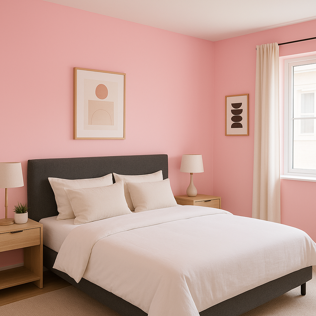
Bedrooms: Blushing is a perfect choice for bedrooms, especially for those seeking a cozy, romantic sanctuary. Pair it with soft textiles such as linen or velvet in neutral tones to create a restful and inviting space.
Living Rooms: Add personality to a living room by using Blushing as an accent wall or incorporating it through decor elements like cushions, throws, or artwork. Pair it with neutral furniture and metallic accents for a polished and sophisticated look.
Nurseries or Kids’ Rooms: The soft pink hue of Blushing is ideal for nurseries or children’s rooms. Its gentle warmth creates a nurturing and playful environment without feeling overly saccharine.
Bathrooms: Blushing can bring a spa-like tranquility to bathrooms. Pair it with white tiles, brushed nickel fixtures, and natural wood elements for a fresh and serene design.
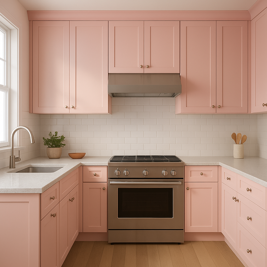
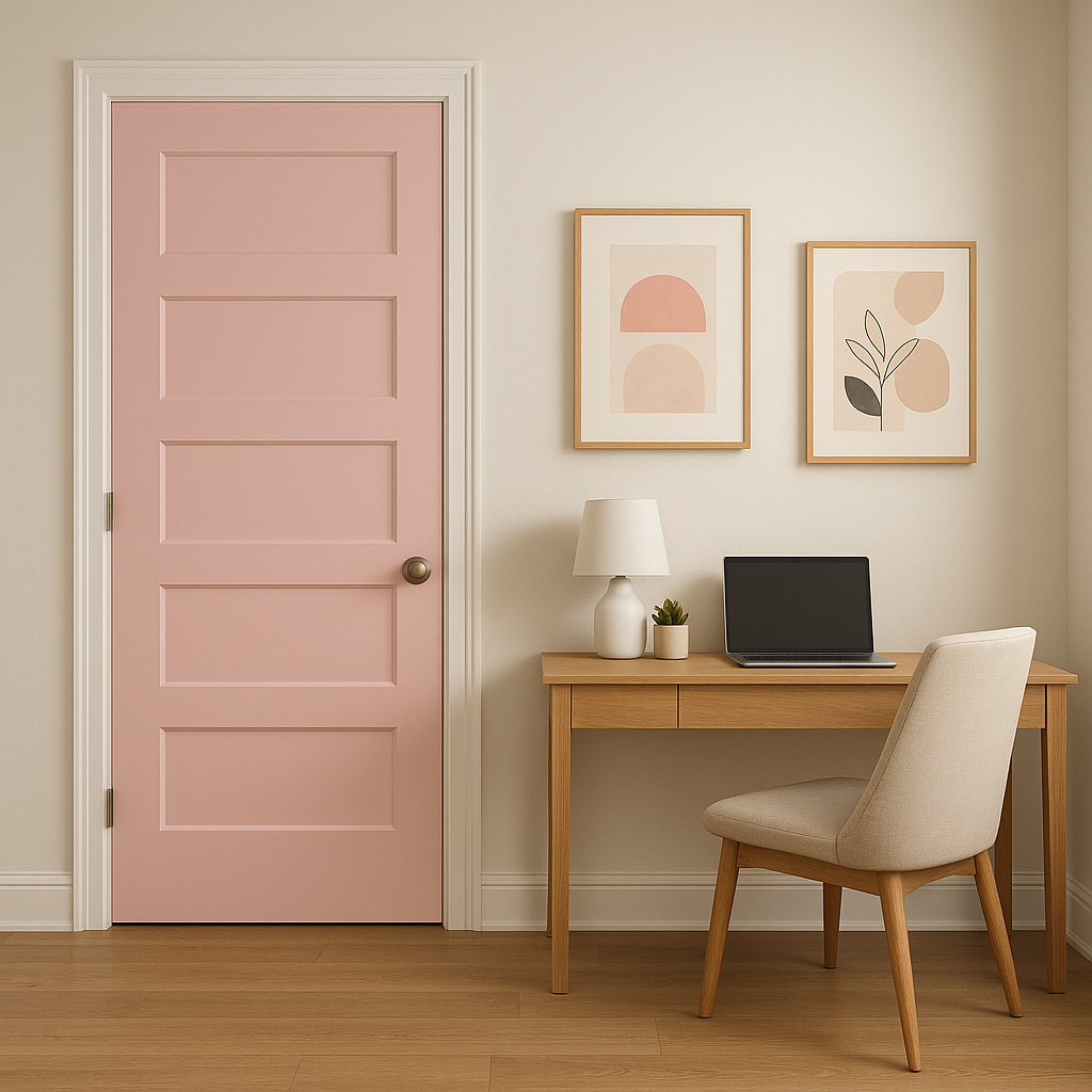
Home Offices: Create an inspiring and uplifting workspace by introducing Blushing to your home office. Pair it with warm neutrals and wooden furniture for a balanced, productive environment.
As with any paint color, lighting plays a crucial role in how Benjamin Moore Blushing appears in your space. It thrives in rooms with ample natural light, where its peachy undertones radiate warmth and vibrancy. In spaces with artificial lighting or cooler tones, Blushing may appear more muted but still retains its cozy, inviting essence. Testing the color in your room under various lighting conditions can help you determine how it will interact with your existing design elements.
Blushing (2086-50) is the perfect balance between playfulness and sophistication. Its versatility allows it to serve as a primary wall color, an accent, or even as part of a layered palette. Whether you’re designing a peaceful retreat or adding a touch of personality to your home, Blushing is a timeless choice that brings warmth, elegance, and charm to any space.
View Colors Only by Brand (No Imagery):
Sherwin-Williams
|
Benjamin-Moore
|
Behr
|
Valspar
Live on the Eastern Slope of Colorado and looking for a local painting professional, check out all our painting services and reach out for a free estimate.
Copyright © 2026 : Wild Fox Painting Inc. : 12435 Mead Way, Littleton, CO 80125


