Benjamin Moore Watermelon (2087-20) is a vibrant and energetic shade of pink-red that instantly elevates any space with its cheerful personality. This bold hue is reminiscent of the juicy, ripe flesh of summer watermelon, making it an excellent choice for rooms that aim to exude warmth, liveliness, and creativity. Perfect for accent walls, furniture pieces, or even entire rooms, Watermelon is a statement-making color that brings a sense of playful vibrancy to interiors.
Watermelon features strong red undertones balanced by hints of deep pink, which give the color its striking appearance. These undertones make it a rich and saturated hue that leans toward the warmer side of the spectrum. It’s not overly muted or subdued, so it provides a fresh burst of energy wherever it’s used. However, the pink undertones soften the intensity of the red, creating a shade that is bold yet approachable.
Depending on the lighting conditions, Watermelon may appear more red or pink. In natural light, the pink undertones tend to shine through, while under artificial warm-toned lighting, the red notes become more prominent. This dynamic interplay of undertones ensures the color remains visually engaging from dawn to dusk.
Pairing Benjamin Moore Watermelon with complementary colors can help enhance its boldness while creating a harmonious palette. Here are some suggestions for coordinating colors:
Watermelon is undeniably a daring choice, but its versatility allows it to shine in a variety of interior design applications. Here are some creative ways to incorporate this color into your space:
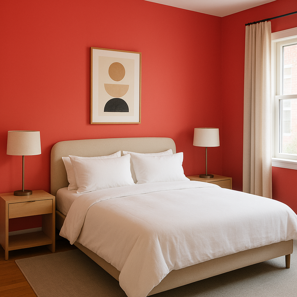
Watermelon makes an excellent accent wall color, especially in spaces like living rooms, dining areas, or children’s bedrooms. Pair it with neutral walls to keep the overall design balanced while allowing the accent wall to steal the spotlight.
For those who love bold colors but prefer smaller doses, Watermelon can be used on furniture pieces such as cabinets, dressers, or even upholstered chairs. It also works beautifully for decor elements like throw pillows, lampshades, or art frames.
This vibrant hue is perfect for spaces that thrive on energy and creativity, such as kids’ rooms or playrooms. Watermelon’s playful personality can inspire imagination and bring joy to these areas.
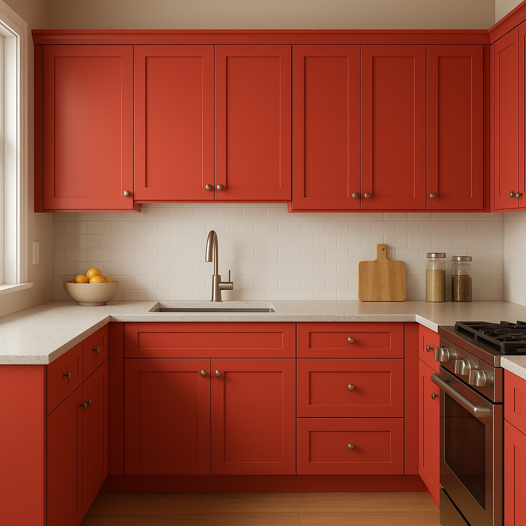
Bring a touch of retro charm or modern whimsy to your kitchen or dining room with Watermelon on cabinetry or as a backsplash color. Pair it with gleaming whites or soft grays for an inviting and fun atmosphere.
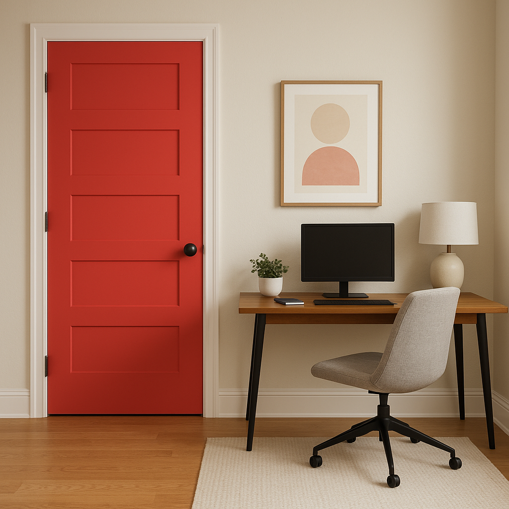
Make a statement with Watermelon on your front door for an unforgettable curb appeal. It’s a great way to showcase your love for bold, cheerful design.
Benjamin Moore Watermelon (2087-20) is a color that refuses to go unnoticed. Whether you use it as a centerpiece or a supporting hue, this bold and playful shade is sure to bring energy, creativity, and a touch of summer-inspired joy to your home.
View Colors Only by Brand (No Imagery):
Sherwin-Williams
|
Benjamin-Moore
|
Behr
|
Valspar
Live on the Eastern Slope of Colorado and looking for a local painting professional, check out all our painting services and reach out for a free estimate.
Copyright © 2026 : Wild Fox Painting Inc. : 12435 Mead Way, Littleton, CO 80125


