Benjamin Moore Italiano (2087-30) is a rich and sophisticated shade of burgundy that exudes warmth, depth, and elegance. Perfect for creating dramatic interiors, this striking color is ideal for spaces where you want to make a statement or evoke a sense of cozy refinement. With its timeless appeal, Italiano is well-suited for both contemporary and traditional designs, offering versatility and character.
Italiano is a deep burgundy that carries distinct undertones of red and brown. These subtle earthy hues add complexity to the color, preventing it from feeling overly bright or saturated. The warm red tones make it inviting and luxurious, while the brown undertones provide a grounded, classic feel. This combination ensures Italiano can seamlessly adapt to various design styles, from moody and dramatic to refined and sophisticated.
When pairing Benjamin Moore Italiano with other colors, consider options that balance its boldness while enhancing its warmth. Here are some coordinating colors to create harmonious palettes:
Italiano is a bold color that shines in spaces where drama and personality are desired. Below are some creative ways to incorporate this stunning shade into your interior design:
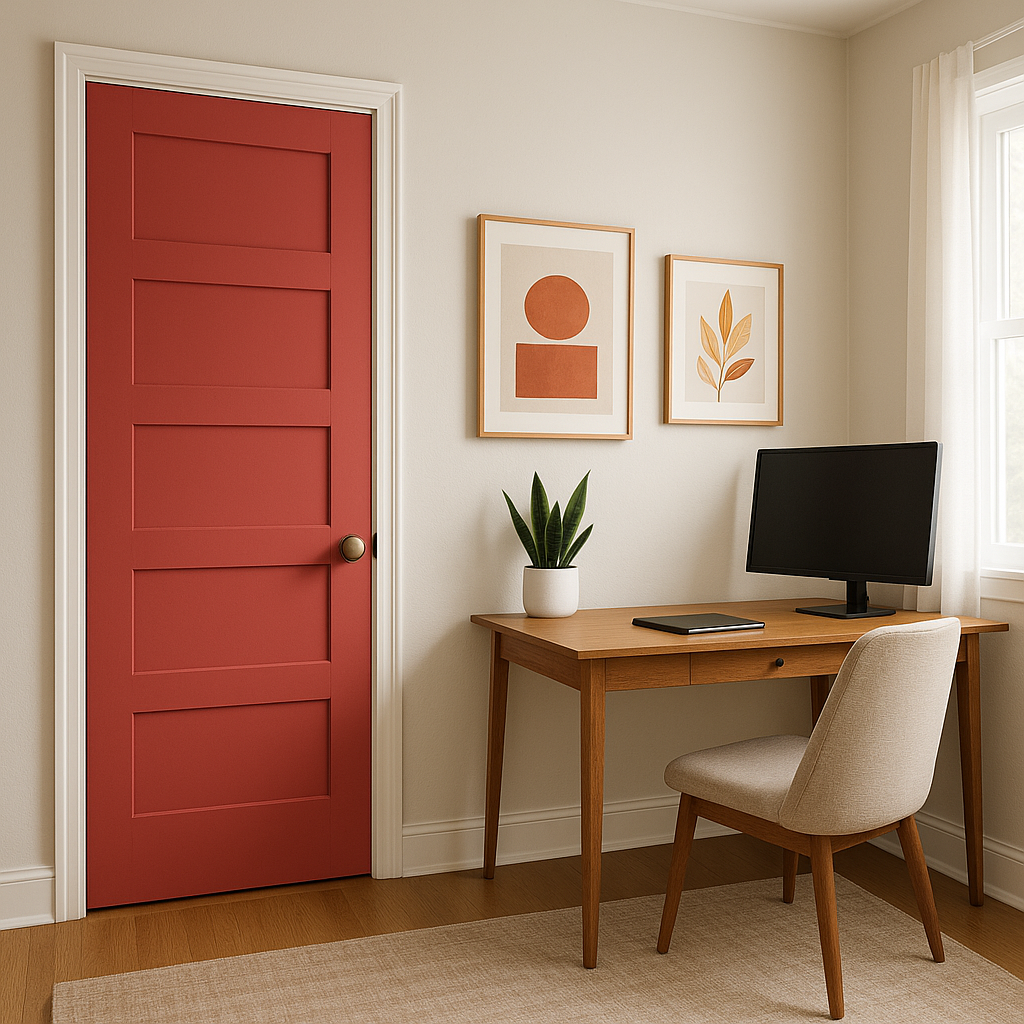
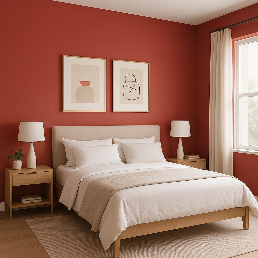
Italiano works beautifully as an accent wall in living rooms, dining areas, or bedrooms. Its rich tone draws attention and adds depth to the space, especially when paired with lighter surrounding walls or neutral furnishings.
Create an intimate, luxurious dining experience by painting the walls in Italiano. Its warm and inviting qualities make it an excellent choice for spaces designed for gathering and entertaining.
The deep, moody nature of Italiano lends itself well to home offices or libraries, where it can encourage focus and create a cozy yet elegant environment. Pair it with dark wood furniture for a classic, stately look.
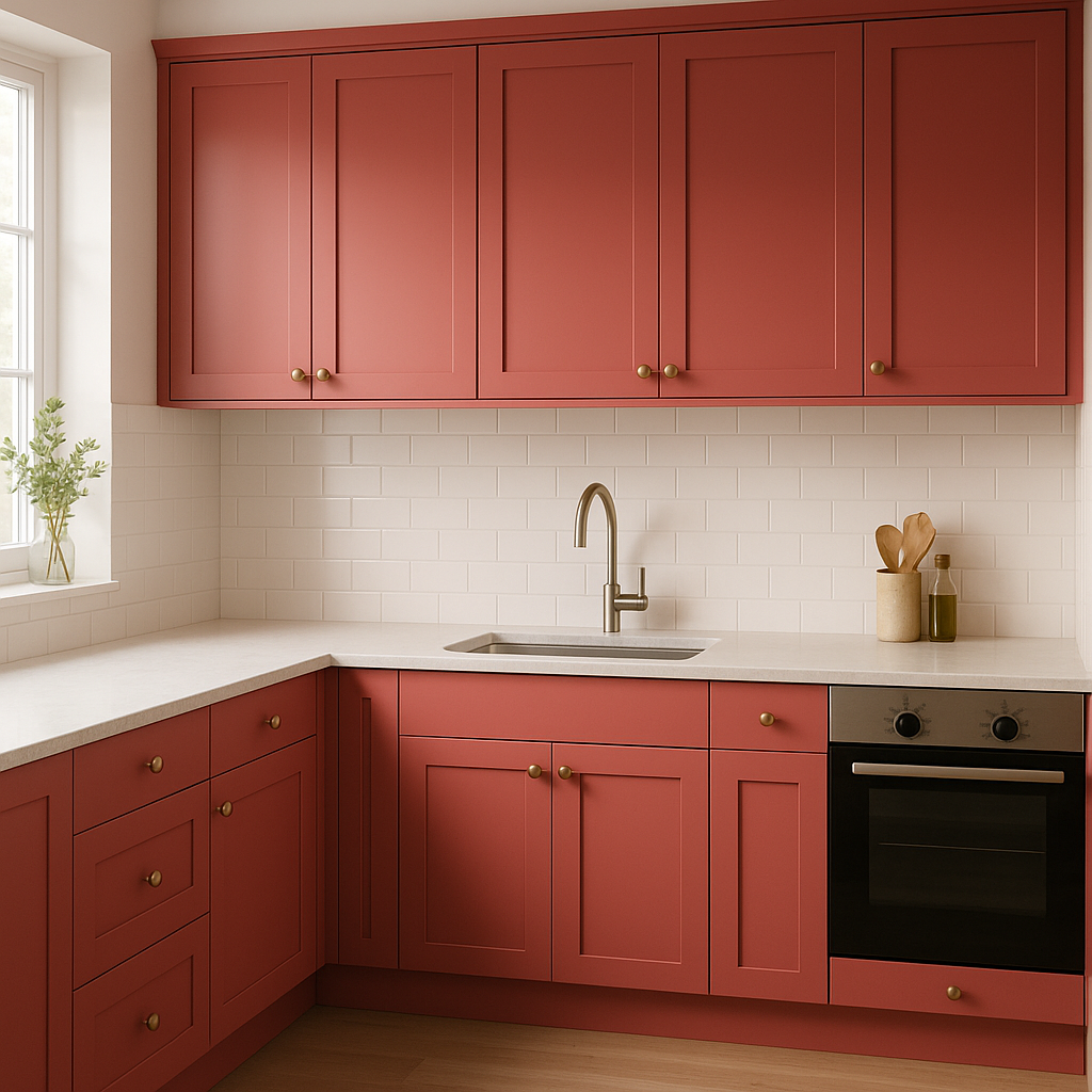
This bold shade can be used for painted furniture pieces, such as a vintage dresser or kitchen island, to bring character and vitality to the room. It’s also an excellent choice for cabinetry in spaces where you want a touch of drama.
Make a memorable first impression by using Italiano in your entryway. Pair it with brass hardware and an oversized mirror for a chic, welcoming vibe.
The appearance of Benjamin Moore Italiano can vary depending on the lighting. In spaces with ample natural light, Italiano showcases its vibrant burgundy tones, while in dimly lit areas, the brown undertones come forward, creating a more subdued and cozy atmosphere. To achieve the desired look, test the color in different lighting conditions before committing to it.
Italiano is an excellent choice for spaces where you want to evoke warmth, intimacy, and sophistication. Its dramatic presence makes it ideal for creating moody, cocoon-like environments, while its earthy undertones prevent it from feeling overpowering. Whether used to accentuate architectural features or as a bold focal point, this color brings undeniable character to any room.
By incorporating Benjamin Moore Italiano (2087-30) into your design, you’ll achieve a space that feels luxurious, inviting, and timeless. With its versatility and depth, this burgundy hue is a perfect choice for those seeking to elevate their interiors with a bold yet elegant touch.
View Colors Only by Brand (No Imagery):
Sherwin-Williams
|
Benjamin-Moore
|
Behr
|
Valspar
Live on the Eastern Slope of Colorado and looking for a local painting professional, check out all our painting services and reach out for a free estimate.
Copyright © 2026 : Wild Fox Painting Inc. : 12435 Mead Way, Littleton, CO 80125


