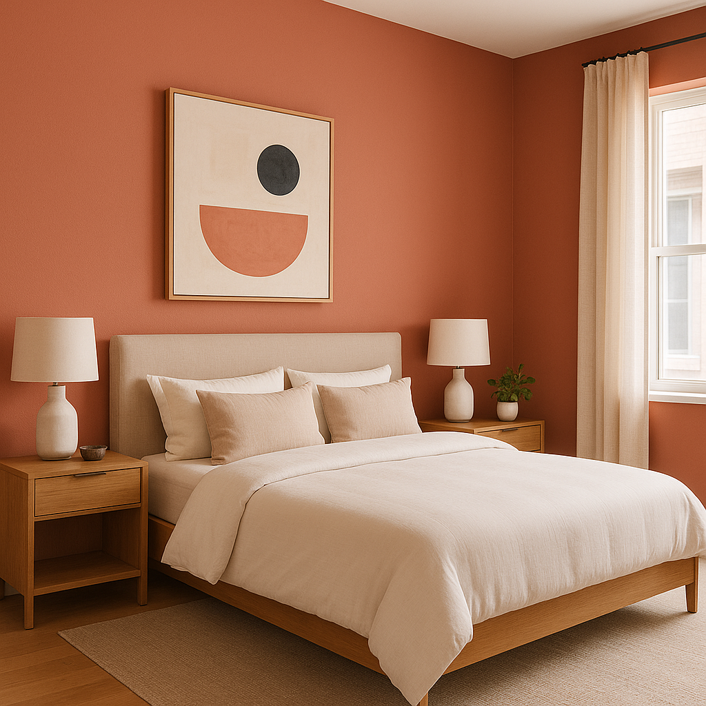
Benjamin Moore Persimmon 2088-40 is a vibrant, fiery hue that strikes the perfect balance between red and orange, making it a bold choice for those who want to infuse their space with energy, warmth, and personality. This striking shade commands attention while maintaining an approachable, inviting character. Whether used as an accent or a main wall color, Persimmon 2088-40 adds a sense of passion and sophistication to any design.
Persimmon 2088-40 features a harmonious blend of red and orange undertones with a subtle earthy base, which gives it a slightly muted quality compared to brighter, more neon-like oranges. The red undertones create a sense of warmth and depth, while the orange contributes vibrancy and cheerfulness. This balance ensures that Persimmon feels rich and luxurious rather than overpowering or brash.
The earthy undertones in this color make it a versatile choice, as they ground the bright hues and help the shade pair seamlessly with various design styles, from rustic to contemporary.
Benjamin Moore Persimmon 2088-40 pairs beautifully with a variety of colors, offering endless opportunities for creativity in your interiors. Here are some ideas to inspire harmonious combinations:
The versatile nature of Benjamin Moore Persimmon 2088-40 makes it suitable for a variety of applications, whether you’re looking to make a bold statement or add a touch of warmth to a space. Here are some popular ways to incorporate this stunning shade into your home or office:
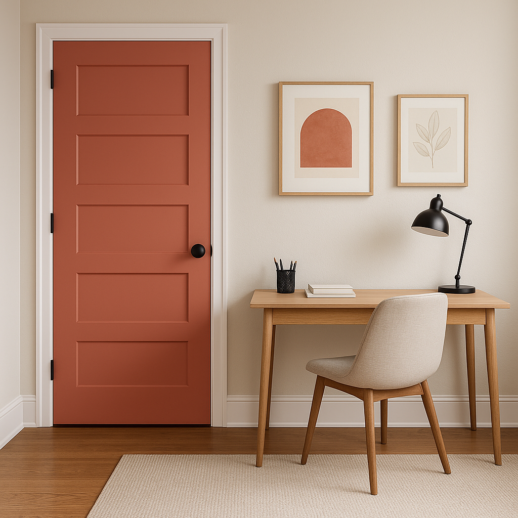
Persimmon is an exceptional choice for an accent wall, especially in living rooms, dining rooms, or entryways. Its boldness draws the eye, creating a focal point that energizes the space without overwhelming it.
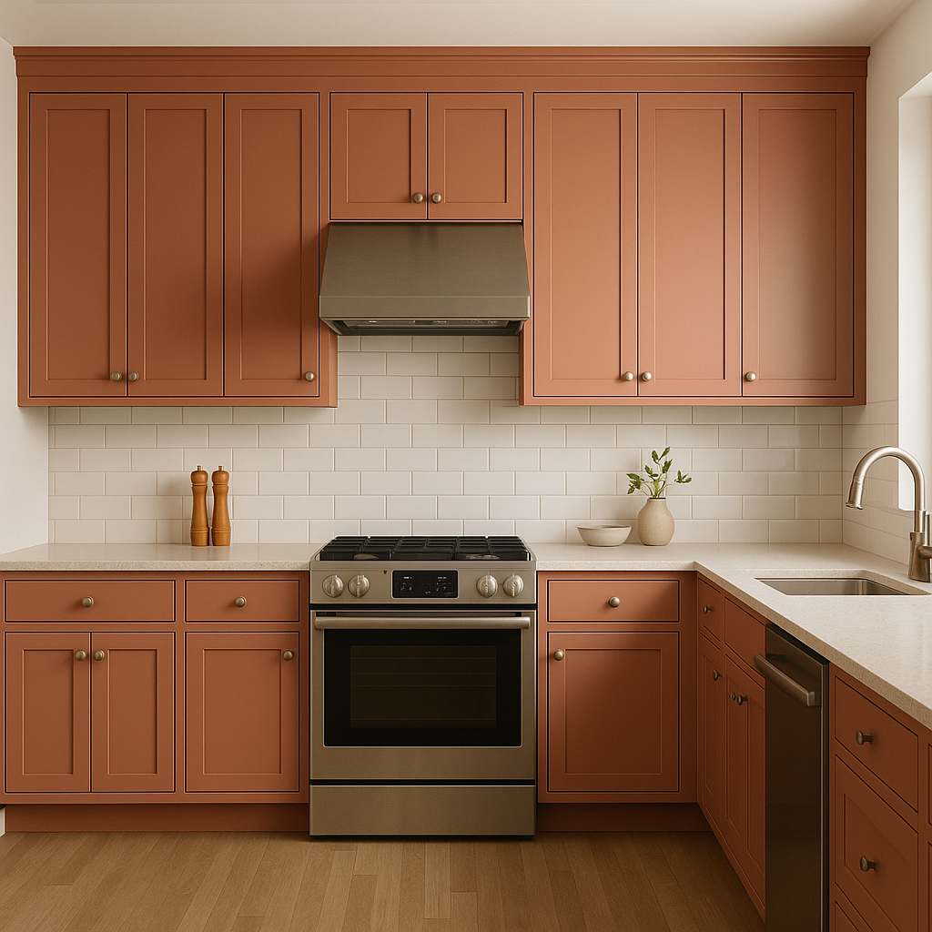
This warm, vibrant hue works wonderfully in kitchens and dining areas, where it encourages conversation and adds a sense of coziness. Pair it with natural wood tones and soft neutrals for a balanced look.
For a more subtle application, consider using Persimmon on cabinetry, furniture, or built-ins. It adds a pop of personality to these elements while maintaining a cohesive design.
View Colors Only by Brand (No Imagery):
Sherwin-Williams
|
Benjamin-Moore
|
Behr
|
Valspar
Live on the Eastern Slope of Colorado and looking for a local painting professional, check out all our painting services and reach out for a free estimate.
Copyright © 2026 : Wild Fox Painting Inc. : 12435 Mead Way, Littleton, CO 80125


