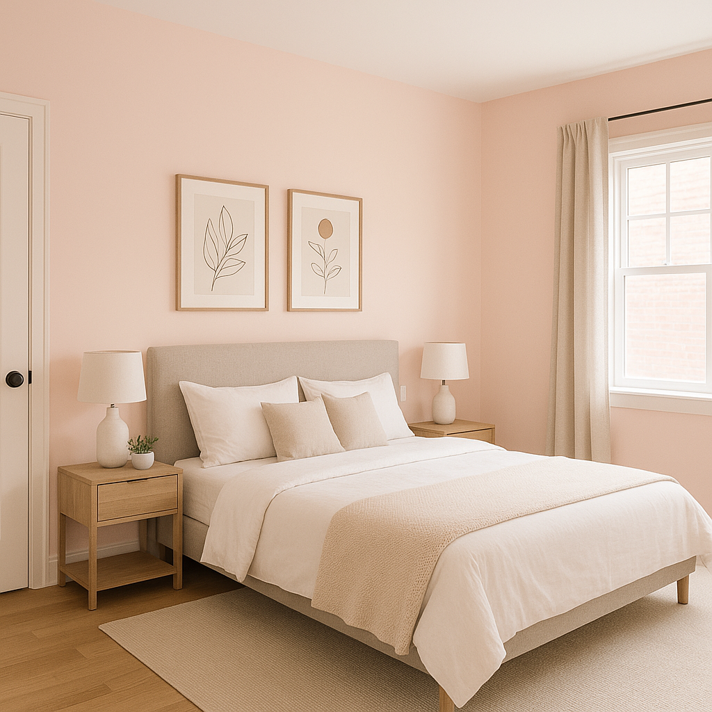
Benjamin Moore Fond (2088-70) is a delicate and enchanting shade that exudes sophistication and warmth. This captivating light pink color has a gentle presence, making it ideal for creating serene and inviting spaces. Its soft pastel quality feels timeless yet contemporary, offering versatility in a variety of interior design styles. Whether you’re looking to craft a cozy bedroom oasis or add a subtle touch of femininity to a modern living room, Fond is a shade that delivers understated charm with ease.
Fond carries subtle warm undertones, leaning slightly peachy rather than purely pink. These undertones prevent it from feeling overly saccharine or childish and instead give it a refined, grown-up aesthetic. The warmth in its undertones makes Fond especially complementary to environments that feature natural light, where the hue can softly glow and shift throughout the day. In spaces with cooler artificial lighting, Fond retains its gentle warmth, adding a cozy and inviting feel.
Selecting coordinating colors for Fond is key to enhancing its beauty and versatility. Its pastel softness pairs beautifully with neutral tones and deeper shades for balance. Here are a few Benjamin Moore color suggestions to complement Fond:
You can also experiment with muted greens, such as October Mist (1495), or earthy browns, like Kendall Charcoal (HC-166), for a grounding effect.
Benjamin Moore Fond is a versatile shade that works beautifully in a variety of spaces and applications. Its soft and romantic nature makes it particularly suited for creating tranquil environments. Here are some ways to incorporate Fond into your interior design:
Fond is a perfect choice for bedrooms, where its gentle warmth fosters relaxation and intimacy. Pair it with crisp white bedding and natural wood accents to create a serene retreat. If you prefer a bolder look, introduce darker coordinating colors like Hale Navy for contrast in furniture or décor.
Fond’s soft pastel quality makes it ideal for nurseries or children’s rooms. Its warm undertones provide a nurturing and cozy atmosphere without feeling overly traditional. Pair it with white trim and playful accents in muted greens or yellows for a joyful yet calming space.
Create a spa-like atmosphere in your bathroom with Fond. Its subtle peachy-pink hue complements marble finishes and brushed gold hardware beautifully, delivering a luxurious yet approachable aesthetic.
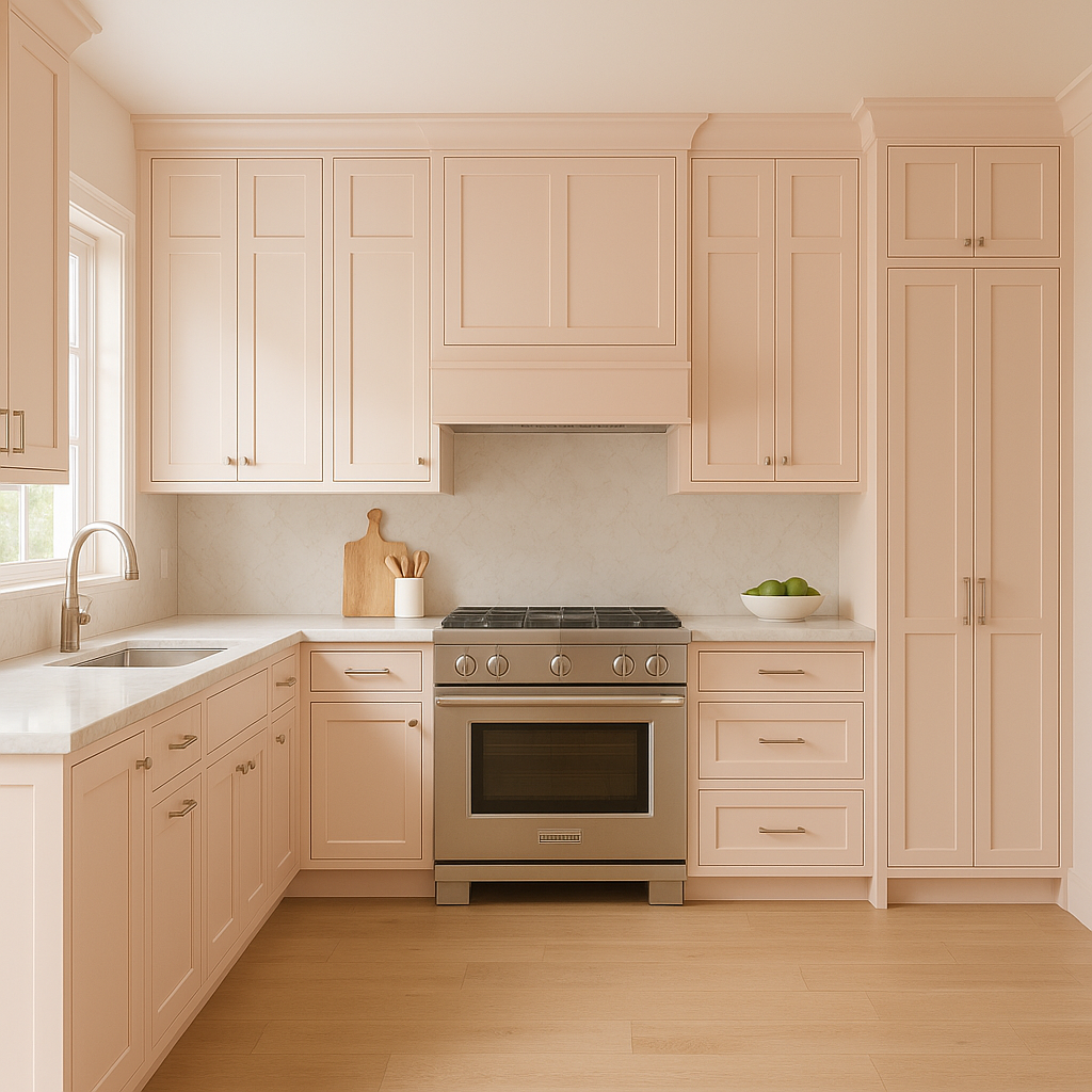
For living spaces, Fond can serve as either the main wall color or an accent wall. It pairs wonderfully with neutral furniture pieces, such as gray sofas or beige armchairs, and can be elevated with metallic décor in gold or brass finishes. Add texture through woven rugs or velvet throw pillows for a layered, inviting look.
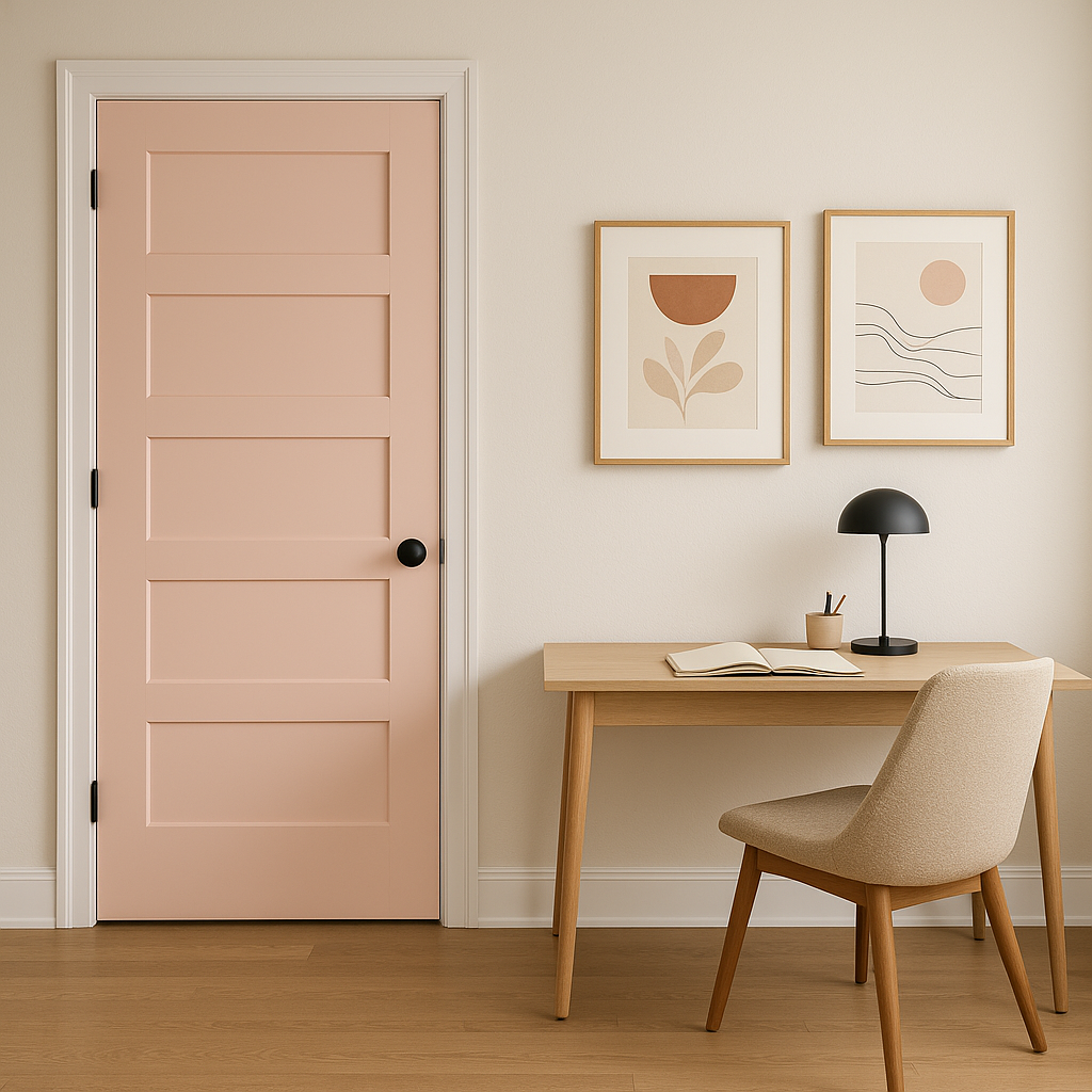
Fond works well in smaller spaces like powder rooms, reading nooks, or hallway alcoves. Its delicate tone can brighten these areas and make them feel more intimate and welcoming.
Benjamin Moore Fond (2088-70) is a graceful and versatile shade that can transform any space into a tranquil haven. Whether used as an accent or the primary color, its gentle warmth and timeless appeal make it a favorite for interior designers looking to balance softness and sophistication.
View Colors Only by Brand (No Imagery):
Sherwin-Williams
|
Benjamin-Moore
|
Behr
|
Valspar
Live on the Eastern Slope of Colorado and looking for a local painting professional, check out all our painting services and reach out for a free estimate.
Copyright © 2026 : Wild Fox Painting Inc. : 12435 Mead Way, Littleton, CO 80125


