Benjamin Moore Iron (2089-10) is a bold, enigmatic shade that commands attention and exudes sophistication. This deep, dark color is part of Benjamin Moore's Classic Color Collection, and it is celebrated for its rich and dramatic presence. Perfect for creating moody atmospheres or adding depth to a space, Iron is a versatile hue that works beautifully across various design styles, from industrial chic to modern elegance.
Iron is a blackened, charcoal-like shade with subtle brown undertones. These warm undertones soften its depth and add complexity, preventing the color from feeling flat or harsh. The brown undertones lend a rich, earthy quality, making Iron a more approachable and versatile dark shade compared to true blacks or cooler charcoals. This warmth allows it to pair effortlessly with other warm neutrals and natural materials like wood or leather.
Benjamin Moore Iron is a strong, statement-making color that pairs beautifully with complementary tones to create a harmonious palette. Consider these coordinating colors to enhance its beauty:
Iron pairs exceptionally well with metallic accents like brushed gold, antique brass, or matte black hardware. These finishes enhance its luxurious feel and add texture and shine to the space.
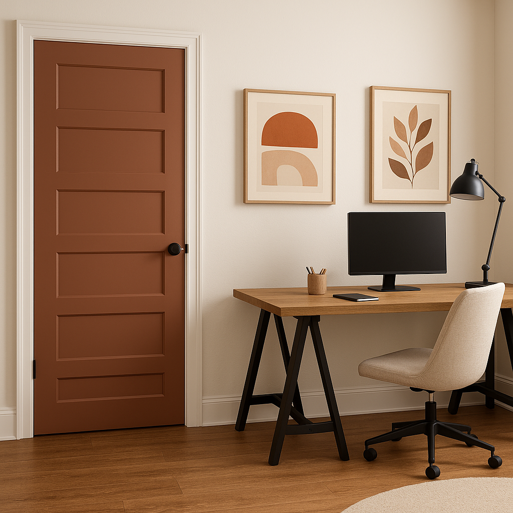
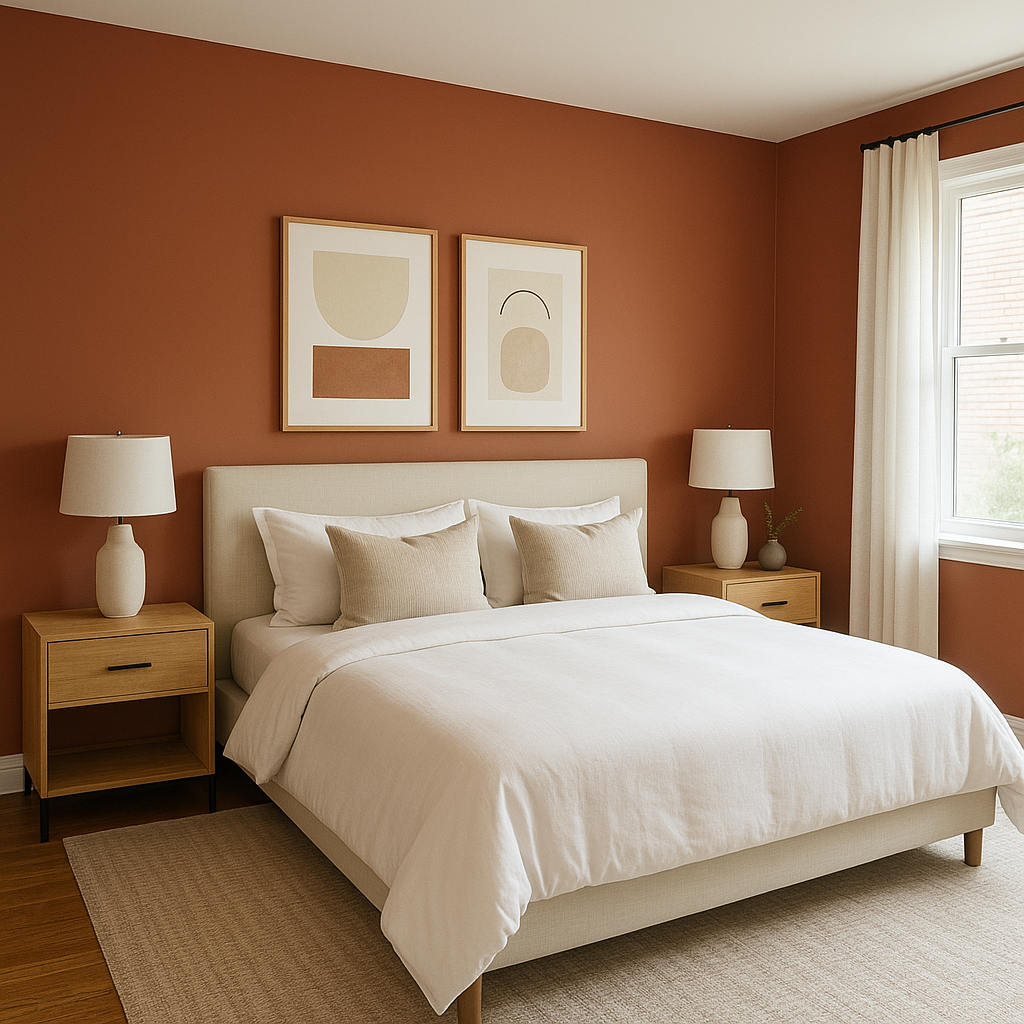
Iron is the perfect choice for creating a feature wall in spaces like living rooms, bedrooms, or entryways. Its bold nature draws the eye and adds instant drama, making it ideal for highlighting architectural details or decorative elements.
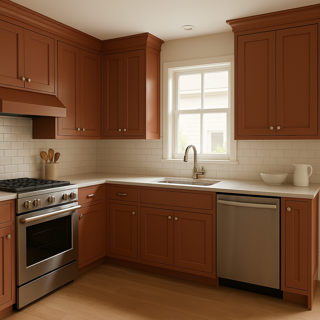
This deep shade works beautifully on kitchen cabinetry, built-ins, or bathroom vanities. Pair Iron cabinetry with warm wood tones, marble countertops, or gold hardware for a modern and elegant look.
Iron’s grounded warmth makes it an excellent choice for dining rooms, home libraries, or studies. It creates a moody, intimate atmosphere that fosters focus and relaxation.
Iron isn’t just limited to interiors—it works beautifully as an exterior color. Use it for front doors, shutters, or siding to make a striking, contemporary statement. Pair with crisp whites like Chantilly Lace (OC-65) for trim to create a balanced, high-contrast look.
Lighting Considerations: Iron’s depth and richness can vary depending on the light in your space. In rooms with ample natural light, Iron takes on a softer, inviting quality, while in dimly lit spaces, it intensifies for a dramatic effect. Be sure to test it in different lighting conditions to understand its true character.
Texture and Contrast: To avoid overwhelming the space, incorporate textures like natural wood, woven fabrics, or metallic accents. These elements create visual interest and balance the boldness of Iron.
Layering Colors: If using Iron for walls or cabinetry, layer lighter colors in furniture, rugs, and accessories to keep the space feeling dynamic and balanced.
Benjamin Moore Iron (2089-10) is a stunning choice for those seeking drama, sophistication, and timeless appeal. Whether you’re designing a cozy retreat or making a bold statement, this color delivers unmatched depth and versatility, elevating any space it graces.
View Colors Only by Brand (No Imagery):
Sherwin-Williams
|
Benjamin-Moore
|
Behr
|
Valspar
Live on the Eastern Slope of Colorado and looking for a local painting professional, check out all our painting services and reach out for a free estimate.
Copyright © 2026 : Wild Fox Painting Inc. : 12435 Mead Way, Littleton, CO 80125


