Benjamin Moore Tomato (2089-40) is a rich and vibrant red paint color that commands attention with its dynamic presence. Inspired by the warm, sun-ripened hue of freshly picked tomatoes, this shade injects a sense of energy, passion, and sophistication into any space. Whether you’re looking to create a dramatic focal point or add a splash of warmth to your interiors, Tomato is a versatile choice that exudes confidence and creativity.
Benjamin Moore Tomato leans toward the warmer side of the red spectrum, with subtle orange undertones that give it an inviting, approachable quality. Unlike cooler reds with blue undertones, Tomato feels earthy and grounded, making it an excellent choice for spaces where warmth and vibrancy are desired. The orange undertones also soften the intensity of the red, ensuring the color remains bold without overwhelming the room.
This shade has a luminous, saturated quality that works well in both natural and artificial lighting, though it truly shines in spaces with ample light. Depending on the lighting conditions, Tomato may appear slightly brighter or deeper, adding depth and character to your walls.
Pairing Benjamin Moore Tomato with the right coordinating colors can transform your space into a harmonious masterpiece. Here are some suggestions for complementary hues:
Neutral Pairings:
For a balanced and elegant look, pair Tomato with soft neutrals like White Dove (OC-17) or Classic Gray (1548). These shades provide contrast and allow Tomato to stand out while maintaining a clean, modern aesthetic.
Earthy Complements:
Enhance the warmth of Tomato by pairing it with earthy tones such as Kendall Charcoal (HC-166) or Kingsport Gray (HC-86). These muted colors anchor the vibrancy of Tomato, creating a cozy and sophisticated ambiance.
Bold Accents:
For a high-energy palette, consider pairing Tomato with equally bold shades like Golden Honey (297) or Citrus Orange (2017-20). These combinations can be ideal for eclectic or bohemian interiors that embrace vivid, adventurous color schemes.
Cool Contrasts:
To balance the warmth of Tomato, introduce cooler tones like Gentle Gray (1626) or Blue Danube (2062-30). These shades create a striking contrast that fosters a dynamic yet balanced aesthetic.
Tomato’s bold personality makes it a versatile choice for various applications. Here are some ideas to incorporate this color into your home:
Accent Walls:
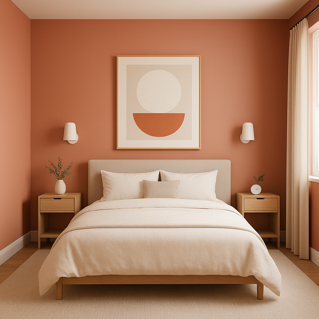
Tomato is perfect for an accent wall in living rooms, dining areas, or bedrooms. Its striking hue can instantly draw the eye and create a focal point in the space. Pair it with neutral walls to keep the overall design balanced.
Dining Rooms:
Red tones are known to stimulate conversation and appetite, making Tomato an excellent choice for dining rooms. Its warmth fosters a welcoming environment for family gatherings or dinner parties.
Kitchens:
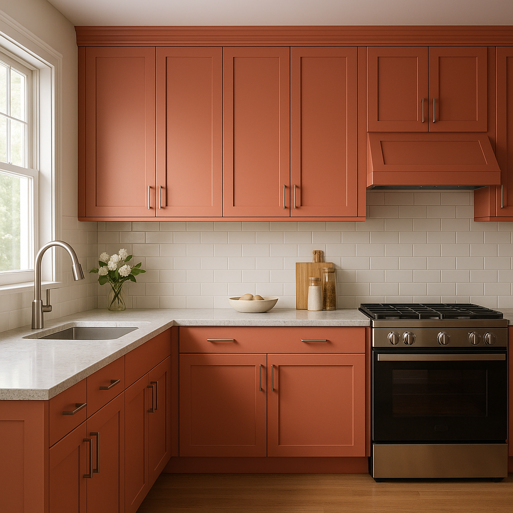
Incorporate Tomato into your kitchen cabinetry or backsplash for a cheerful, energizing vibe. This color pairs beautifully with white countertops and stainless steel appliances.
Front Doors:
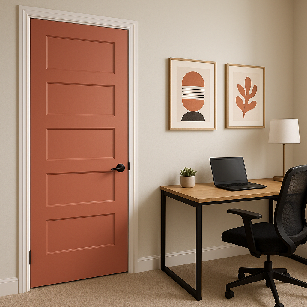
Make a bold statement with a Tomato-painted front door. This eye-catching red will boost curb appeal and create a warm, inviting entryway for guests.
Creative Spaces:
Tomato’s energizing qualities make it ideal for spaces like home offices, art studios, or playrooms, where creativity and enthusiasm are essential.
Benjamin Moore Tomato (2089-40) is a powerful choice for those who want to infuse their home with warmth, energy, and style. Whether used sparingly as an accent or boldly across an entire room, this color is sure to leave a lasting impression.
View Colors Only by Brand (No Imagery):
Sherwin-Williams
|
Benjamin-Moore
|
Behr
|
Valspar
Live on the Eastern Slope of Colorado and looking for a local painting professional, check out all our painting services and reach out for a free estimate.
Copyright © 2026 : Wild Fox Painting Inc. : 12435 Mead Way, Littleton, CO 80125


