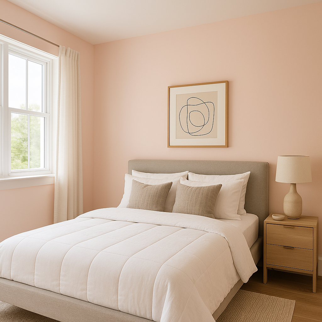
Benjamin Moore Spring (2090-70) is a charming and uplifting pastel pink that radiates joy and warmth. Its delicate, rosy hue is perfect for creating inviting spaces that feel both fresh and timeless. This soft, light pink carries a gentle vibrancy that evokes the blooming beauty of springtime flowers, making it an ideal choice for those seeking a touch of playfulness in their interiors.
Spring (2090-70) features warm undertones that lean slightly peachy, giving it a sophisticated and nuanced character. These undertones prevent the color from feeling overly saccharine or juvenile, making it suitable for a wide range of design styles, from modern to traditional. Its subtle warmth ensures that spaces painted in Spring feel cozy and welcoming rather than stark or overly bright.
When paired with natural or artificial lighting, the peachy undertones of Spring can shift slightly, creating a dynamic effect that adds depth to your walls. In brighter light, the pink appears fresh and vibrant, while in dimmer settings, it takes on a softer, muted quality.
Spring (2090-70) pairs beautifully with a variety of complementary shades, allowing you to design harmonious palettes for any space.
Spring (2090-70) is versatile and can be used in a variety of spaces to achieve different moods. Here are some ideas for incorporating this delightful pink into your home or office:
The soft and soothing qualities of Spring make it an excellent choice for bedrooms. Paint an accent wall behind the bed to create a focal point, or use it throughout the room to foster a calming and feminine oasis. Pair it with plush bedding in white or pale gray to maintain a serene atmosphere.
Spring is a natural fit for nurseries and children’s rooms, thanks to its playful yet timeless appeal. Combine it with pastel greens or blues for a gender-neutral look, or go bold with bright yellows and oranges for a more vibrant space.
Add a touch of elegance to your powder room by painting the walls in Spring. Pair it with gold or brass fixtures and a marble countertop for a sophisticated look that feels fresh and modern.
This color can work beautifully in living rooms or sunrooms, especially when paired with neutral furniture and natural textures like rattan, linen, or wood. Spring brings a subtle energy to communal spaces without overwhelming them, making it a great choice for homeowners who love soft pops of color.
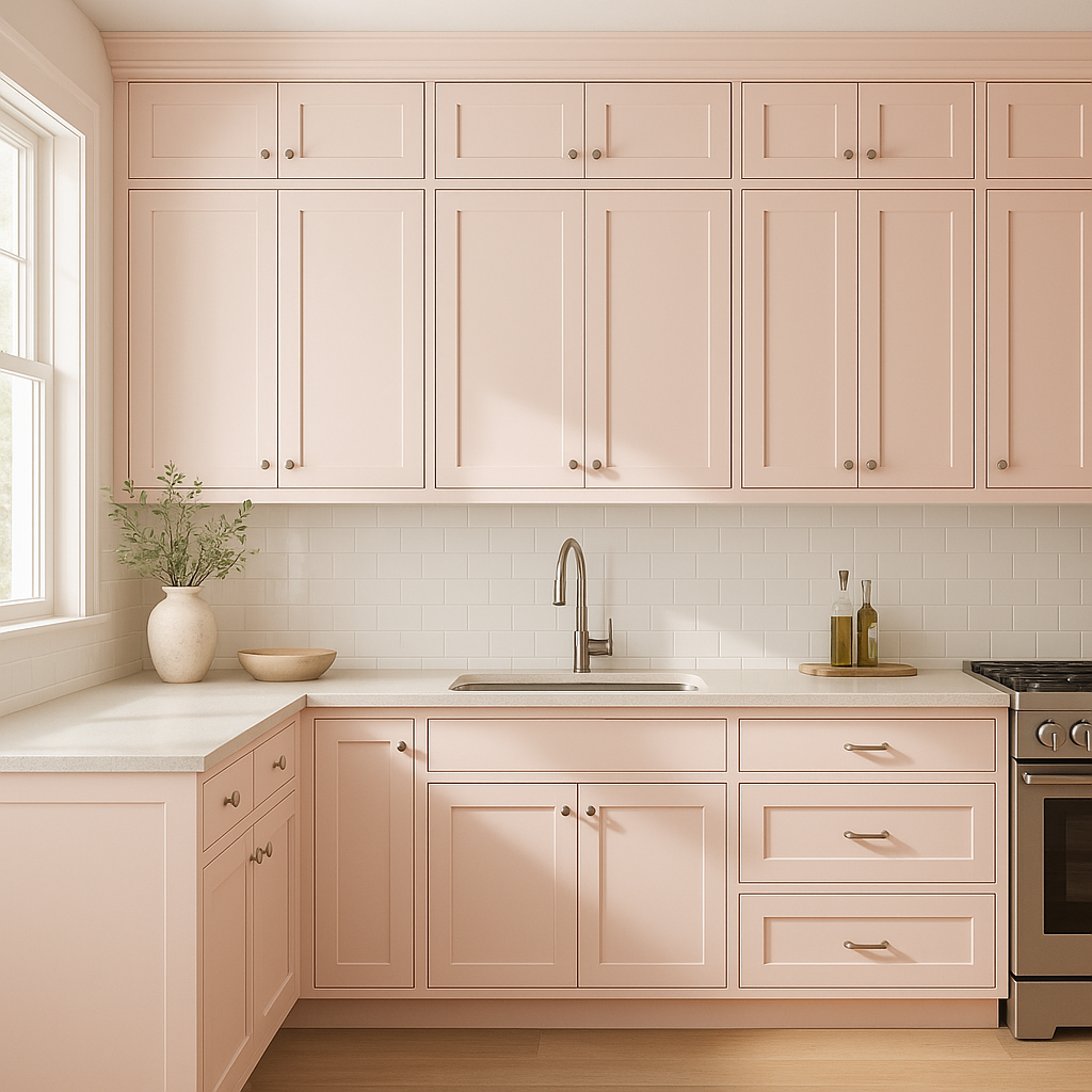
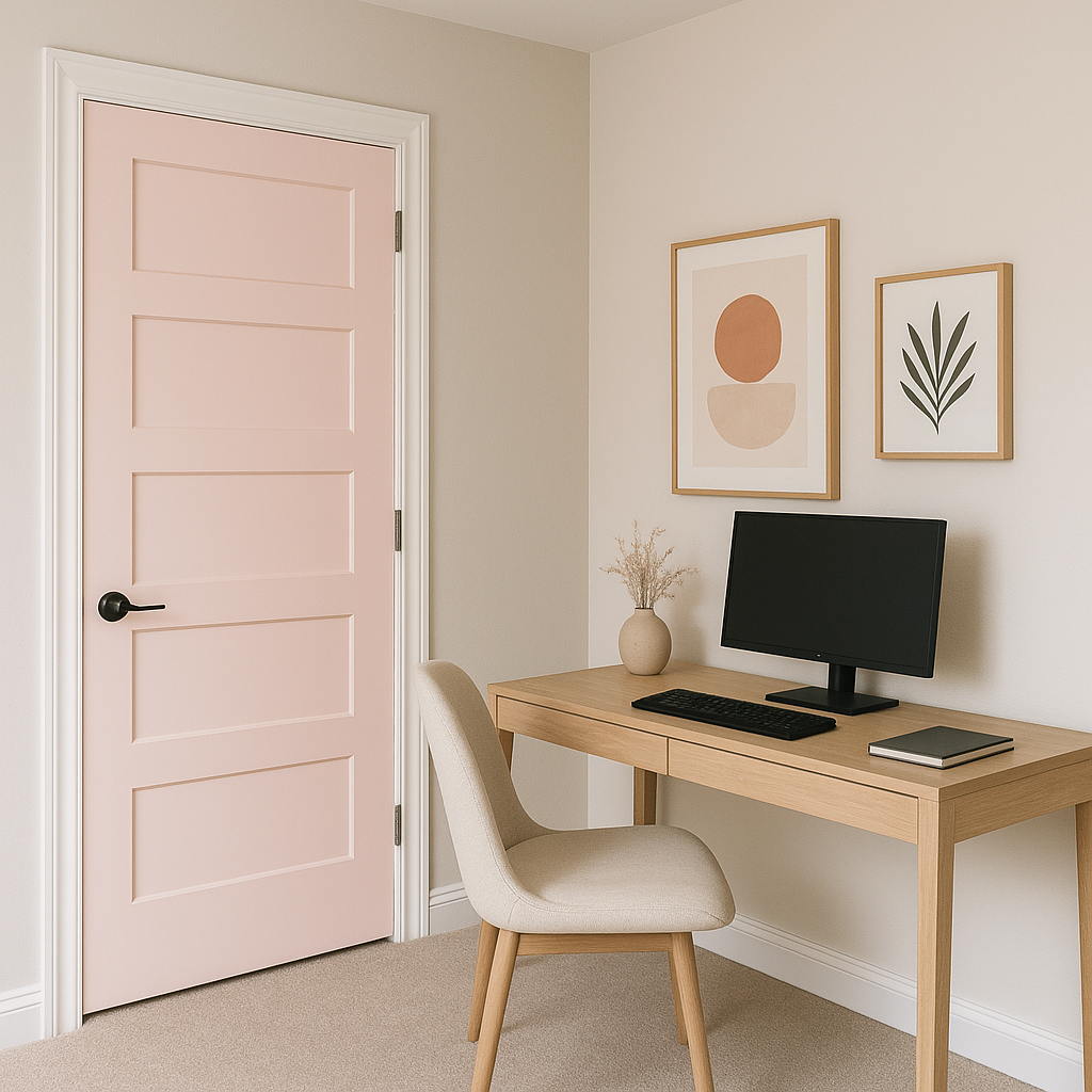
If you’re not ready to commit to pink walls, Spring can be used on accent pieces like furniture, cabinets, or decor. A painted bookshelf or console table in Spring can brighten up a room and add personality without dominating the space.
When choosing Benjamin Moore Spring, consider the lighting in your space. In rooms with ample natural light, Spring will appear brighter and more vivid, emphasizing its cheerful qualities. In rooms with less light, it will take on a softer, more subdued tone that feels intimate and cozy.
Benjamin Moore Spring (2090-70) is a delightful color that brings the essence of blooming flowers and warm sunshine into your home. Whether used as a wall color, an accent, or a complementary hue in your palette, its fresh and cheerful energy makes it a versatile choice for designers and homeowners alike.
View Colors Only by Brand (No Imagery):
Sherwin-Williams
|
Benjamin-Moore
|
Behr
|
Valspar
Live on the Eastern Slope of Colorado and looking for a local painting professional, check out all our painting services and reach out for a free estimate.
Copyright © 2026 : Wild Fox Painting Inc. : 12435 Mead Way, Littleton, CO 80125


