Benjamin Moore April (2091-70) is a delicate and inviting shade that strikes the perfect balance between warmth and luminosity. This soft, pale pink carries a gentle feminine touch that feels timeless and versatile, making it an ideal choice for spaces where you want to evoke tranquility, charm, and subtle sophistication.
April (2091-70) is a light pink with a whisper of peach undertones, which adds a gentle warmth to its overall appearance. These undertones prevent the shade from feeling overly sweet or saccharine, giving it a refined quality that pairs well with a variety of design styles. The peachy undertone also ensures that this color works beautifully in both natural and artificial lighting conditions, where it can shift in tone from soft blush to a creamy, warm pink.
Benjamin Moore April is incredibly versatile when it comes to pairing it with complementary shades. Below are some ideas for coordinating colors that enhance its beauty:
April (2091-70) is a versatile shade that works well in various settings, from intimate spaces to larger, open areas. Here are some ideas for using this color in your home or commercial interior design:
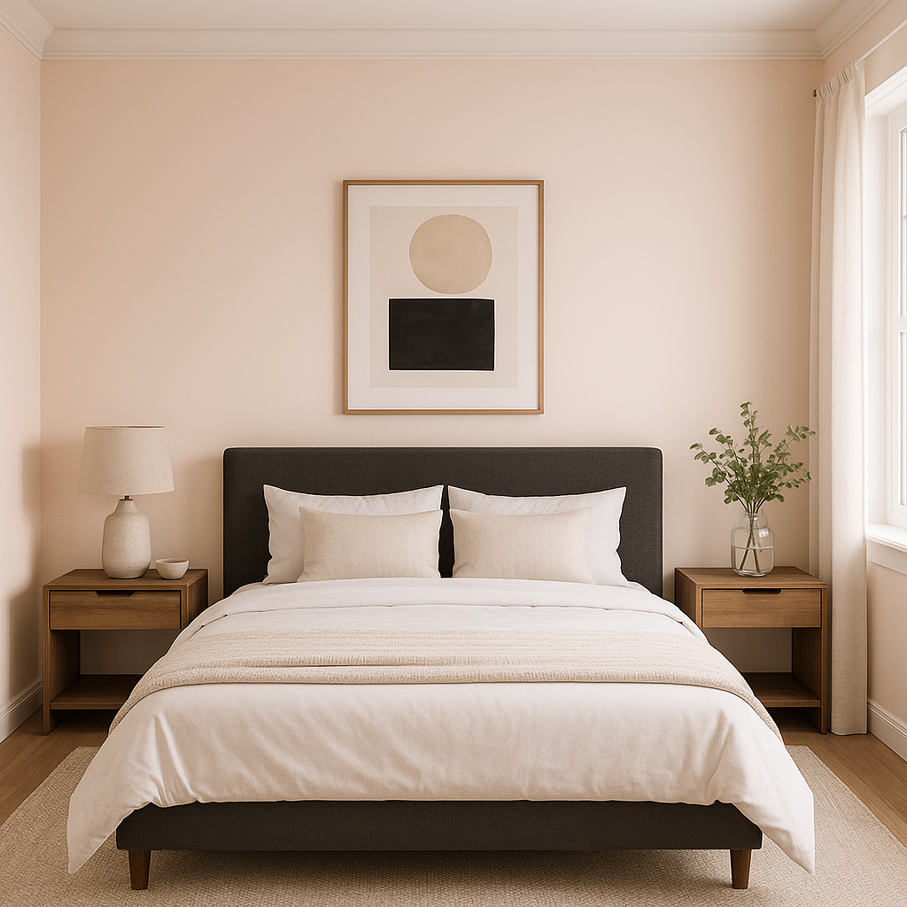
The gentle and soothing qualities of April make it a fantastic choice for bedrooms. Its soft pink tones create a calming ambiance, perfect for relaxation. Pair it with white linens, muted beige accents, and natural wood furniture for a serene retreat.
April’s delicate hue is an excellent option for nurseries, offering a gender-neutral alternative to traditional baby blues or bright pinks. Add playful accessories in soft greens or yellows for a cheerful yet tranquil environment.
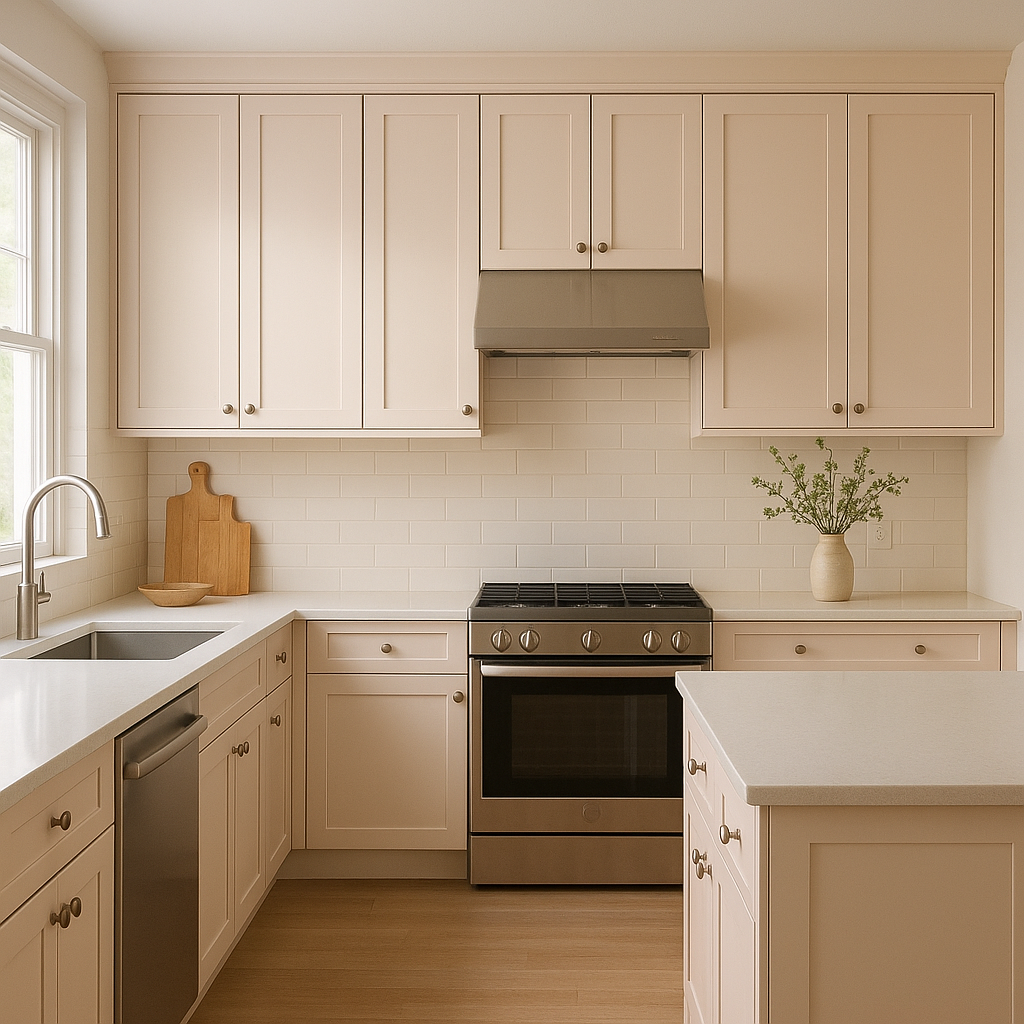
In living rooms, April can be used to add a subtle pop of color without overwhelming the space. Pair it with mid-tone grays, earthy greens, or creamy whites for a warm and inviting gathering area. Consider using it on an accent wall or alongside textured fabrics and natural materials like linen and jute.
For a spa-like feel, April is a lovely choice for bathroom walls. Combine it with crisp white tiles, brushed nickel fixtures, and soft gray towels for a clean and elegant look. It’s also a great option for powder rooms, where its understated charm can shine.
April can bring a touch of romance and elegance to dining areas. Pair it with dark wood furniture and metallic accents, like gold or brass, for a sophisticated yet welcoming setting.
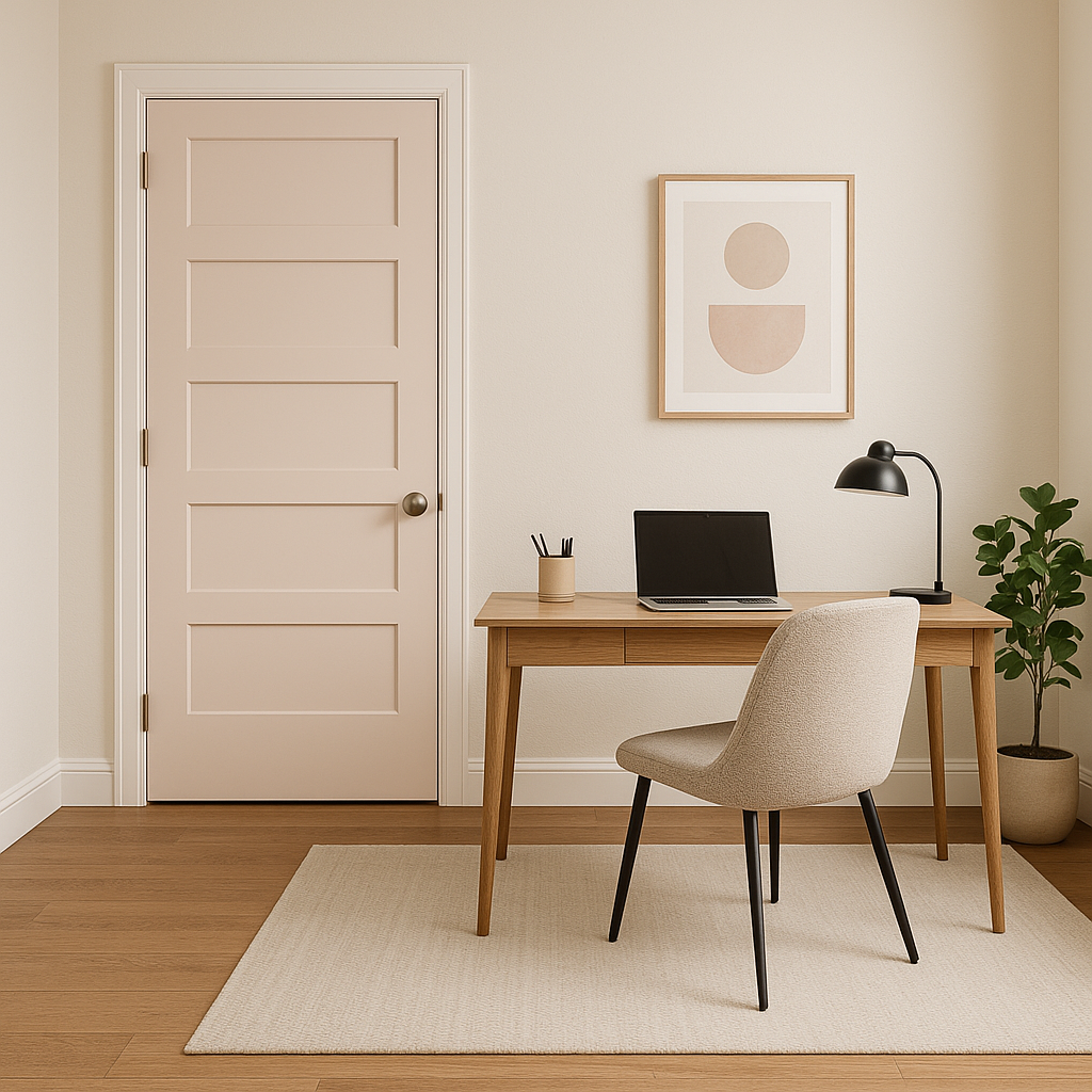
Transform entryways or hallways into inviting spaces with April’s warm and cheerful presence. Add coordinating artwork or mirrors framed in white or gold to create visual interest in these transitional areas.
April’s soft and approachable tone makes it a great choice for boutique shops, salons, or cafes. It sets a welcoming mood that enhances customer experiences while subtly elevating the aesthetic of the space.
Benjamin Moore April (2091-70) is more than just a light pink—it’s a versatile color that adapts beautifully to different styles, lighting conditions, and moods. Whether you’re designing a cozy retreat, a playful nursery, or a sophisticated dining space, this hue offers endless possibilities. With its peachy undertones and ability to pair effortlessly with a wide range of colors, April is a timeless choice for any interior design project.
View Colors Only by Brand (No Imagery):
Sherwin-Williams
|
Benjamin-Moore
|
Behr
|
Valspar
Live on the Eastern Slope of Colorado and looking for a local painting professional, check out all our painting services and reach out for a free estimate.
Copyright © 2026 : Wild Fox Painting Inc. : 12435 Mead Way, Littleton, CO 80125


