Benjamin Moore Copper (2094-20) is a rich, earthy shade that evokes the warmth and timeless appeal of burnished metal. This deep reddish-orange hue radiates character and sophistication, making it a perfect choice for those who want to create a welcoming yet dramatic ambiance in their interiors. Its bold and saturated tone is ideal for adding depth and personality to a space, whether through an accent wall, cabinetry, or an entire room.
The beauty of Benjamin Moore Copper lies in its complexity. This shade features prominent red and orange undertones, giving it a fiery warmth reminiscent of autumn leaves or molten metals. The underlying earthy quality grounds the color, preventing it from feeling overly bright or garish. Instead, it exudes a sense of refinement and maturity, making it a versatile choice for both contemporary and traditional interiors.
The warm undertones in Copper also make it an emotionally engaging color. It has a cozy and comforting effect, making it particularly suited for living rooms, dining areas, or any space where you want to encourage connection and conversation.
Benjamin Moore Copper pairs beautifully with a variety of hues, allowing you to craft a cohesive and balanced palette. Here are a few suggestions to consider:
Neutral Pairings: To let Copper shine, pair it with soft, warm neutrals like Benjamin Moore White Dove (OC-17) or Classic Gray (OC-23). These subtle shades create contrast without competing for attention, allowing Copper to be the star of the show.
Earthy Tones: Complement its natural warmth with other earthy shades like Benjamin Moore Spanish Brown (HC-64) or Tate Olive (HC-112). These organic tones blend seamlessly with Copper, creating a harmonious, grounded look.
Cool Contrasts: For a more dynamic and modern aesthetic, consider pairing Copper with cooler tones like Benjamin Moore Hale Navy (HC-154) or Kendall Charcoal (HC-166). The contrast between warm and cool hues adds visual interest and sophistication.
Metallic Accents: Add a touch of opulence by incorporating metallic finishes—think brushed gold, antique brass, or even copper itself. These accents enhance the luxurious quality of the color and tie the palette together.
Copper is a highly versatile color that can be used in a variety of ways, depending on the mood and style you want to achieve in your space. Here are some creative and practical ways to integrate this stunning hue into your home:
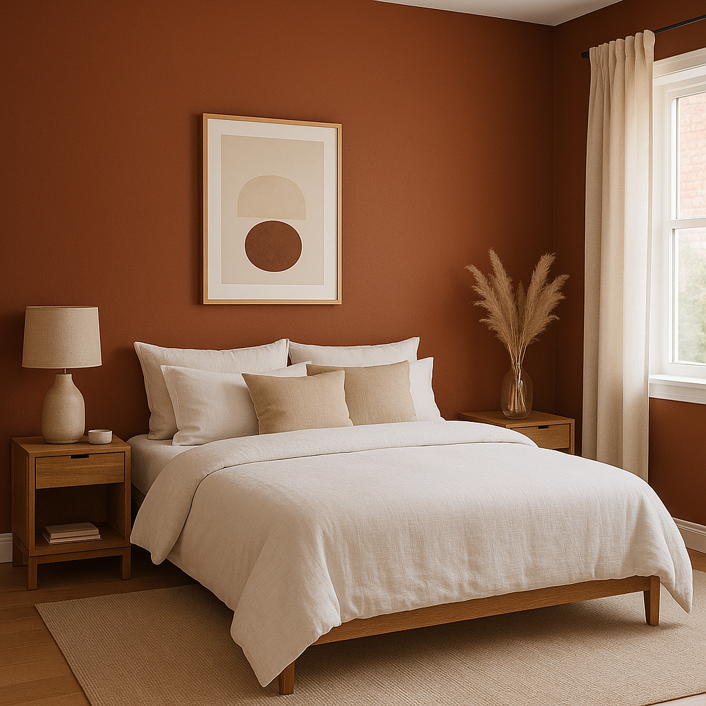
Copper makes a statement as an accent wall, especially in living rooms, dining areas, or bedrooms. Its boldness draws the eye, creating a focal point that feels both dramatic and inviting. Pair it with lighter neutral walls to create a balanced look.
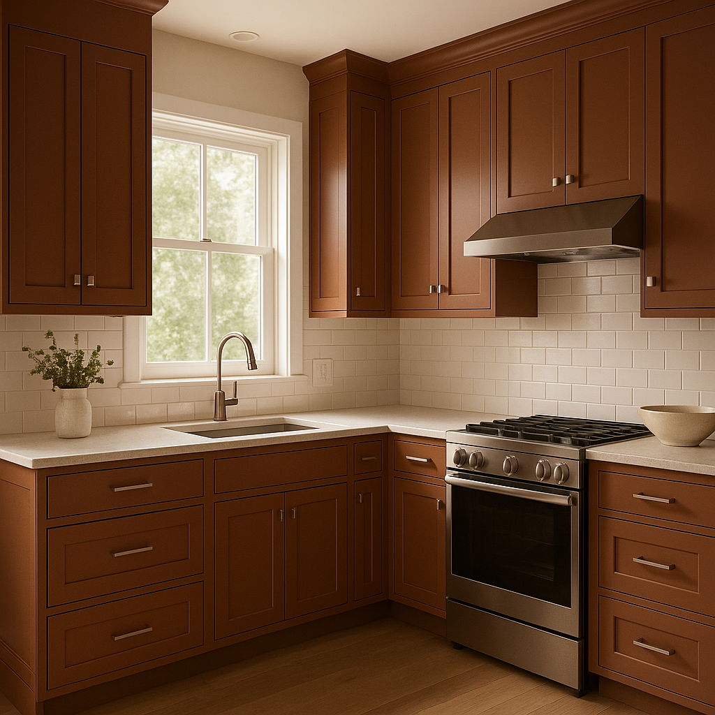
For a kitchen that feels warm and unique, consider using Copper on your cabinetry. This color works beautifully in kitchens with wood or stone elements, enhancing the natural textures and creating a cozy yet contemporary vibe.
Copper is perfect for dining spaces, where its warm undertones help foster a sense of intimacy and comfort. Pair it with candlelight and metallic tableware for an elegant, moody atmosphere.
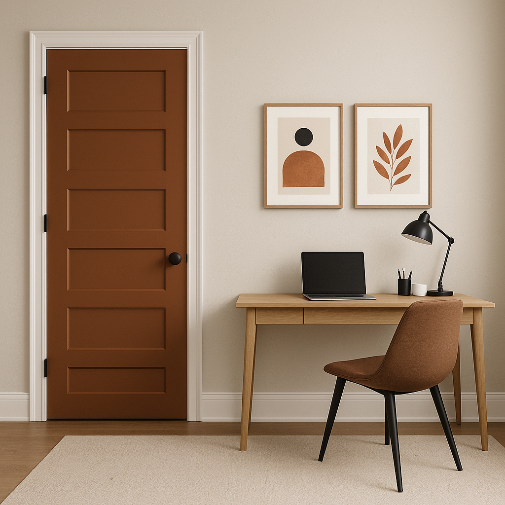
If you're looking to energize your home office, Copper can inspire creativity and focus. Pair it with dark wood furniture and brass accents for a sophisticated workspace.
This color isn't limited to interiors—it can also be used to stunning effect on exterior doors, shutters, or even outdoor furniture. Its earthy warmth harmonizes beautifully with natural surroundings.
Because Benjamin Moore Copper is a rich and saturated color, it’s essential to consider the lighting in your space. In rooms with ample natural light, Copper will appear vibrant and lively, highlighting its red and orange undertones. In spaces with dimmer lighting, the color will deepen, taking on a moodier, more dramatic tone. Be sure to test the color in your specific lighting conditions before committing to it.
If you're searching for a color that combines warmth, sophistication, and versatility, Benjamin Moore Copper (2094-20) is an excellent choice. Its earthy undertones and dynamic richness lend themselves to a wide range of interior styles, from rustic and traditional to bold and contemporary. By pairing it with complementary colors and incorporating thoughtful lighting and textures, you can create a space that feels both timeless and full of character.
View Colors Only by Brand (No Imagery):
Sherwin-Williams
|
Benjamin-Moore
|
Behr
|
Valspar
Live on the Eastern Slope of Colorado and looking for a local painting professional, check out all our painting services and reach out for a free estimate.
Copyright © 2026 : Wild Fox Painting Inc. : 12435 Mead Way, Littleton, CO 80125


