Benjamin Moore Adirondack (2095-10) is a captivating deep green that effortlessly blends boldness with sophistication. Its rich, earthy tone evokes the tranquility of lush forests, making it an exceptional choice for spaces where you want to bring the natural world indoors. With its timeless appeal, Adirondack creates an ambiance that is both grounding and luxurious, perfect for interiors that demand character and depth.
Adirondack is a deep, saturated green with warm undertones that lean slightly toward olive. These subtle yellow-brown undertones give the color a natural warmth and prevent it from feeling overly cool or stark. The result is a balanced shade that complements a wide range of interior styles, from rustic and traditional to modern and eclectic.
The undertones make Adirondack incredibly versatile, allowing it to play well with both earthy neutrals and vibrant colors. Its warmth ensures it feels inviting, while its depth gives it an air of sophistication.
Benjamin Moore Adirondack pairs beautifully with a variety of hues, offering endless design possibilities. Here are some coordinating colors to consider:
Benjamin Moore Adirondack is a versatile shade that can be used in a variety of ways to make a statement or provide a grounding backdrop:
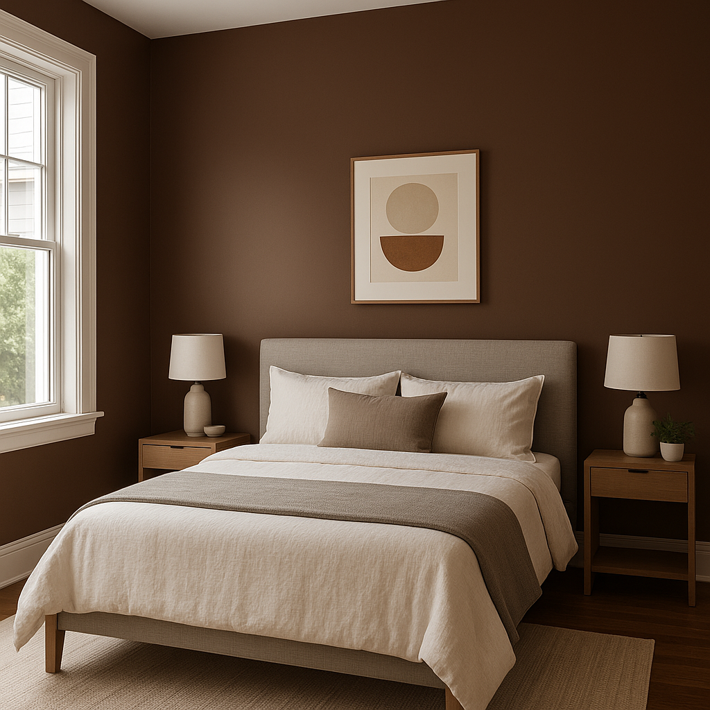
Adirondack is an excellent choice for accent walls in living rooms, dining spaces, or bedrooms. Its deep green creates a focal point that draws the eye, adding depth and character to the room. Pair it with lighter, neutral walls to balance its boldness.
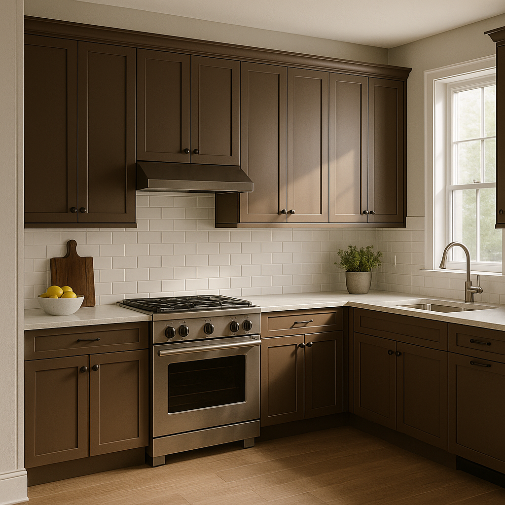
For kitchens or bathrooms, Adirondack brings a refined, natural elegance to cabinetry. Its rich tone works beautifully with brass or matte black hardware, creating a modern yet timeless look. Consider pairing it with a white or marble countertop to keep the space light and airy.
If you’re aiming for a cozy, dramatic vibe in a study or den, Adirondack is the perfect choice. Combine it with dark woods, leather furniture, and warm metallics like gold or bronze to create an inviting retreat.
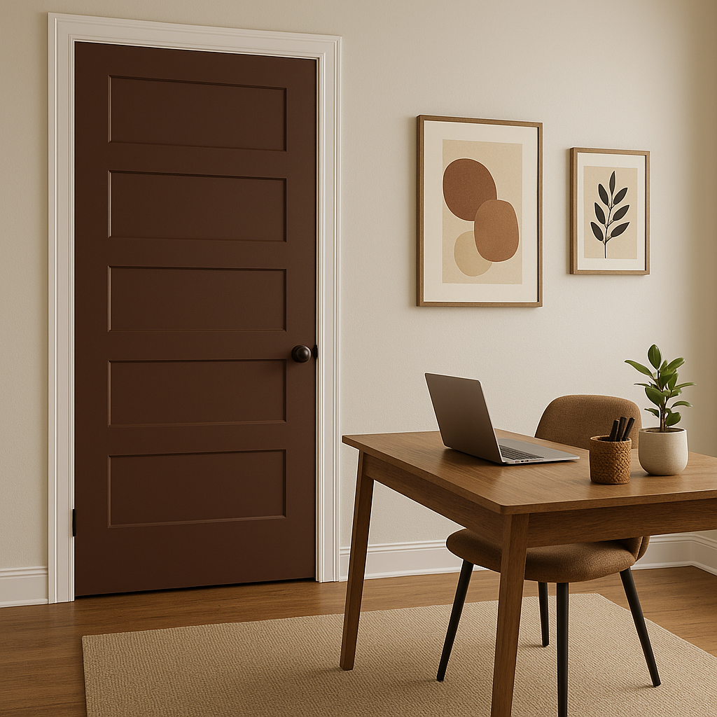
Adirondack’s earthy tone makes it a stunning option for exterior doors or shutters. It blends seamlessly with natural landscapes, creating a harmonious connection between your home and its surroundings.
If painting entire walls feels too bold, Adirondack can be incorporated through decorative touches like picture frames, furniture, or accent pieces. This approach allows you to enjoy its richness without overwhelming the space.
Adirondack’s versatility makes it suitable for a range of interior design styles:
Benjamin Moore Adirondack (2095-10) is more than just a paint color—it’s an invitation to bring richness and depth into your space. Whether used as a bold statement or a grounding element, this earthy green is sure to transform your interiors into a timeless haven.
View Colors Only by Brand (No Imagery):
Sherwin-Williams
|
Benjamin-Moore
|
Behr
|
Valspar
Live on the Eastern Slope of Colorado and looking for a local painting professional, check out all our painting services and reach out for a free estimate.
Copyright © 2026 : Wild Fox Painting Inc. : 12435 Mead Way, Littleton, CO 80125


