Benjamin Moore Cappuccino (2096-50) is a rich, medium-toned brown that exudes warmth, sophistication, and versatility. Its cozy, mocha-inspired essence makes it an excellent choice for creating inviting spaces that feel grounded and harmonious. Whether used to anchor a room or as an accent shade, Cappuccino provides a sense of depth and timeless charm that resonates with a variety of design styles.
Cappuccino, true to its name, carries soft reddish undertones that add warmth and subtle complexity to the color. These undertones prevent it from feeling overly dark or heavy, making it a balanced brown that is both comforting and elegant. The reddish notes in the hue can shift slightly depending on the lighting, appearing richer and deeper in low-light settings and more muted in bright, natural light.
Benjamin Moore Cappuccino pairs beautifully with a range of complementary shades, allowing you to create a harmonious and well-curated color scheme. Here are some suggestions:
The versatility of Cappuccino makes it suitable for a wide range of applications, from cozy living spaces to elegant accent walls. Below are some ideas for incorporating this shade into your home:
Cappuccino is perfect for creating an inviting, relaxed atmosphere in living rooms or dens. Use it on walls to anchor the space and complement it with soft furnishings in cream, beige, or muted greens for a balanced look.
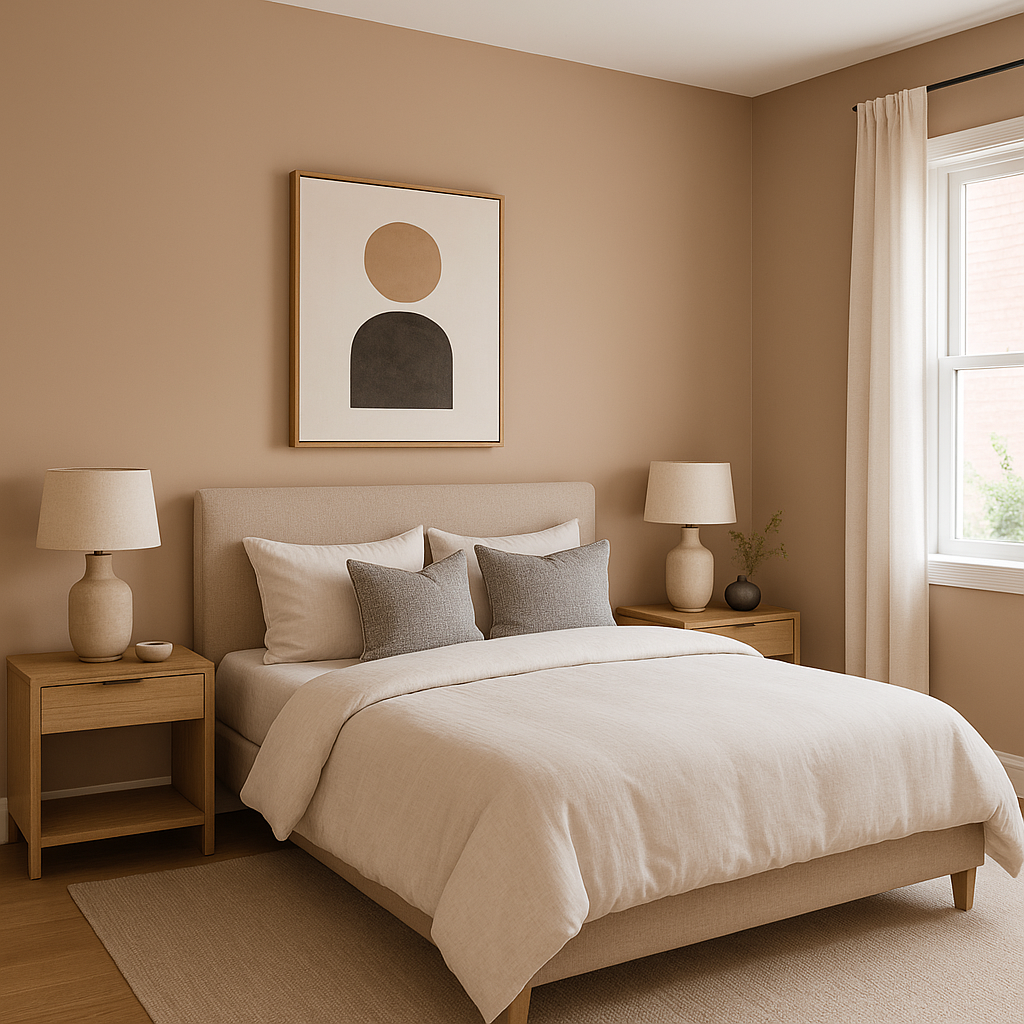
In bedrooms, Cappuccino can establish a cocoon-like ambiance that feels restful and warm. Pair it with plush linens in neutral tones or soft patterns to achieve a luxurious retreat.
Cappuccino shines in dining spaces, where its richness adds depth and elegance. Combine it with dark wood furniture and metallic accents like bronze or gold for a sophisticated setup.
For those who prefer subtle hints of this color, Cappuccino works beautifully as an accent wall. It can serve as the backdrop for framed artwork or mirrors, adding dimension without overwhelming the space.
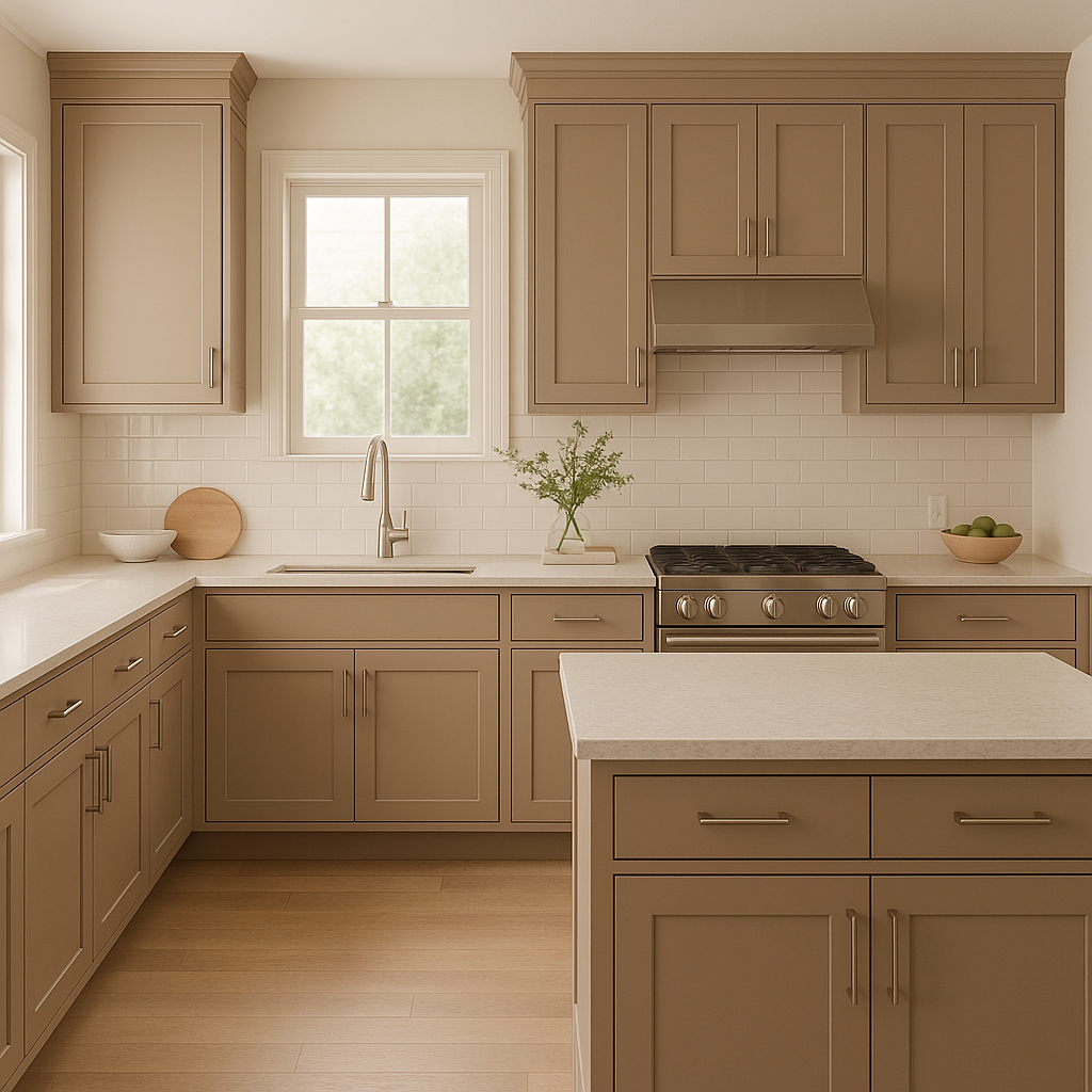
This earthy brown hue can add warmth to kitchen cabinetry or walls, especially when paired with light countertops and stainless steel appliances.
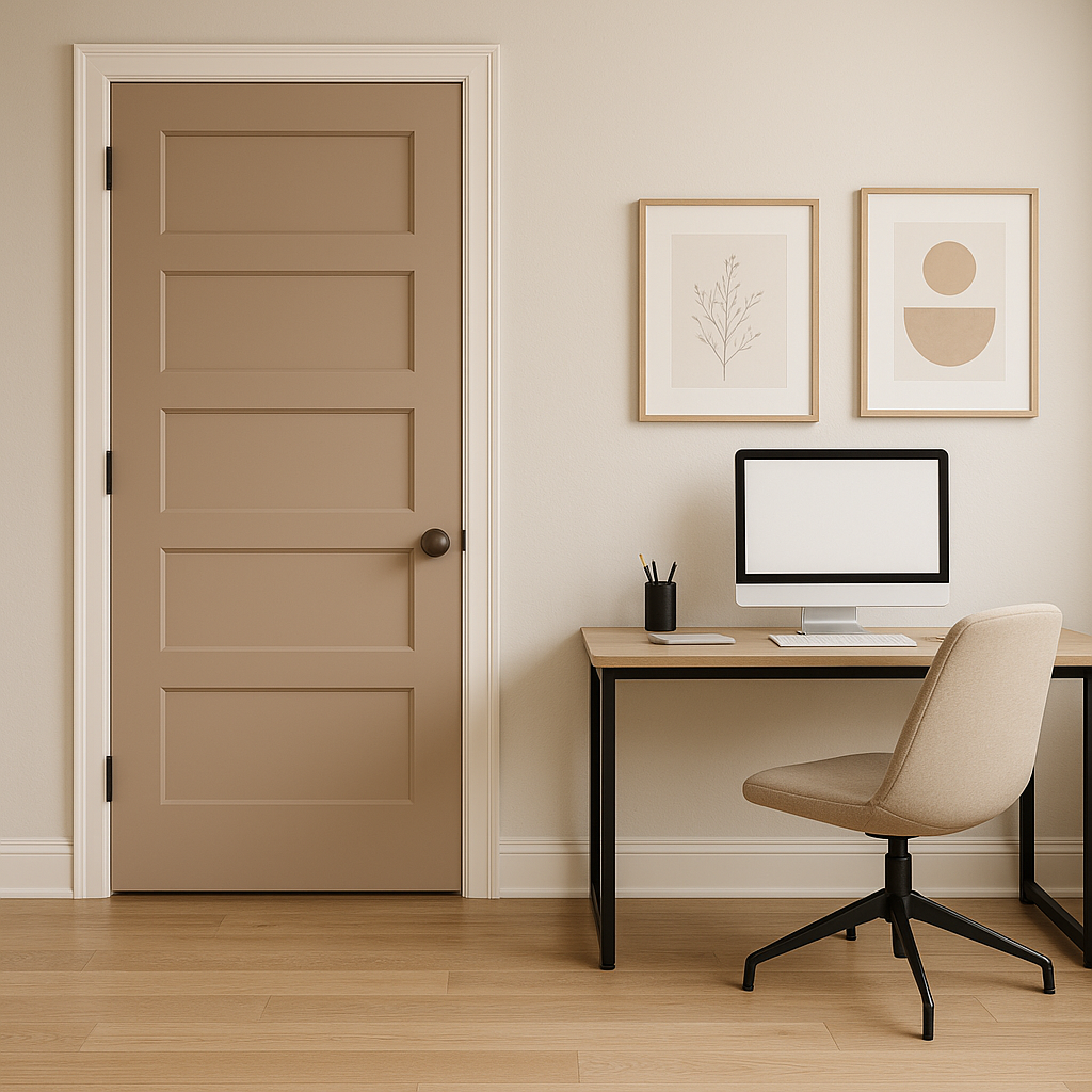
Cappuccino's grounding qualities make it an ideal choice for home offices, where it fosters focus and productivity. Pair it with sleek furniture and minimalistic décor for a polished look.
Benjamin Moore Cappuccino transforms beautifully depending on the light source. In spaces with ample natural light, the reddish undertones become more pronounced, lending the shade a lively and inviting vibe. In dim or artificial lighting, the color deepens, creating a moodier and more intimate ambiance. Be sure to test the shade in your space before committing, as lighting can significantly influence its appearance.
Benjamin Moore Cappuccino (2096-50) is more than just a neutral brown; it’s a color that brings warmth, character, and adaptability to any design scheme. Its ability to coordinate effortlessly with a variety of hues makes it a favorite among interior designers, while its timeless appeal ensures it remains stylish for years to come. Whether you're aiming for a rustic, modern, or traditional aesthetic, Cappuccino is a reliable choice that enhances the beauty and comfort of any room.
View Colors Only by Brand (No Imagery):
Sherwin-Williams
|
Benjamin-Moore
|
Behr
|
Valspar
Live on the Eastern Slope of Colorado and looking for a local painting professional, check out all our painting services and reach out for a free estimate.
Copyright © 2026 : Wild Fox Painting Inc. : 12435 Mead Way, Littleton, CO 80125


