Benjamin Moore Leap (210) is a striking, invigorating green that exudes energy and confidence. This rich, jewel-toned hue makes a bold statement, offering a sense of vitality and renewal to any space. Leap is a color that feels alive, bringing the beauty of nature indoors with its vivid emerald undertones. Whether used sparingly as an accent or generously as the main wall color, Leap has the versatility to elevate both modern and traditional interiors.
Leap is characterized by its deep, saturated green appearance, with distinct emerald undertones that give it a luxurious and spirited quality. Unlike muted greens that lean toward olive or sage, Leap is unapologetically vibrant and leans cooler on the spectrum. Its subtle touches of blue prevent it from feeling overly warm, making it a refreshing yet bold choice for a variety of design aesthetics. This cool undertone also allows it to pair effortlessly with crisp whites and cool neutrals, creating a clean and polished look.
When designing with a color as impactful as Leap (210), selecting coordinating hues is key to achieving a cohesive, balanced space. Here are some complementary color options:
Leap’s bold personality makes it an excellent choice for spaces that are meant to captivate and energize. Its versatility allows it to shine in various applications, from statement walls to cabinetry. Here are some ideas for incorporating Leap into your home:
Create a sophisticated yet invigorating focal point by using Leap on a feature wall. Pair it with a plush velvet sofa in navy or charcoal and accent with metallic decor for a modern, luxe vibe. If you want a more traditional aesthetic, balance Leap with warm wood tones and classic white trim.
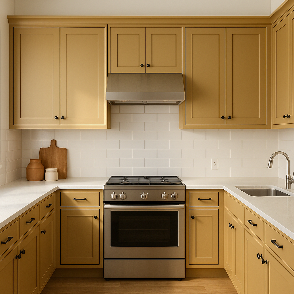
For a dramatic yet chic kitchen, Leap can be used on cabinetry or an island. Pair it with white quartz countertops and a subway tile backsplash for a crisp, contemporary look. In dining areas, Leap adds a sense of refinement when paired with a statement chandelier and upholstered chairs in soft neutrals.
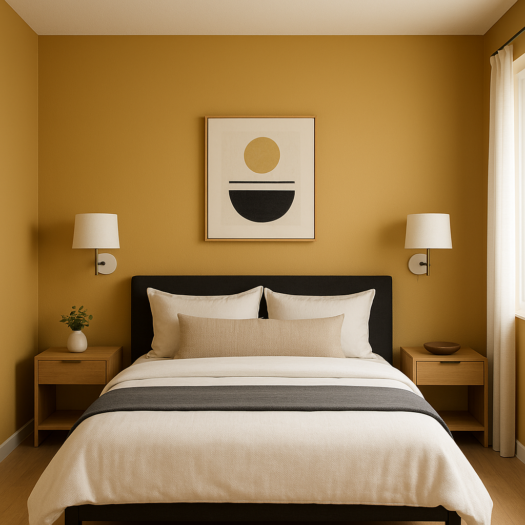
While bold, Leap can create a cocooning effect when used in bedrooms, particularly as an accent wall behind the bed. Soften the space with bedding in muted tones like cream, blush, or dusty blue to balance the intensity of the green.
Powder rooms are the perfect place to experiment with daring colors, and Leap excels in smaller spaces. Use it on all four walls for a jewel-box effect, complemented by a gilded mirror and vintage lighting for added drama.
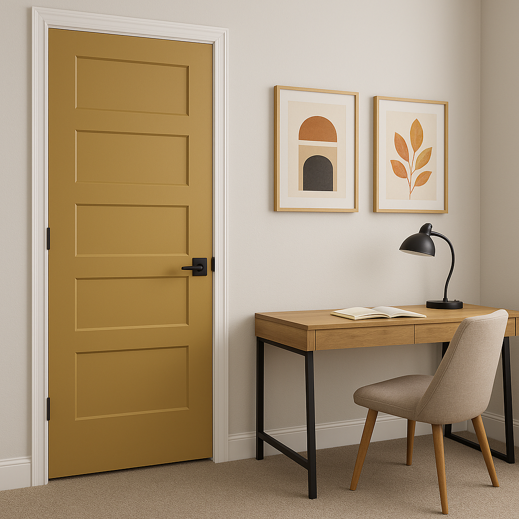
If you’re not ready for a full commitment, use Leap as a pop of color on furniture, such as a painted console table or shelving unit. It also works beautifully on outdoor furniture, bringing a fresh, natural energy to patios and gardens.
Leap’s depth and vibrancy can shift depending on the lighting in your space. In areas with ample natural light, the color appears brighter and more dynamic, highlighting its emerald undertones. In dimly lit rooms, Leap takes on a richer, moodier quality, enhancing its luxurious appeal. To fully appreciate this color’s versatility, test it in your space with both artificial and natural light before committing.
Benjamin Moore Leap (210) is a daring, energetic green that infuses any space with character and charm. Its emerald undertones and versatility make it an exceptional choice for those looking to add a bold yet refined pop of color. Whether used as an accent or a main feature, Leap creates a dynamic and memorable impression that will leave your home feeling vibrant and full of life.
View Colors Only by Brand (No Imagery):
Sherwin-Williams
|
Benjamin-Moore
|
Behr
|
Valspar
Live on the Eastern Slope of Colorado and looking for a local painting professional, check out all our painting services and reach out for a free estimate.
Copyright © 2026 : Wild Fox Painting Inc. : 12435 Mead Way, Littleton, CO 80125


