Benjamin Moore Savory (2105-70) is an exquisite warm neutral that exudes sophistication and versatility. This soft beige paint color balances elegance and coziness, making it a timeless choice for a variety of interior spaces. Whether you’re looking to create a serene retreat or a polished backdrop for bold accents, Savory offers the flexibility to elevate your design vision.
Savory features subtle warm undertones with hints of creamy beige and a whisper of taupe. These understated undertones make it an adaptable shade that works beautifully in both traditional and contemporary settings. The warm base prevents it from feeling stark, while the muted taupe influence adds depth and complexity, ensuring it doesn’t read as overly yellow or flat. Its undertones are particularly well-suited for spaces that crave a soft, welcoming atmosphere.
Savory’s neutral warmth makes it an excellent companion to a range of colors. Here are some coordinating shades to consider:
Pairing Savory with metallic finishes like brushed gold or bronze can further enhance its sophisticated appeal, while wood tones like walnut or oak can amplify its warm, cozy vibe.
Savory’s versatility makes it suitable for almost any room in the home. Here are some ideas on where and how to use this soft neutral:
Savory creates a welcoming backdrop for living rooms, offering a neutral canvas that works well with both light and dark furniture. Pair it with plush textures, warm woods, and layered lighting for a cozy yet refined space.
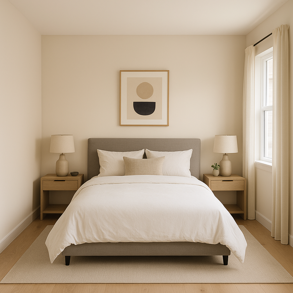
In bedrooms, Savory promotes relaxation and tranquility. It pairs beautifully with soft linens, upholstered headboards, and natural fibers like jute or wool. Add pops of navy, blush, or sage green for a balanced and serene retreat.
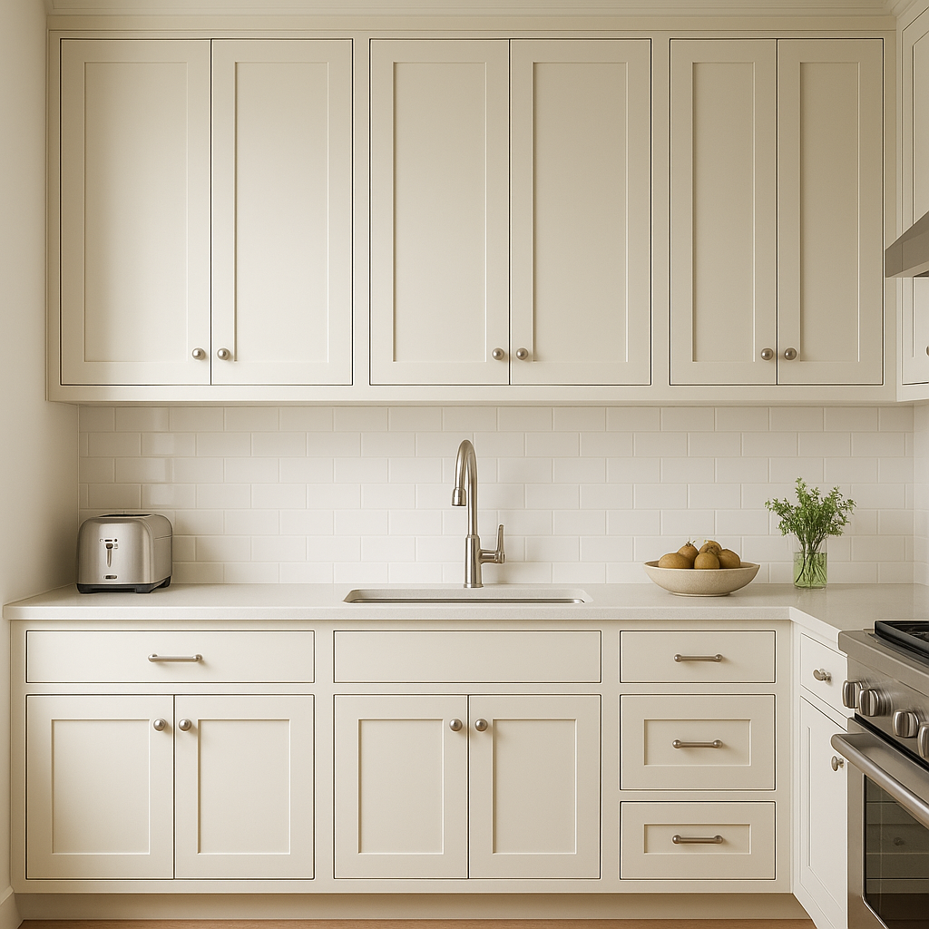
Savory can bring understated elegance to kitchens, especially when paired with crisp white cabinetry or accents of brushed gold hardware. It’s a go-to choice for open-concept spaces, seamlessly merging with adjoining dining or living areas.
For bathrooms, Savory’s warm undertones create a spa-like ambiance. Complement it with marble countertops, white subway tile, and polished chrome fixtures for a fresh yet timeless look.
In transitional spaces like hallways and entryways, Savory acts as the perfect neutral to unify adjoining rooms. Its warm tone ensures these areas feel connected and inviting.
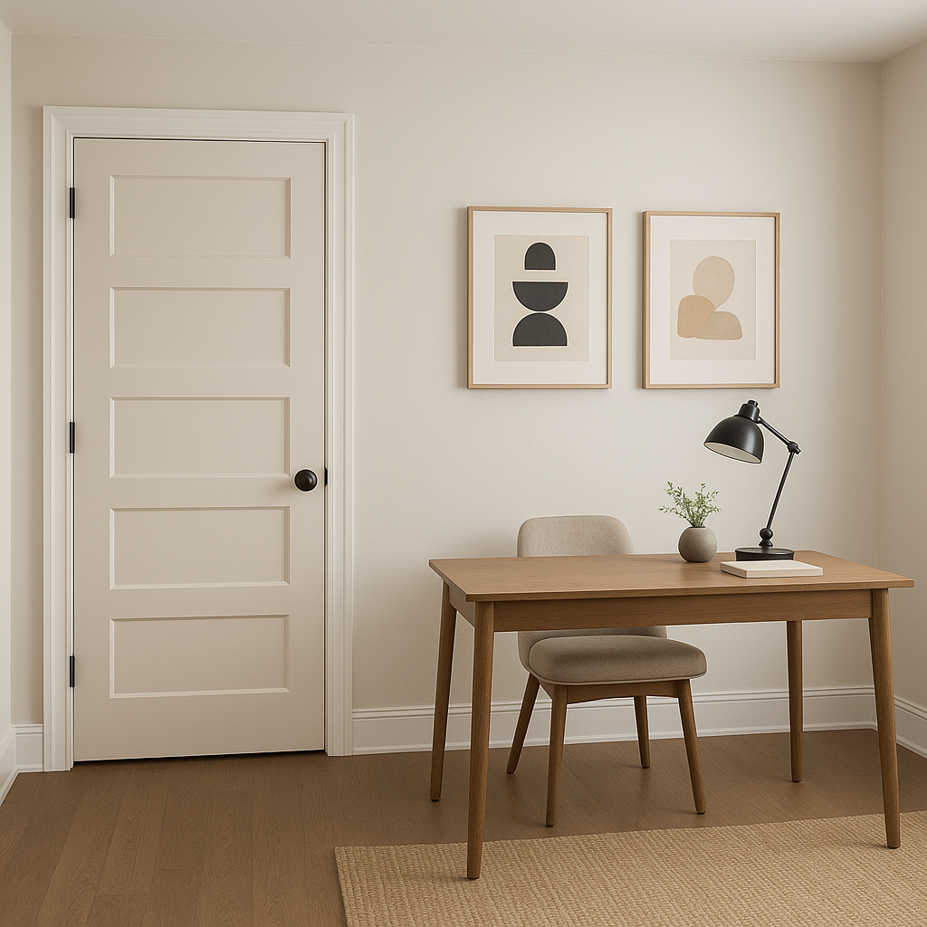
Create a productive yet calming environment by using Savory in your home office. It pairs well with dark wood desks, brass accents, and soft lighting for a stylish and focused workspace.
Savory’s appearance can shift depending on the lighting conditions in your space. In rooms with ample natural light, it will lean slightly lighter and warmer, emphasizing its soft beige qualities. In spaces with artificial or dim lighting, its taupe undertones may become more prominent, lending a cozy and grounded feel. Always test Savory on different walls and observe it at various times of the day to ensure it harmonizes with the natural and artificial light in your home.
Benjamin Moore Savory (2105-70) offers a sophisticated balance between warmth and neutrality, making it a designer favorite for creating inviting, elegant interiors. Its versatility allows it to complement a wide range of design styles, from modern farmhouse to urban contemporary. Whether used as a primary wall color or an accent shade, Savory has a timeless quality that adapts beautifully to evolving trends and personal preferences.
Let Benjamin Moore Savory transform your space with its understated charm and effortless adaptability.
View Colors Only by Brand (No Imagery):
Sherwin-Williams
|
Benjamin-Moore
|
Behr
|
Valspar
Live on the Eastern Slope of Colorado and looking for a local painting professional, check out all our painting services and reach out for a free estimate.
Copyright © 2026 : Wild Fox Painting Inc. : 12435 Mead Way, Littleton, CO 80125


