Benjamin Moore Portland (2109-60) is a timeless and versatile soft gray with a hint of warmth that makes it an excellent choice for interiors seeking an understated yet elegant atmosphere. With its gentle, muted appearance, Portland offers a harmonious balance between cool and warm tones, making it an adaptable neutral that complements a wide range of design styles. Whether you're looking to create a calming sanctuary, a sophisticated living space, or a modern minimalist aesthetic, this hue effortlessly bridges the gap between classic and contemporary design.
Portland carries subtle warm undertones that differentiate it from cooler grays. While it retains an overall gray appearance, the faint beige undertones lend it a welcoming softness, preventing it from feeling stark or cold. These undertones make Portland particularly well-suited for spaces where natural light plays a significant role, as the warmth can enhance the glow of sunlight without overwhelming the room.
The balance between gray and beige means Portland works beautifully in rooms that demand a neutral backdrop, but with a touch of coziness. It’s not overly cool or overly warm—making it a "greige" that adapts seamlessly to different lighting conditions and surrounding colors.
Benjamin Moore Portland is incredibly versatile, pairing well with a wide palette of complementary colors. Consider the following options to create harmonious color schemes:
Portland shines when paired with clean, crisp whites like Benjamin Moore Chantilly Lace (OC-65) or Simply White (OC-117). These whites amplify its softness while providing a fresh and modern contrast, ideal for trims, ceilings, or cabinetry.
For a bold contrast, pair Portland with dark, moody hues such as Benjamin Moore Wrought Iron (2124-10) or Black Panther (2125-10). These darker shades can create a dramatic effect when used on accents like doors, furniture, or feature walls.
Portland’s warm undertones make it a natural companion to earthy greens and subdued blues. Consider hues like Benjamin Moore Wythe Blue (HC-143) or Saybrook Sage (HC-114) to add depth and richness to your space. These colors evoke a sense of tranquility and pair beautifully with Portland in bedrooms or living areas.
For a delicate and airy palette, Portland works well alongside light pastels such as Benjamin Moore Pale Oak (OC-20) or Gray Cashmere (2138-60). This combination is perfect for creating serene spaces like nurseries or bathrooms.
Portland’s understated charm makes it a highly adaptable paint color that can be used throughout the home. Here are some ideas for incorporating this hue into various spaces:
Portland creates a calm and inviting atmosphere in living rooms, allowing furniture and decor to take center stage. Pair it with plush textures like velvet or linen and add metallic accents in gold or silver for a sophisticated look.
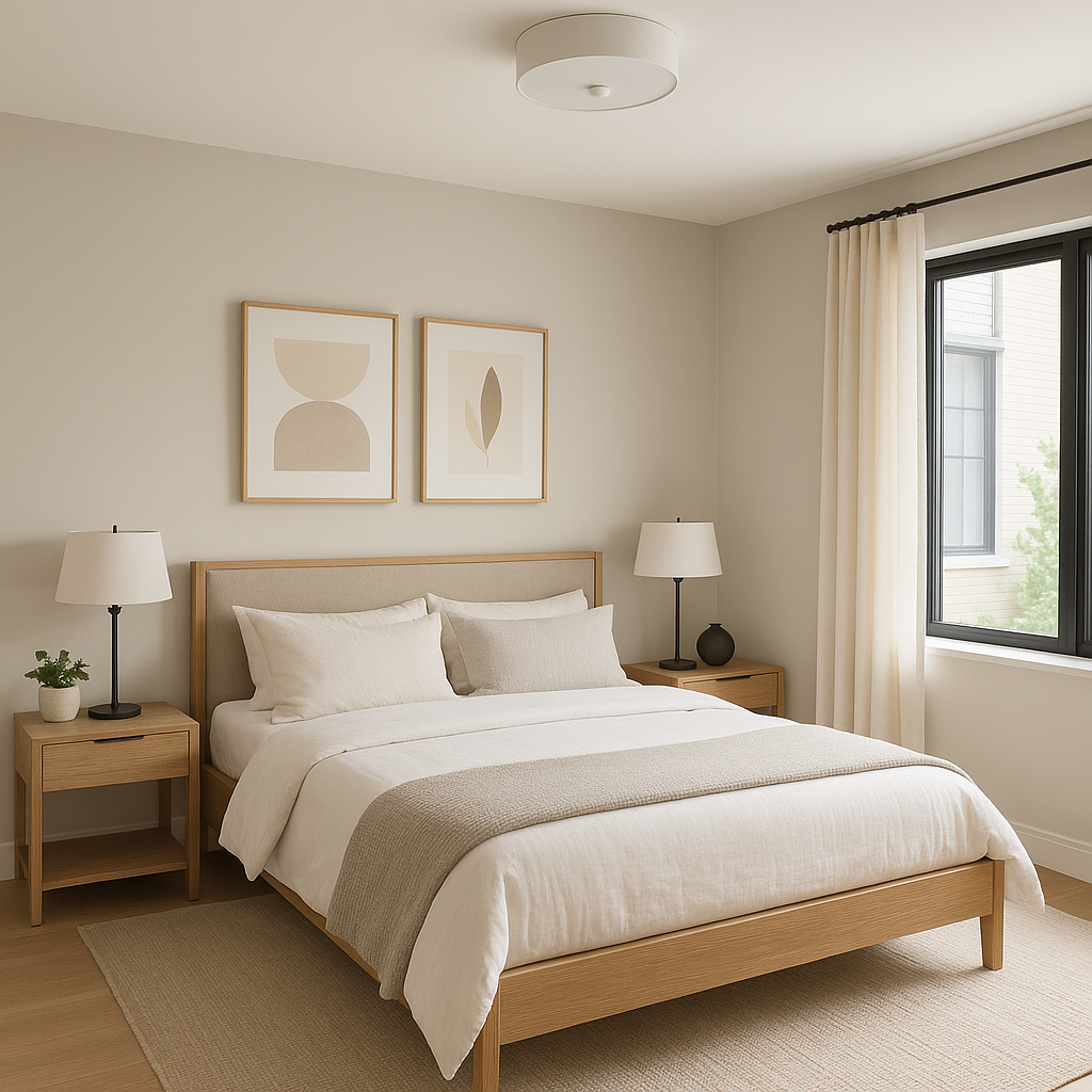
The soothing nature of Portland makes it an excellent choice for bedrooms. Use it on walls to create a restful retreat, combined with crisp white linens and soft accent colors like blush pink or muted green.
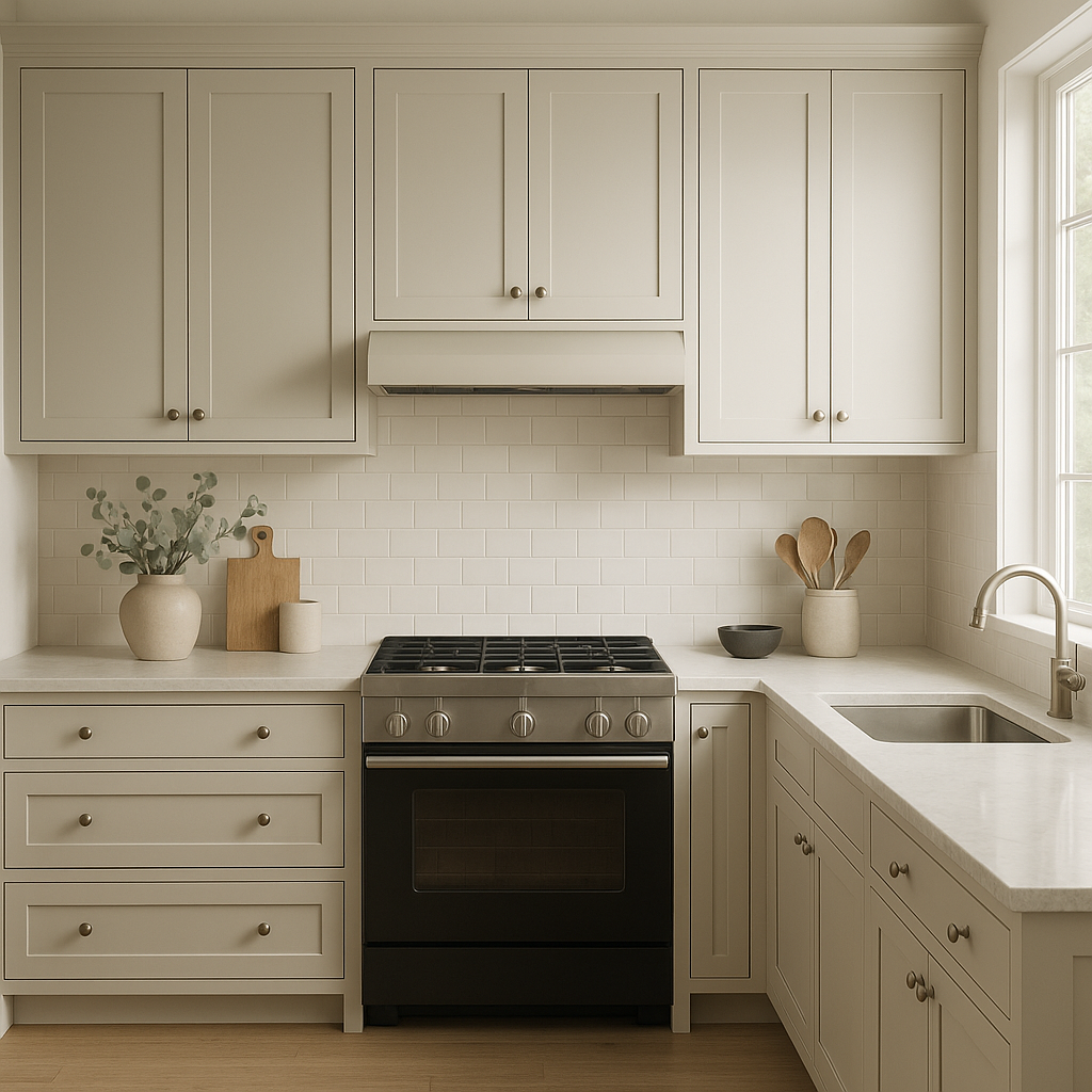
Portland is a fantastic option for kitchens looking for a contemporary yet warm vibe. Use it on cabinetry for a clean, modern aesthetic or on walls with white subway tile backsplashes and stainless steel appliances.
Bring a spa-like tranquility to your bathroom with Portland. Pair it with white marble countertops and chrome fixtures for a fresh, luxurious feel. Add greenery to accentuate its warm undertones and create a relaxing environment.
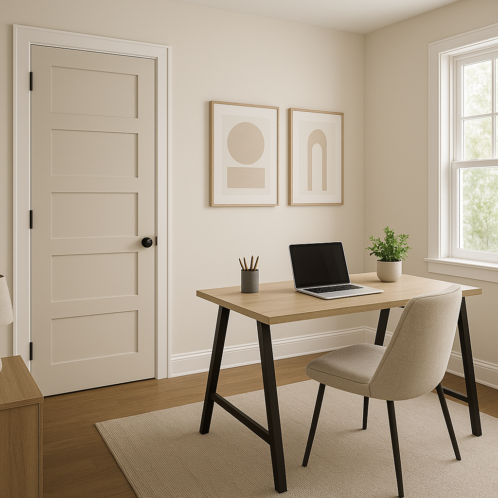
Portland is a perfect neutral for entryways and hallways, as it provides a welcoming backdrop without stealing attention from decor or architectural features. Pair it with bold artwork or statement lighting for added personality.
Whether you're refreshing a single space or designing an entire home, Benjamin Moore Portland (2109-60) offers a refined and versatile neutral that will stand the test of time. Its ability to adapt to different moods and styles makes it a favorite among interior designers and homeowners alike.
View Colors Only by Brand (No Imagery):
Sherwin-Williams
|
Benjamin-Moore
|
Behr
|
Valspar
Live on the Eastern Slope of Colorado and looking for a local painting professional, check out all our painting services and reach out for a free estimate.
Copyright © 2026 : Wild Fox Painting Inc. : 12435 Mead Way, Littleton, CO 80125


