Benjamin Moore Pampas (2110-60) is a stunning pale taupe paint color that brings understated elegance to any space. With its delicate balance of warmth and coolness, Pampas offers a timeless neutral that pairs beautifully with a wide range of palettes and styles. Whether you're striving for a serene ambiance or a sophisticated backdrop for bold accents, Pampas is a versatile choice that elevates design possibilities.
Pampas (2110-60) has subtle gray undertones that anchor its taupe base, giving it a modern edge while maintaining its soft and inviting appearance. A whisper of beige warmth adds depth, allowing Pampas to work seamlessly with both cool and warm color schemes. These gentle undertones make Pampas a chameleon-like hue, adapting beautifully to lighting conditions. In spaces with natural light, it leans slightly warmer, while in artificial or cooler lighting, the gray undertones become more pronounced, creating a grounded and sophisticated feel.
Benjamin Moore Pampas is a versatile neutral that pairs effortlessly with an array of complementary hues:
In addition to these options, Pampas also complements natural wood tones and metallic finishes like brushed gold or antique brass, making it ideal for spaces that embrace mixed textures and materials.
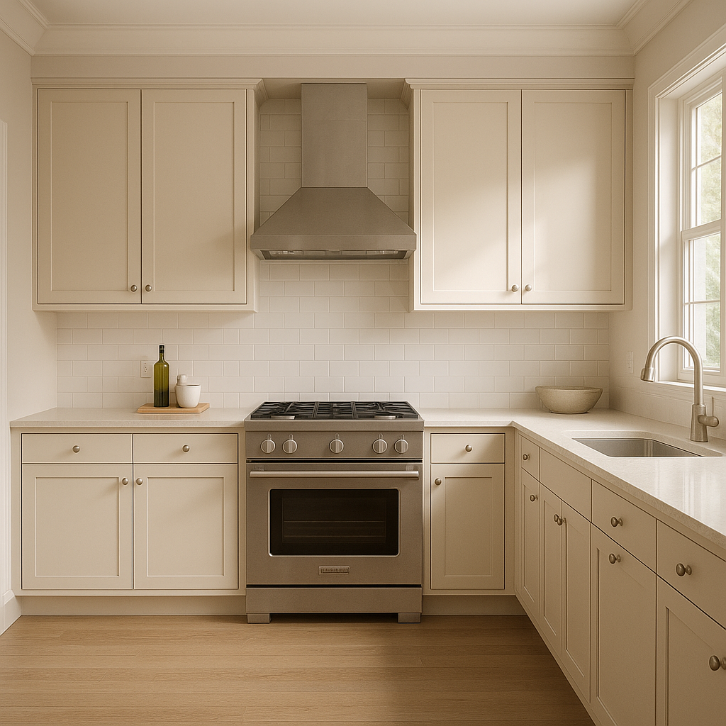
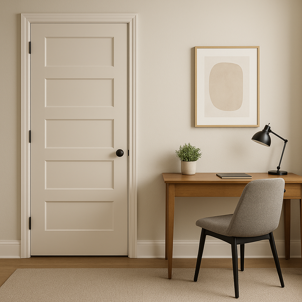
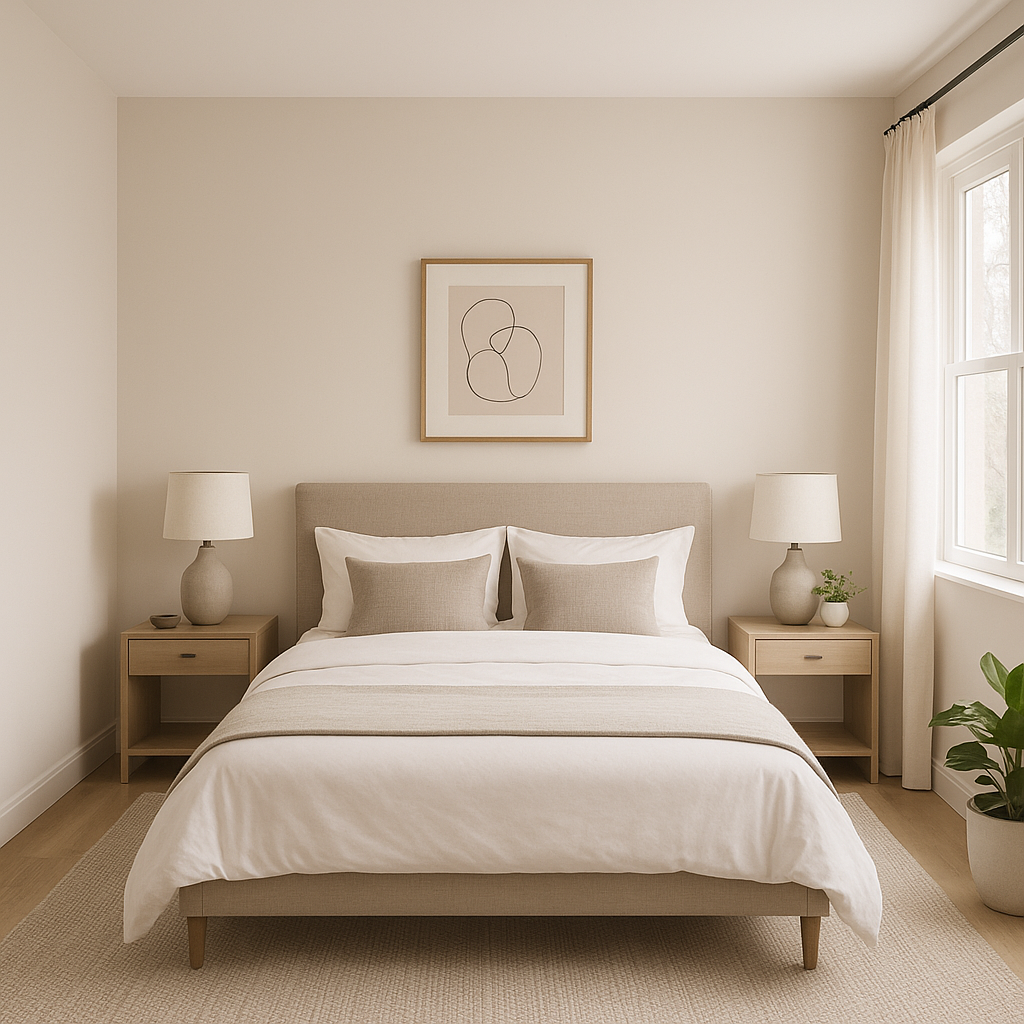
Benjamin Moore Pampas is a versatile hue that works well in a variety of interior applications:
Pampas (2110-60) is more than just a neutral; it’s a sophisticated foundation for creating layered and nuanced interiors. Its delicate taupe tone strikes the perfect balance between warmth and coolness, making it adaptable to both modern and traditional styles. Whether you’re refreshing a single room or designing an entire home, Pampas offers the flexibility to harmonize effortlessly with your vision.
This timeless hue is ideal for homeowners and designers seeking a soft, inviting color that works across a variety of spaces and lighting conditions. With its subtle undertones, coordinating versatility, and ability to create a serene yet elevated atmosphere, Pampas is a paint color that never goes out of style.
View Colors Only by Brand (No Imagery):
Sherwin-Williams
|
Benjamin-Moore
|
Behr
|
Valspar
Live on the Eastern Slope of Colorado and looking for a local painting professional, check out all our painting services and reach out for a free estimate.
Copyright © 2026 : Wild Fox Painting Inc. : 12435 Mead Way, Littleton, CO 80125


