Benjamin Moore Calm (2111-70) is a soft, understated neutral that exudes tranquility and elegance. This light gray with subtle beige undertones is part of Benjamin Moore's Off-White Collection, designed to create harmonious and inviting spaces. Calm is the epitome of understated sophistication, offering a versatile canvas for a variety of design styles, from modern minimalism to classic elegance. Its ability to adapt to different lighting conditions and pair beautifully with other colors makes it a favorite among interior designers seeking a serene, grounding hue.
What sets Benjamin Moore Calm apart is its delicate balance of undertones. While it primarily reads as a soft gray, it has warm beige undertones that prevent it from feeling stark or cold. These warm undertones lend a sense of coziness and approachability to the color, making it a perfect choice for creating restful spaces. Depending on your lighting conditions, Calm may lean slightly cooler in rooms with abundant natural light or warmer in spaces lit by incandescent bulbs. This chameleon-like quality ensures that the color feels perfectly suited to its environment, whether you're designing a bright, airy living room or a cozy bedroom retreat.
Benjamin Moore Calm is incredibly versatile and pairs seamlessly with a wide range of coordinating colors. Here are some ideas for creating harmonious palettes:
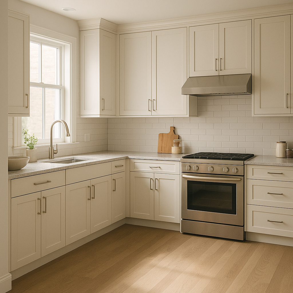
Benjamin Moore Calm is well-suited for a variety of interior applications. Its neutral yet warm quality makes it a favorite for spaces where relaxation and comfort are key. Here are some ways to use Calm effectively:
Calm is a perfect backdrop for living rooms, creating an inviting atmosphere that allows your furnishings and décor to shine. Pair it with plush sofas, textured throws, and natural wood accents to achieve a cozy yet refined look. Use metallic finishes like brushed gold or silver for a touch of luxury.
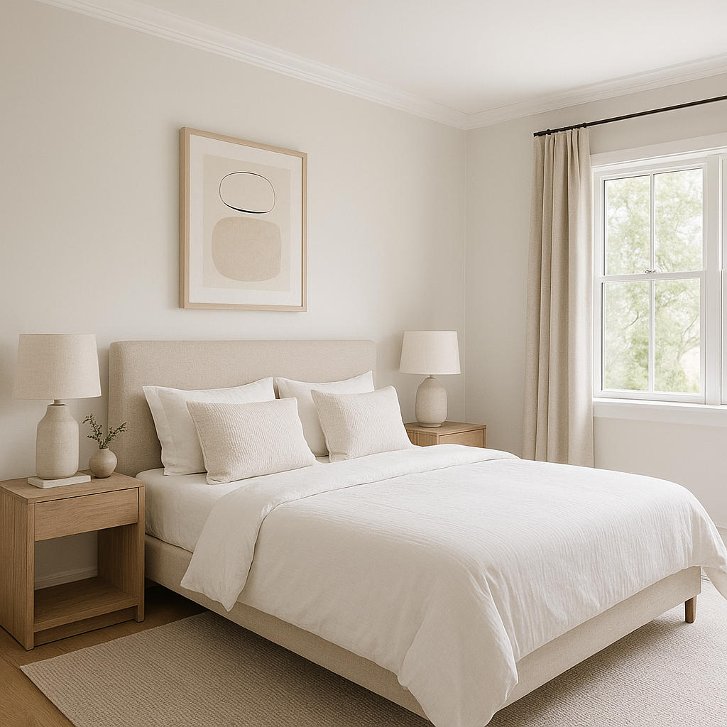
If you're designing a bedroom that feels like a sanctuary, Calm is an exceptional choice. Its soft, warm undertones promote relaxation and restful sleep. Layer it with crisp white bedding, soft pastels, or muted greens and blues to create a serene retreat.
For bathrooms, Calm provides a spa-like ambiance, especially when paired with clean white tiles and brushed nickel fixtures. Add soft towels in shades of blue or green to bring a refreshing pop of color to the space.
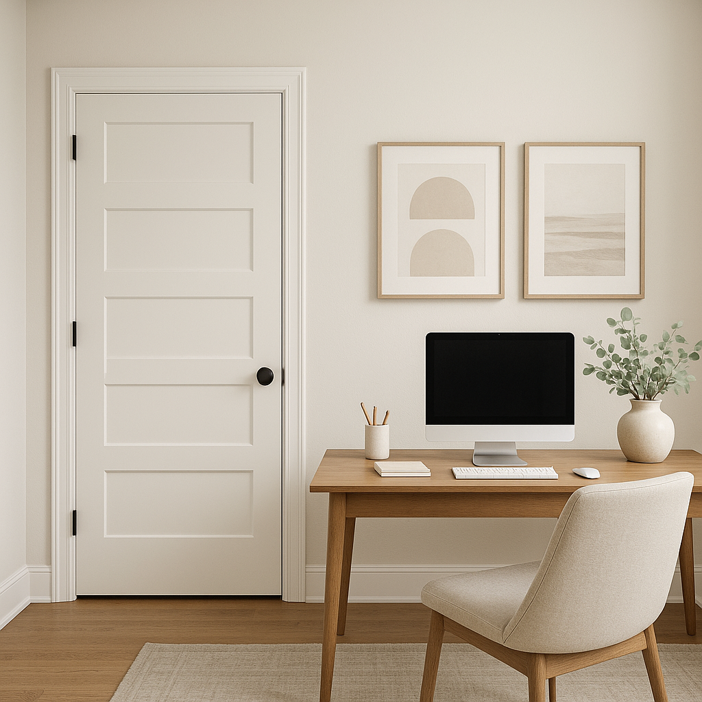
Calm fosters focus and productivity, making it an excellent choice for home offices. Pair it with darker accent furniture or shelving to create a balanced and professional environment.
Using Calm in hallways and entryways helps create a seamless transition between rooms. Its understated elegance allows it to blend well with adjacent colors, ensuring a cohesive flow throughout your home.
Choosing Benjamin Moore Calm (2111-70) means embracing a versatile neutral that delivers both style and serenity. Whether you're designing a modern space or a traditional home, Calm adapts effortlessly, lending a timeless quality to any room. Its warm undertones and ability to coordinate with a variety of colors make it a reliable choice for homeowners and designers alike.
Benjamin Moore Calm is more than just a paint color—it's a mood, a feeling, and an invitation to create spaces that truly feel like home.
View Colors Only by Brand (No Imagery):
Sherwin-Williams
|
Benjamin-Moore
|
Behr
|
Valspar
Live on the Eastern Slope of Colorado and looking for a local painting professional, check out all our painting services and reach out for a free estimate.
Copyright © 2026 : Wild Fox Painting Inc. : 12435 Mead Way, Littleton, CO 80125


