Benjamin Moore Stormy (2112-50) is a beautifully complex mid-tone gray that exudes sophistication and a sense of calm. With its balanced mix of warm and cool undertones, Stormy is an incredibly versatile color that adapts to a variety of spaces and lighting conditions. It’s the ideal shade for creating a serene yet dynamic atmosphere in your home.
One of the standout features of Stormy is its ability to bridge the gap between warm and cool. This gray has subtle blue undertones that give it a hint of coolness while maintaining a soft, warm base. The result is a nuanced hue that doesn’t feel too stark or too heavy. Depending on the lighting, Stormy can appear slightly cooler in north-facing rooms or more neutral in spaces with ample natural light. Its chameleon-like qualities make it a crowd-pleaser for those who love timeless, understated elegance.
Benjamin Moore Stormy pairs effortlessly with a wide range of colors, making it an excellent foundation for your design scheme. Here are some top coordinating color recommendations:
Stormy’s refined gray is a timeless choice for a variety of rooms and design styles. Whether you’re aiming for modern minimalism, classic elegance, or a cozy transitional vibe, this color checks all the boxes.
In living rooms or family spaces, Stormy creates a polished and inviting backdrop. Pair it with soft furnishings in muted tones or layer it with bold accents like patterned area rugs or colorful throw pillows for added interest.
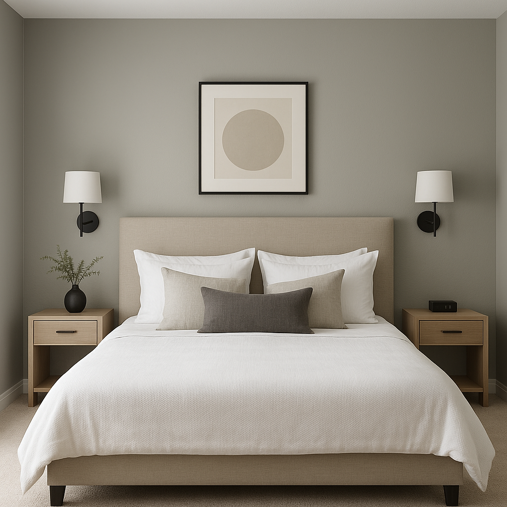
Stormy’s calming undertones make it a perfect choice for bedrooms. Use it as the main wall color and pair it with warm white bedding and plush textures to create a restful retreat. Add soft lighting to highlight its subtle blue undertones and enhance the tranquil ambiance.
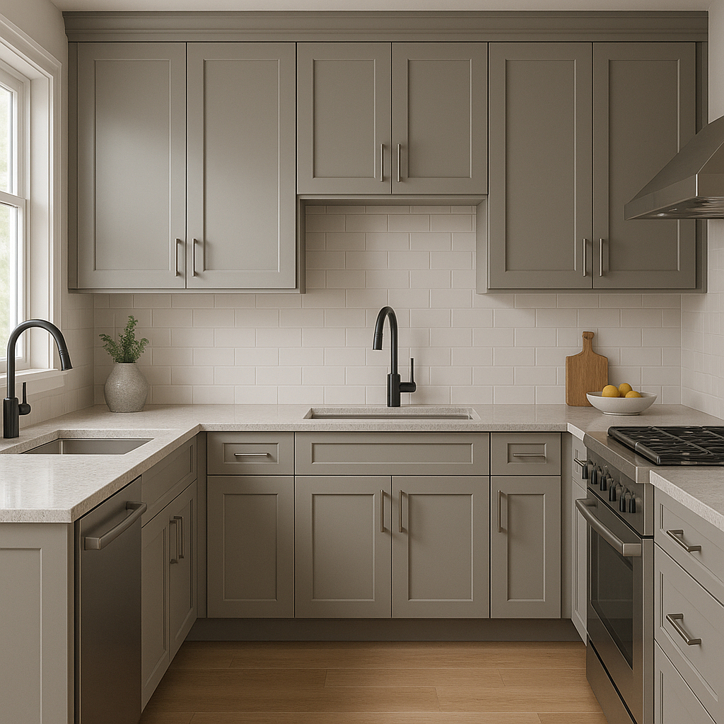
For kitchens and dining rooms, Stormy works beautifully on walls or cabinetry. Its versatile tone complements stainless steel appliances, marble countertops, and both modern and farmhouse-inspired decor. Pair it with darker accents like navy or black for a sleek, contemporary look.
In bathrooms, Stormy offers a spa-like feel when paired with crisp white tiles and chrome or brushed nickel fixtures. Its soothing hue can help create a serene space perfect for relaxation.
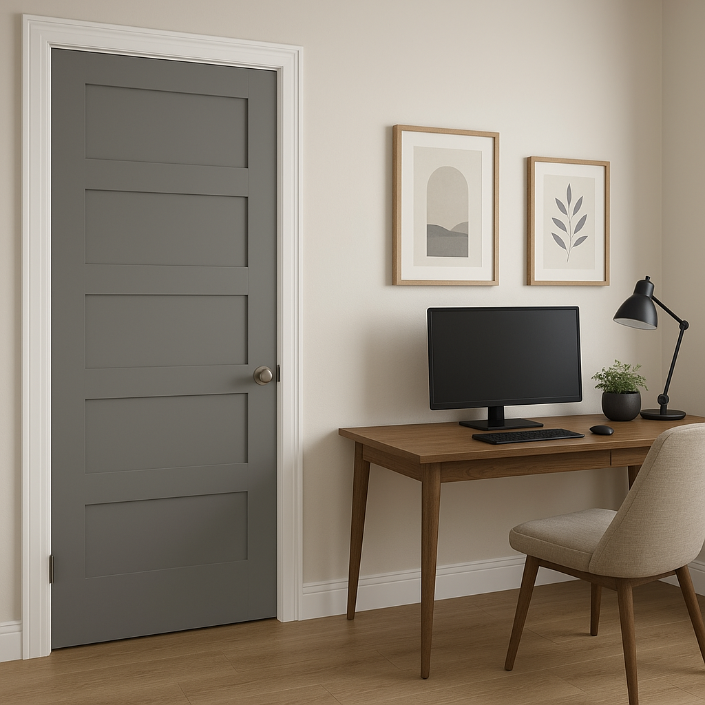
Stormy is an excellent choice for home offices, as its balanced tone promotes focus without being overly stark. Add natural wood furniture and greenery to complete a productive yet welcoming work environment.
Benjamin Moore Stormy (2112-50) is a color that balances sophistication with versatility. Its understated elegance, subtle undertones, and ability to pair seamlessly with a variety of coordinating colors make it a go-to choice for both classic and contemporary interiors. Whether you’re painting a single accent wall or the entire room, Stormy delivers a polished and timeless look that adapts effortlessly to your unique style.
By choosing Benjamin Moore Stormy, you’re investing in a paint color that will stand the test of time, creating a refined and serene space that you’ll love for years to come.
View Colors Only by Brand (No Imagery):
Sherwin-Williams
|
Benjamin-Moore
|
Behr
|
Valspar
Live on the Eastern Slope of Colorado and looking for a local painting professional, check out all our painting services and reach out for a free estimate.
Copyright © 2026 : Wild Fox Painting Inc. : 12435 Mead Way, Littleton, CO 80125


