Benjamin Moore Porcelain (2113-60) is an elegant, muted lavender-gray that effortlessly bridges the gap between subtle sophistication and modern charm. This color exudes tranquility, making it a versatile choice for creating serene and stylish spaces. Its understated nature allows it to shine as both a primary color or a complementary accent in your home.
Porcelain features gentle purple undertones that are softened by a delicate gray base. The result is a refined hue that avoids being overly feminine or dramatic. Its balanced undertones make it adaptable to various lighting conditions—appearing cooler in bright, natural light and warmer in dim or artificial lighting. This duality ensures that Porcelain retains its elegant character regardless of the environment, making it a timeless choice for any room.
Benjamin Moore Porcelain pairs beautifully with a range of coordinating colors, whether you’re aiming for a monochromatic scheme or adding contrast. Here are some suggestions to inspire your palette:
Porcelain’s versatility allows it to work across a variety of design styles and spaces. Here are some ideas for incorporating this color into your home:
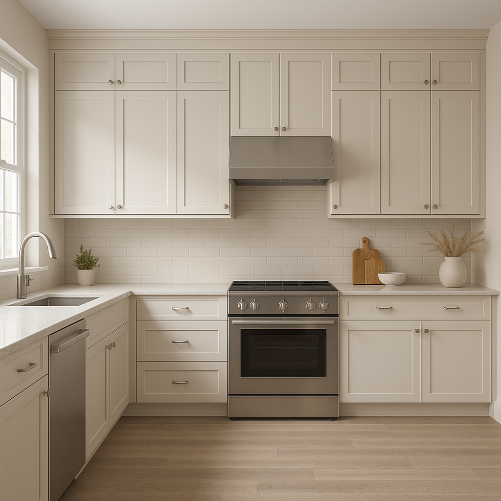
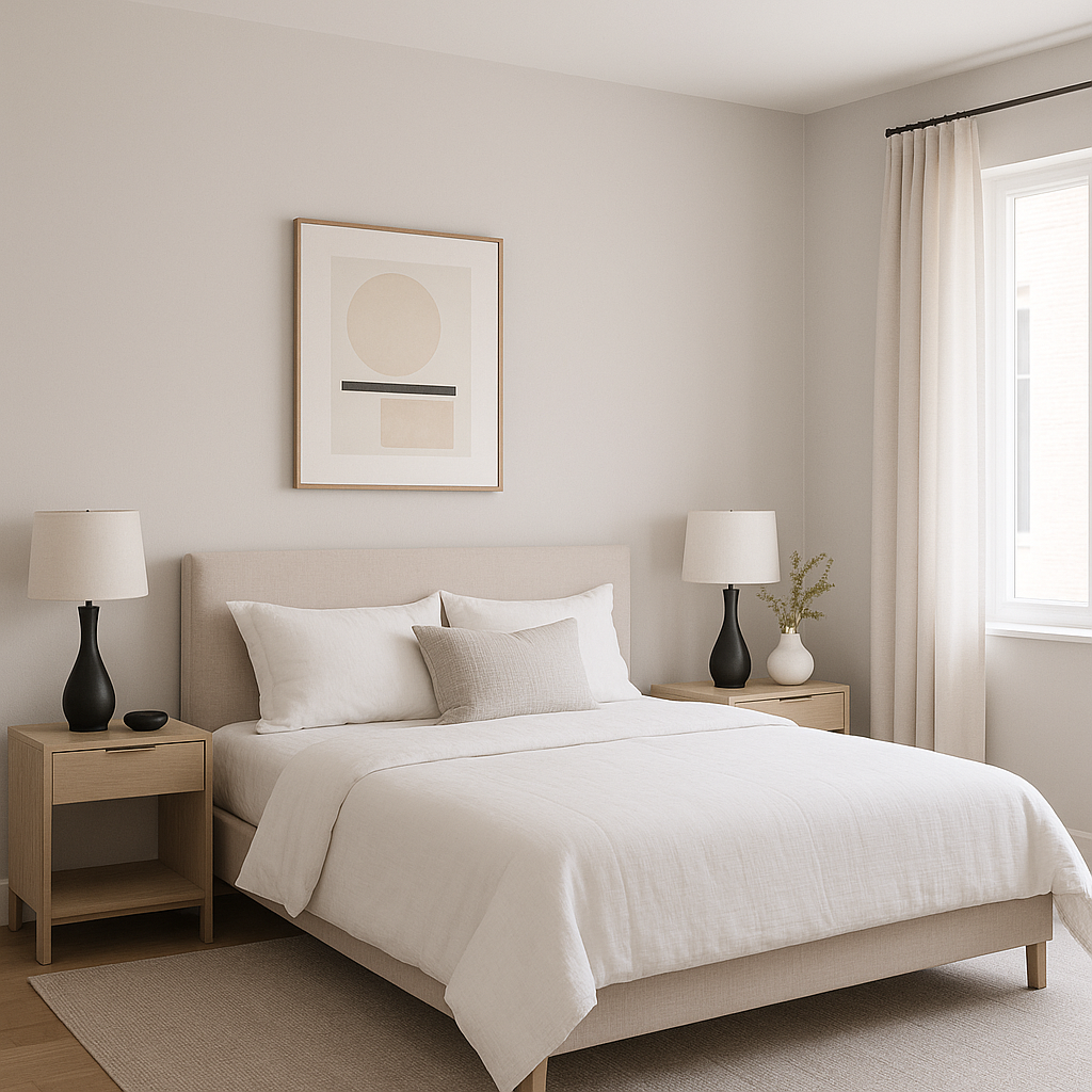
Porcelain is perfect for creating a calming atmosphere in spaces where relaxation is key. Use it as the primary wall color in bedrooms or living rooms to evoke comfort and sophistication. Pair it with velvet or linen textures for an added layer of luxury.
In bathrooms, Porcelain adds a spa-like quality. Combine it with crisp white trim and marble surfaces for a refreshing yet elegant look. Add silver or chrome fixtures to complement its cool undertones.
If you’re not ready to commit to Porcelain throughout an entire room, consider using it as an accent wall. Its understated tone works well behind headboards, fireplaces, or shelving units to subtly elevate the space.
Porcelain is an excellent choice for nurseries or children’s rooms, as it offers a gentle alternative to traditional pink or blue. It’s neutral enough to grow with the child while maintaining a timeless appeal.
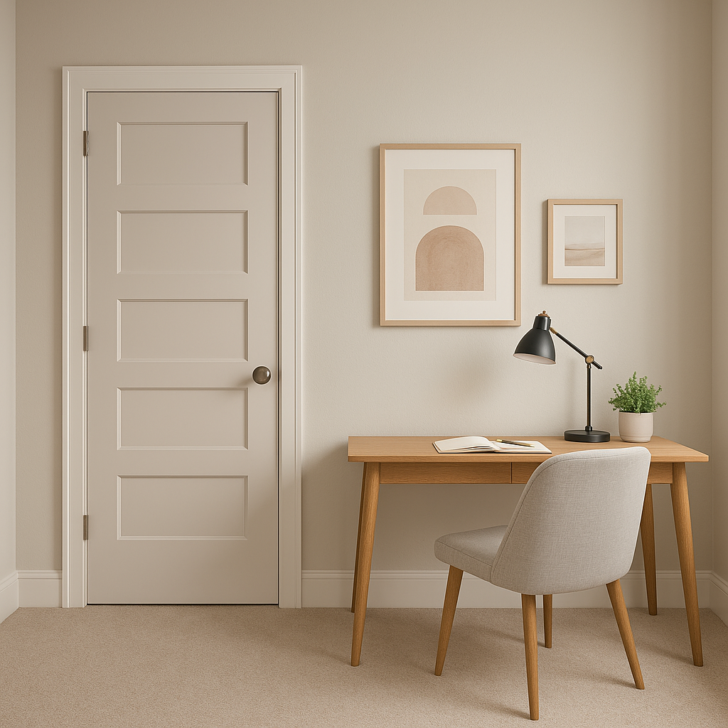
The serene quality of Porcelain makes it ideal for home offices. It promotes focus and creativity without overwhelming the senses, creating a balanced and productive environment.
Lighting plays a crucial role in how Benjamin Moore Porcelain appears in your space. In rooms with ample natural light, its purple undertones become more pronounced, adding a soft vibrancy. In spaces with limited light, the gray base takes center stage, creating a more subdued and calming effect. To ensure the perfect look, test Porcelain in your room at different times of the day before committing to it.
Benjamin Moore Porcelain (2113-60) is the epitome of understated elegance. Whether setting the tone for a peaceful retreat or adding a touch of modern sophistication, this lavender-gray hue adapts seamlessly to various design styles and palettes. With its soft undertones, versatile coordinating colors, and ability to enhance any space, Porcelain is a stylish choice for homeowners and designers alike.
View Colors Only by Brand (No Imagery):
Sherwin-Williams
|
Benjamin-Moore
|
Behr
|
Valspar
Live on the Eastern Slope of Colorado and looking for a local painting professional, check out all our painting services and reach out for a free estimate.
Copyright © 2026 : Wild Fox Painting Inc. : 12435 Mead Way, Littleton, CO 80125


