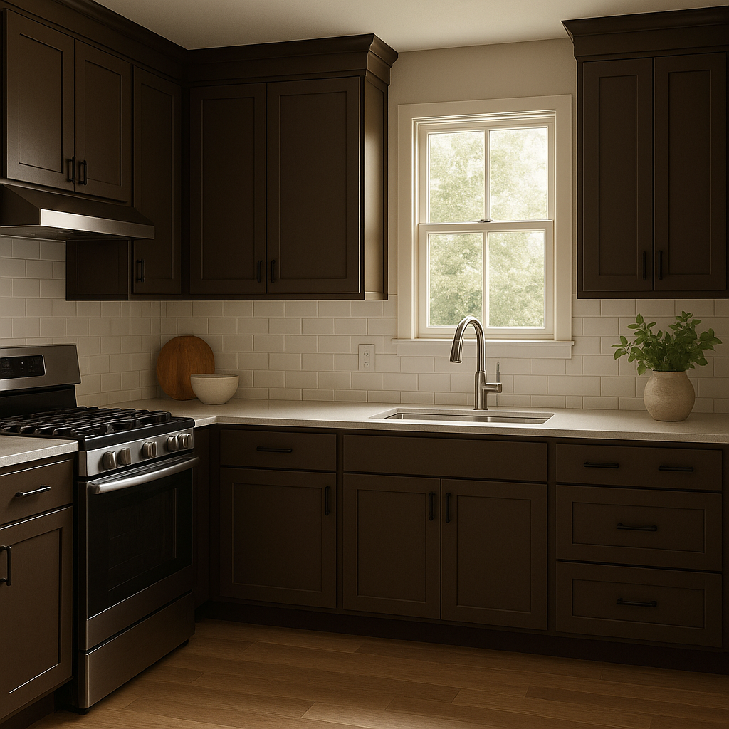
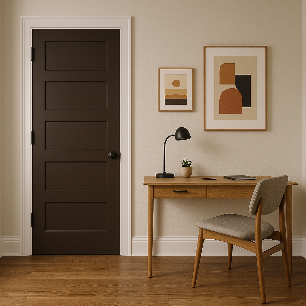
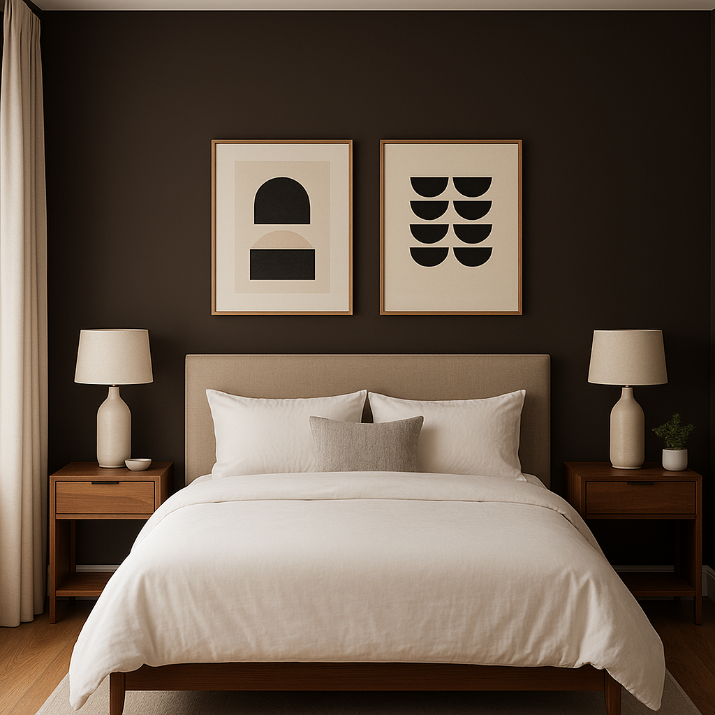
Wild Fox Painting Logo

Bittersweet

2114-10 | benjamin-moore | HEX: #443832 | RGB: 68, 56, 50

Benjamin Moore Bittersweet 2114-10: A Bold and Sophisticated Hue

Benjamin Moore Bittersweet 2114-10 is a deep, rich shade that exudes warmth, elegance, and a touch of drama. This bold color is part of the brand's Classic Color collection, known for its timeless and versatile palette. Bittersweet is a dark, moody brown with subtle undertones of red and violet, lending it a sophisticated depth that feels both luxurious and inviting. Whether used as a statement color or a grounding neutral, this shade offers countless design possibilities.


Undertones: Subtle Depth and Complexity

What makes Bittersweet 2114-10 so captivating is its complex undertones. With a foundation of deep brown, this color is infused with hints of red and violet. These undertones add a sense of warmth and richness, making the color feel cozy and intimate. The reddish undertone brings a sense of energy, while the violet adds a subtle sophistication. This interplay of tones ensures that Bittersweet never feels flat or one-dimensional, offering a dynamic presence in any space.


Coordinating Colors

To maximize the impact of Benjamin Moore Bittersweet 2114-10, pair it with complementary colors that enhance its undertones and bring balance to your design:

  • Warm Neutrals: Soft, creamy whites like Benjamin Moore Simply White OC-117 or White Dove OC-17 create a striking contrast while maintaining a harmonious warmth.
  • Earthy Greens: Shades such as Sage Mountain 1488 or Guilford Green HC-116 provide a natural balance, adding freshness to the moody intensity of Bittersweet.
  • Muted Reds and Pinks: Colors like Etruscan AF-355 or Crimson Red 2083-10 echo the reddish undertones, creating a monochromatic yet dynamic palette.
  • Charcoal Greys: Deep greys like Kendall Charcoal HC-166 or Amherst Gray HC-167 pair effortlessly with Bittersweet for a dramatic, contemporary look.

When used alongside these hues, Bittersweet 2114-10 becomes even more versatile, adapting to various styles and moods.


Uses for Bittersweet 2114-10

Bittersweet 2114-10 is a statement-making color that works beautifully across a variety of spaces and design styles. Its versatility makes it suitable for both residential and commercial interiors:

Accent Walls

This color is an excellent choice for an accent wall in living rooms, dining rooms, or bedrooms. Its bold nature draws the eye and creates a focal point without overwhelming the space.

Cabinetry and Built-Ins

In kitchens or home offices, Bittersweet lends a rich, sophisticated touch to cabinetry and built-ins. Pair it with brass or matte black hardware for added elegance.

Cozy Dens or Libraries

The warm undertones make Bittersweet ideal for intimate spaces like dens, libraries, or reading nooks. It fosters a sense of comfort and relaxation, perfect for unwinding.

Front Doors and Exteriors

For exterior use, Bittersweet 2114-10 can make a striking statement on a front door or as an accent color on trim. Its depth pairs well with neutral siding and natural stone finishes.

Modern and Eclectic Interiors

This shade fits seamlessly into modern, eclectic, or even industrial designs. Combine it with exposed brick, metallic accents, or textured textiles for a layered and sophisticated aesthetic.


Lighting Considerations

The appearance of Bittersweet 2114-10 can vary depending on the lighting in your space. In rooms with ample natural light, its red and violet undertones become more pronounced, softening its dark richness. In dimly lit spaces, the color takes on a deeper, more

Explore All Our Core Services in More Detail

Live on the Eastern Slope of Colorado and looking for a painting professional, check out all our painting services and reach out for a free estimate.

Copyright © 2025 : Wild Fox Painting Inc.