Benjamin Moore Venetian (2114-70) is a soft and elegant color that effortlessly balances warmth and coolness, making it a versatile choice for a wide array of interior spaces. With its refined charm and muted sophistication, Venetian is a pale lavender-gray shade that exudes subtle luxury without overpowering a room. Its delicate nature allows it to act as a neutral backdrop while still providing a hint of character, making it perfect for modern, transitional, or classic design schemes.
Venetian carries cool undertones of soft lavender, giving it a whisper of purple that is neither overly bold nor overly icy. This touch of lavender enhances its gray base, resulting in a color that feels calm, serene, and slightly romantic. The understated nature of its undertones allows Venetian to adapt to different lighting conditions, appearing slightly warmer in artificial light and cooler in natural light. These subtle shifts make it an intriguing and dynamic choice for walls, furniture, or accents.
Benjamin Moore Venetian pairs beautifully with a variety of complementary and contrasting hues, depending on the mood you want to create:
Neutrals: To highlight Venetian’s muted sophistication, pair it with warm whites such as Benjamin Moore White Dove (OC-17) or cooler grays like Stonington Gray (HC-170). These neutrals will create a harmonious, soothing palette that feels clean and timeless.
Bold Contrast: If you’re looking to add drama, pair Venetian with darker shades such as Kendall Charcoal (HC-166) or Black Ink (2116-20). These deep tones create a striking contrast and lend a contemporary edge to the softness of Venetian.
Pastels and Soft Colors: For a more playful or romantic vibe, consider pairing Venetian with soft pastel hues like Benjamin Moore Palladian Blue (HC-144) or Mellow Pink (2094-70). These combinations are ideal for bedrooms, nurseries, or feminine spaces.
Earth Tones: Venetian also works beautifully with muted greens like October Mist (1495) or sandy beiges like Edgecomb Gray (HC-173). These pairings evoke a grounded, natural feel that’s perfect for living rooms or home offices.
Venetian (2114-70) is a versatile color that can elevate a variety of spaces with its understated elegance. Here are some ideas for incorporating Venetian into your interior design:
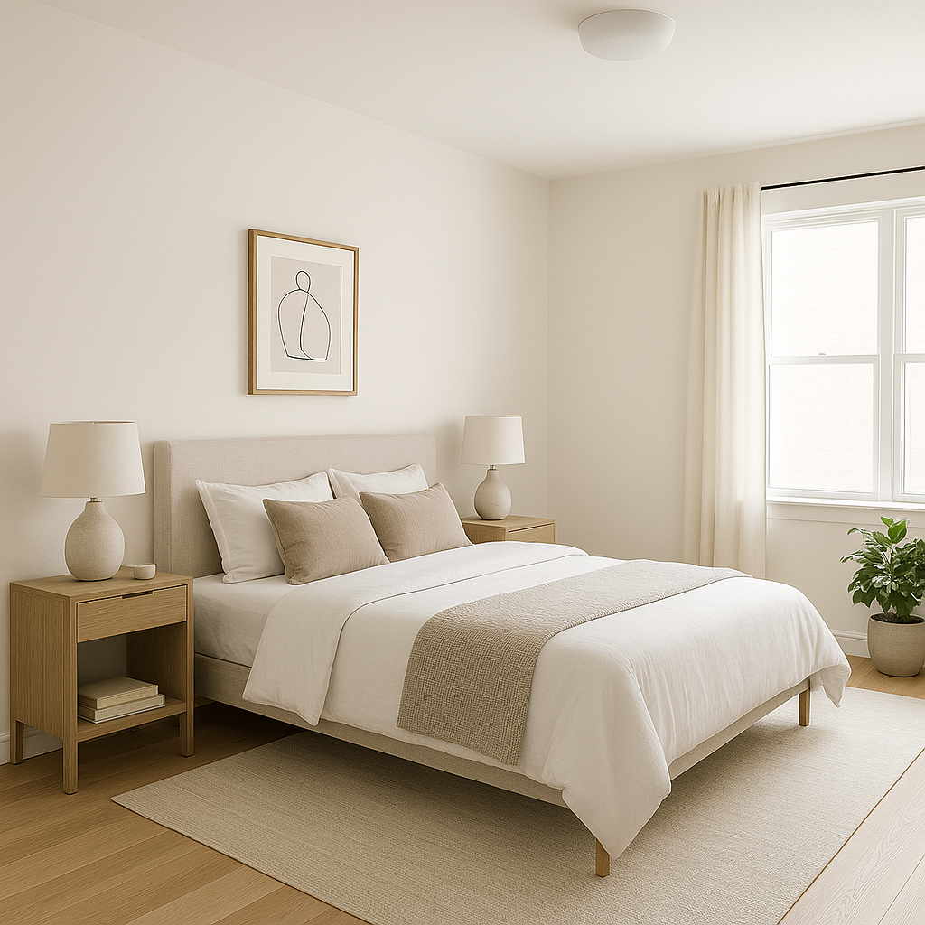
Venetian’s soft lavender undertones make it an excellent choice for bedrooms, creating a restful and tranquil ambiance. Pair it with crisp white bedding and plush throws to evoke a serene retreat that feels luxurious yet approachable.
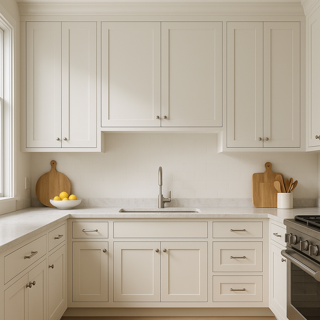
For a spa-like vibe, use Venetian on bathroom walls alongside marble or quartz countertops and silver or brushed nickel hardware. The subtle lavender-gray hue adds a touch of sophistication while maintaining a clean and calming aesthetic.
Venetian can serve as a delicate backdrop for living rooms, especially in transitional or contemporary spaces. Combine it with textured fabrics like velvet or linen and accentuate with metallic finishes, such as gold or brass, to create a room that feels inviting and polished.
The hint of lavender in Venetian brings a gentle playfulness to nurseries or children’s rooms without being overly juvenile. Pair it with pastel accents or whimsical patterns to create a cheerful yet serene environment.
If you’re hesitant to commit to Venetian throughout an entire room, use it as an accent wall. Its subtle color adds depth and visual interest while remaining understated. Pair it with complementary neutrals or bold contrasts to complete the look.
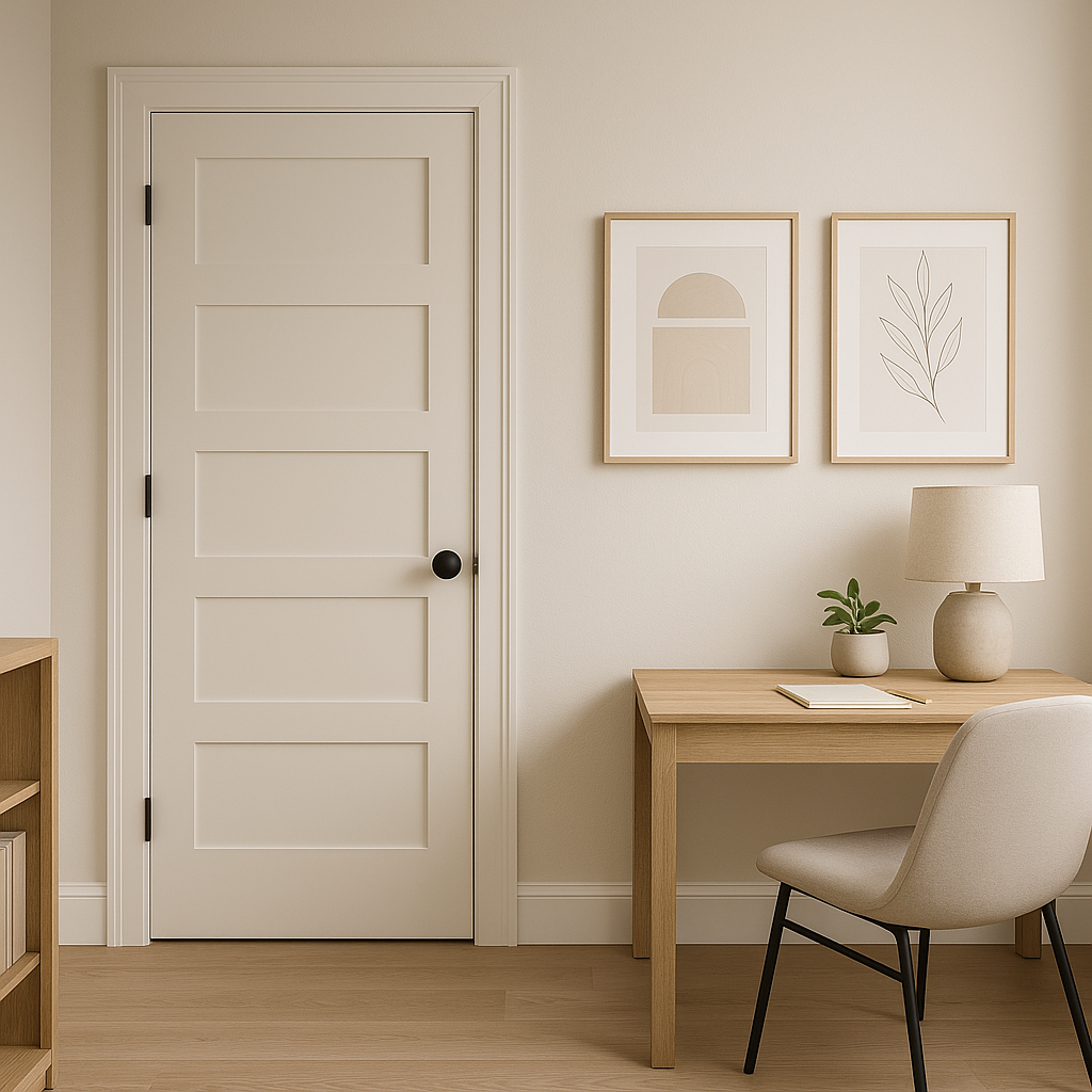
Venetian’s balance of cool and warm tones makes it a fantastic choice for home offices. It promotes focus and calm without feeling stark or sterile. Combine it with natural wood finishes and muted greens for a grounded, productive atmosphere.
The appearance of Venetian (2114-70) can vary depending on the lighting in your space. In natural daylight, its lavender undertones are more pronounced, giving it a cooler, airy feel. Under warmer artificial lighting, Venetian shifts slightly toward a soft gray, offering a cozier ambiance. Be sure to test the color in your space to understand how it interacts with your lighting conditions throughout the day.
Benjamin Moore Venetian (2114-70) is more than just a paint color—it's a timeless expression of subtle elegance that can transform any interior space. Whether used as a primary wall color or as an accent, its versatility and sophisticated undertones make it a favorite among interior designers and homeowners alike.
View Colors Only by Brand (No Imagery):
Sherwin-Williams
|
Benjamin-Moore
|
Behr
|
Valspar
Live on the Eastern Slope of Colorado and looking for a local painting professional, check out all our painting services and reach out for a free estimate.
Copyright © 2026 : Wild Fox Painting Inc. : 12435 Mead Way, Littleton, CO 80125


