Benjamin Moore Incense (2115-20) is a rich, enigmatic shade that effortlessly blends elegance with warmth. This deep plum paint color exudes a sense of sophistication, making it an ideal choice for spaces where you want to create a moody yet inviting atmosphere. Its versatility and depth make it a standout option for both modern and traditional interiors, offering a bold but refined backdrop for your design vision.
Incense is more than just a dark purple; its nuanced undertones set it apart. This shade leans into warm undertones, with hints of red and brown that soften its intensity. These subtle elements add depth and earthiness, making Incense feel grounded and approachable. Unlike cooler purples that can feel stark or icy, the warmth in Incense ensures it radiates coziness and sophistication. Depending on the lighting, it can appear as a deeply muted plum with a slightly smoky or velvety quality, adding layers of intrigue to your space.
Benjamin Moore Incense can be paired with a range of complementary shades to create a harmonious palette. Consider these coordinating colors for a cohesive look:
Incense’s versatility and dramatic flair make it suitable for a variety of applications in your home. Here are some design ideas to inspire you:
Create a cozy, luxurious living room by using Incense as an accent wall or painting the entire space for a bold statement. Pair it with plush furnishings in velvet or linen textures and metallic accents like brass or gold for added sophistication.
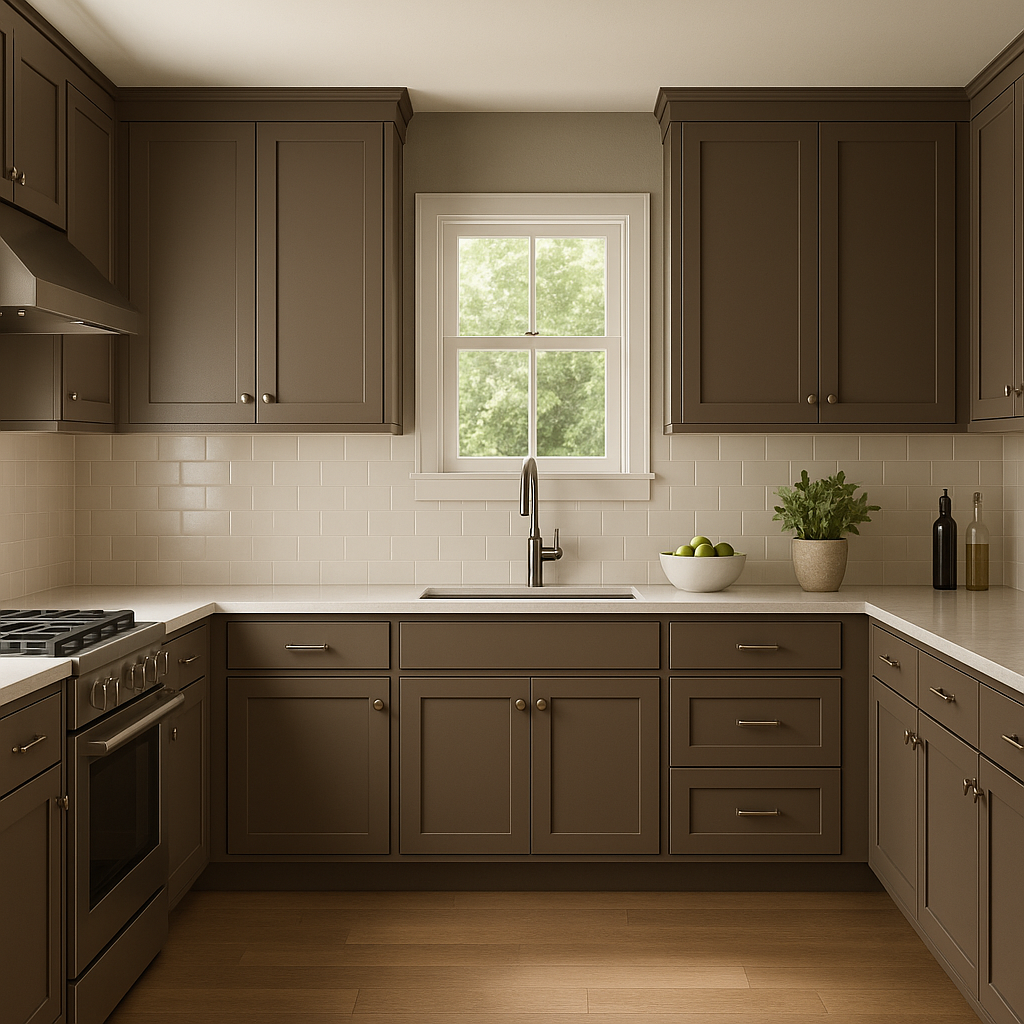
Incense is a stunning choice for dining rooms, where its moody tone can enhance the atmosphere for intimate dinners and gatherings. Combine it with warm wood furniture and soft lighting to elevate the elegance of the space.
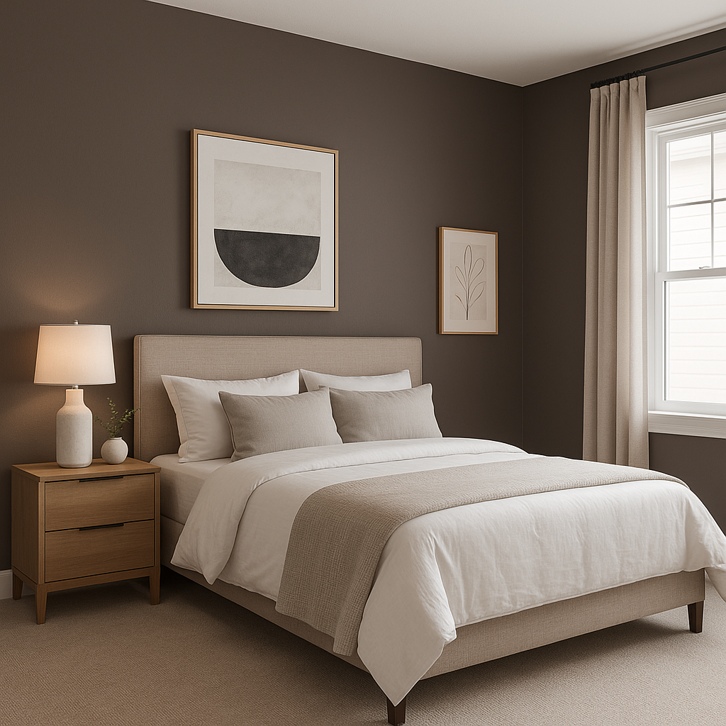
For a serene yet dramatic retreat, use Incense in a bedroom. It works beautifully as a headboard wall color or even for the entire room. Layer with soft bedding in neutral tones like cream or taupe to maintain a balanced and restful vibe.
Transform a small powder room into a jewel box of design by enveloping the space in Incense. Its rich hue makes a bold impression in compact spaces, especially when paired with a sleek vanity and modern fixtures.
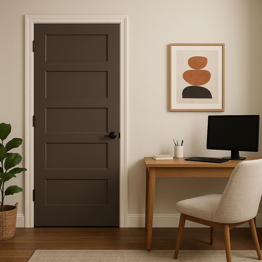
In a home office, Incense fosters focus and creativity. Pair it with clean white trim, dark wood furniture, and pops of metallics for a chic and productive environment.
As with any deep color, lighting plays a critical role in how Incense appears. In natural light, its plum tones will feel more vibrant and warm, while in dimly lit spaces or under artificial light, its smoky, mysterious qualities will take center stage. Use this to your advantage by considering the function and mood of the room when selecting Incense.
Benjamin Moore Incense (2115-20) is a timeless, dramatic paint color that invites warmth, sophistication, and style into your home. Its complex undertones and compatibility with a wide range of coordinating colors make it a designer favorite for spaces that demand both character and elegance. Whether you're creating a cozy living space, an intimate dining area, or a moody bedroom retreat, this deep plum hue brings depth, drama, and an undeniable sense of luxury.
View Colors Only by Brand (No Imagery):
Sherwin-Williams
|
Benjamin-Moore
|
Behr
|
Valspar
Live on the Eastern Slope of Colorado and looking for a local painting professional, check out all our painting services and reach out for a free estimate.
Copyright © 2026 : Wild Fox Painting Inc. : 12435 Mead Way, Littleton, CO 80125


