Benjamin Moore Winter (2117-60) is a soft and sophisticated shade that strikes the perfect balance between lavender and gray. This elegant hue exudes a calming and ethereal quality, making it an ideal choice for spaces designed to evoke tranquility and understated beauty. Its delicate yet versatile character allows it to adapt effortlessly to various design styles, from modern minimalism to classic elegance.
Winter (2117-60) is a gray-based purple with cool undertones. Its subtle lavender notes lend a touch of femininity without overwhelming the space, while the gray foundation grounds the color and adds a sense of refinement. The cool undertones make it particularly suitable for spaces with northern or indirect light, where the color’s muted elegance shines without appearing too warm or saturated.
Benjamin Moore Winter is a versatile shade that pairs beautifully with a range of coordinating colors. Here are some suggestions to create harmonious and visually stunning combinations:
Soft Whites: Pair Winter with crisp whites like Benjamin Moore Chantilly Lace (OC-65) or Simply White (OC-117) for a clean, airy look. This combination works beautifully in bedrooms, bathrooms, or living rooms seeking a serene and fresh ambiance.
Deep Charcoals: For added drama and contrast, pair Winter with darker hues like Benjamin Moore Iron Mountain (2134-30) or Kendall Charcoal (HC-166). This pairing adds depth and sophistication, ideal for accent walls, modern offices, or dining spaces.
Muted Greens and Blues: Shades like Benjamin Moore Gray Wisp (1570) or Quiet Moments (1563) complement Winter’s cool undertones and create a soft, nature-inspired palette for living areas or bedrooms.
Warm Neutrals: To balance Winter’s coolness, you can introduce warm neutrals such as Benjamin Moore Edgecomb Gray (HC-173) or Revere Pewter (HC-172). This pairing creates a welcoming and balanced aesthetic, perfect for transitional spaces.
Winter is a versatile color that works across various settings, offering a sophisticated touch without being overpowering. Here are the top uses for this stunning hue:
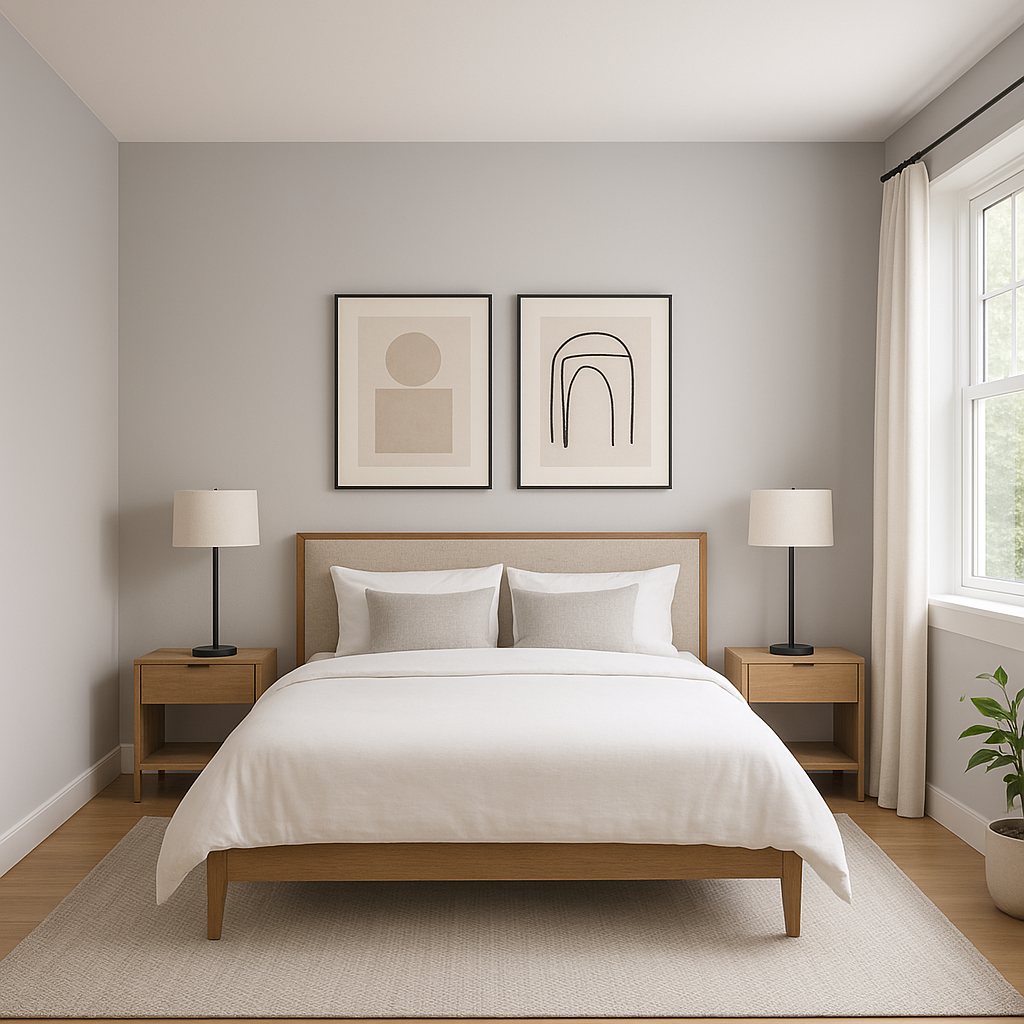
Winter is a natural choice for bedrooms due to its soothing and serene qualities. Its lavender undertones create a calming environment, making it ideal for relaxation. Pair it with soft white linens, plush textures, and muted metallic accents for a tranquil retreat.
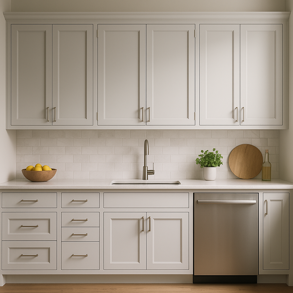
Bring a spa-like feel to your bathroom by using Winter on the walls or as an accent color for cabinetry. Its clean yet elegant vibe pairs beautifully with marble countertops, polished chrome fixtures, and crisp white trim.
For living rooms, Winter offers a unique alternative to traditional grays. Use it as a subtle backdrop for artwork, furniture, or decorative accessories that pop with color. Accent the space with coordinating hues such as muted blues, greens, or even blush tones for a layered and inviting look.
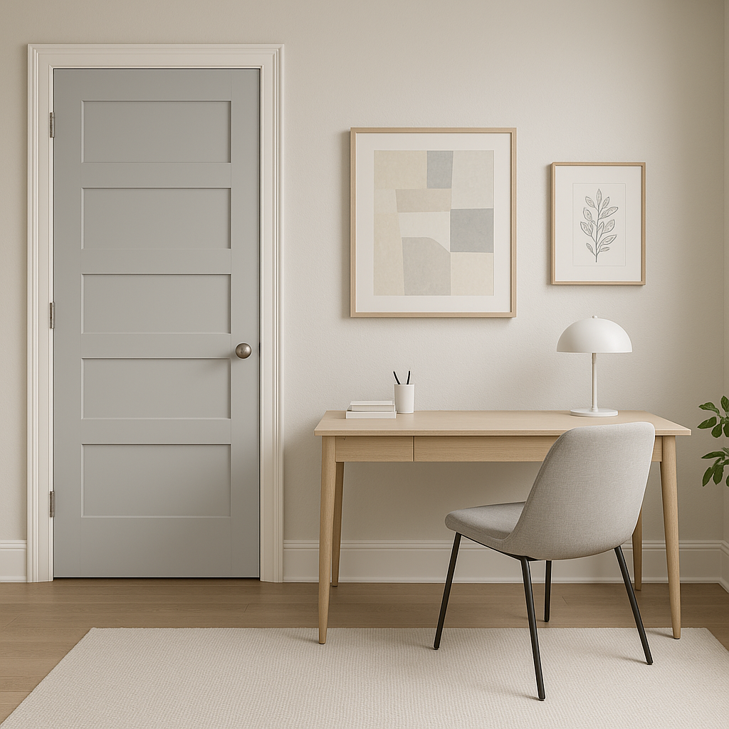
Winter’s cool undertones help create a focused and tranquil atmosphere, making it perfect for home offices or study areas. Pair it with darker accents and sleek furniture for a modern yet refined workspace.
If you’re looking to add a touch of personality without overwhelming the room, Winter works beautifully as an accent wall color. It pairs especially well with neutral furnishings and light flooring, creating a focal point that feels both elegant and contemporary.
Benjamin Moore Winter (2117-60) is a timeless hue that combines the sophistication of gray with the softness of lavender. Its versatility, calming undertones, and ability to coordinate with a wide range of colors make it a favorite among interior designers and homeowners alike. Whether you're designing a restful bedroom, an elegant living room, or a polished office space, Winter delivers a refined aesthetic that effortlessly elevates your interiors.
View Colors Only by Brand (No Imagery):
Sherwin-Williams
|
Benjamin-Moore
|
Behr
|
Valspar
Live on the Eastern Slope of Colorado and looking for a local painting professional, check out all our painting services and reach out for a free estimate.
Copyright © 2026 : Wild Fox Painting Inc. : 12435 Mead Way, Littleton, CO 80125


