Benjamin Moore Excalibur (2118-50) is a captivating shade that effortlessly balances elegance and modernity. Part of the brand's extensive color collection, this medium-toned purple evokes a sense of regality and charm, making it a versatile choice for various design aesthetics. Its soothing yet bold presence can transform a room into a sophisticated retreat or a statement-making space, depending on how it's used. Whether you're aiming for a luxurious ambiance or a contemporary edge, Excalibur is a color that delivers.
Excalibur is a purple with subtle undertones that make it incredibly versatile. It leans slightly warm with hints of muted magenta, giving it a richness that feels comforting rather than overly dramatic. At the same time, it holds a soft gray undertone, which tempers its vibrancy and adds a modern, grounded quality. This duality of warm and cool undertones allows Excalibur to harmonize beautifully with a wide range of palettes, making it adaptable to different lighting conditions and design styles.
Excalibur’s versatility shines when paired with complementary colors that enhance its depth and character. Here are a few coordinating options to consider:
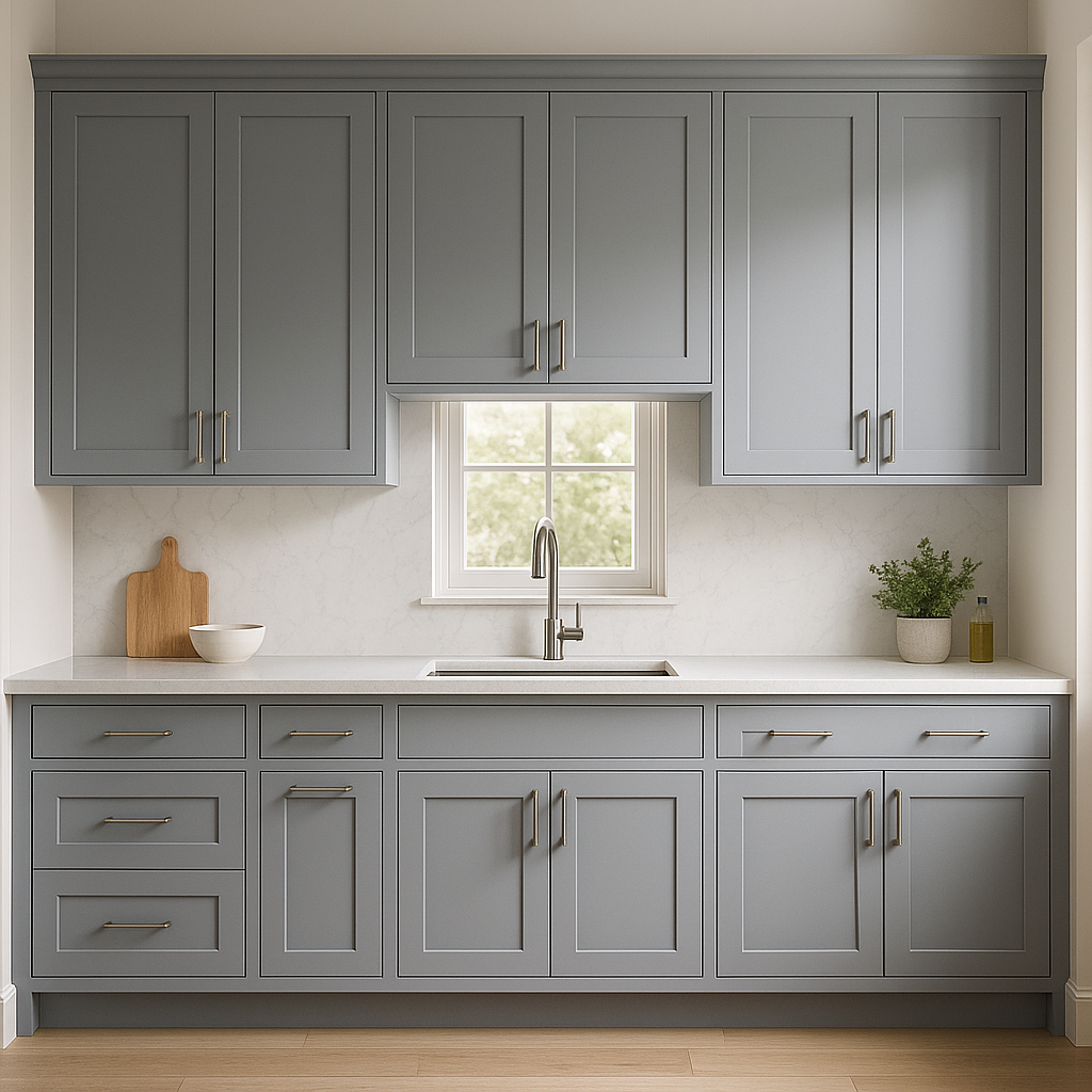
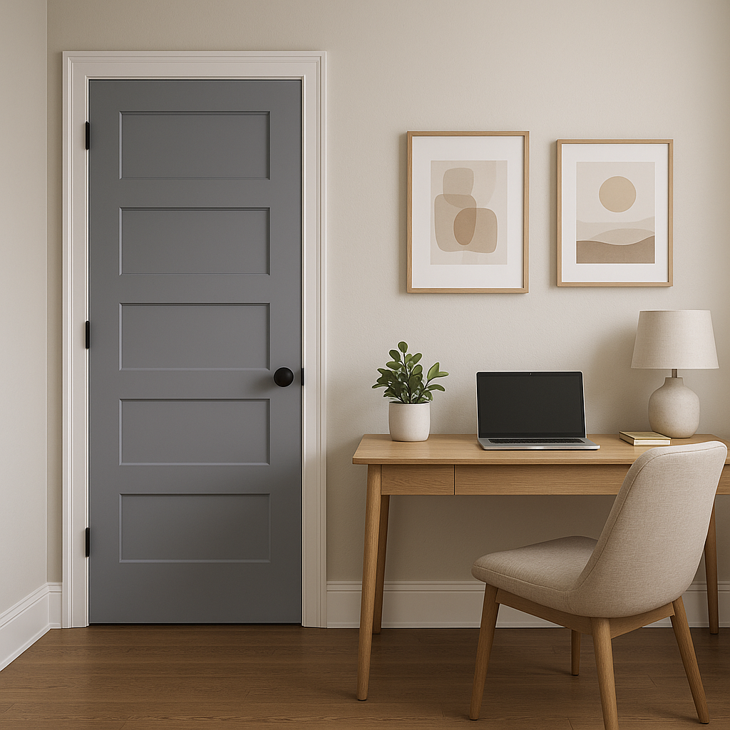
Excalibur is a versatile shade that can be used in various spaces to achieve different effects. Here are some ideas for incorporating this striking hue into your home design:
Excalibur works wonderfully as an accent wall or as the primary color in living rooms and lounges. Its warm undertones create a cozy and inviting atmosphere, while its grayish depth ensures it remains sophisticated. Pair it with plush furnishings, soft textiles, and layered lighting for a polished yet comfortable space.
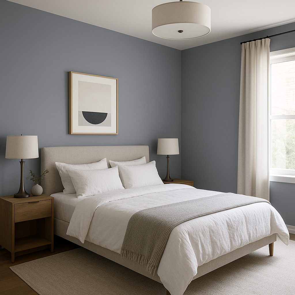
As a calming and slightly moody purple, Excalibur is an excellent choice for bedrooms. Use it on all four walls for a cocoon-like effect, or as a feature wall behind the bed to create a focal point. Pair it with crisp white linens and soft gray or blush accents for a serene and elegant retreat.
For a dramatic and luxurious dining room, consider painting the walls in Excalibur. The rich purple hue adds a sense of opulence and intimacy, perfect for hosting dinner parties or enjoying family meals. Complement the look with metallic fixtures, dark wood furniture, and textured fabrics.
Excalibur can bring unexpected sophistication to a bathroom, especially when paired with clean, white tiles and sleek chrome or brass hardware. Its muted gray undertones ensure the space feels polished rather than overly colorful.
If you're not ready to commit to an entire room painted in Excalibur, consider using it on furniture or accent pieces. A painted dresser, shelving unit, or even a front door in this hue can make a bold statement without overwhelming the space.
As with any paint color, the way Excalibur appears can shift based on lighting conditions. In natural light, its purple tones may appear softer and more subdued, while under artificial lighting, its warmer undertones might come to the forefront. To ensure the best results, test a sample of Excalibur in the room you plan to use it and observe how it looks at different times of the day.
Benjamin Moore Excalibur (2118-50) is a color that balances boldness with refinement. Its rich purple hue, softened by gray undertones, makes it versatile, timeless, and adaptive to a wide range of designs. Whether used as a primary wall color or as an accent, Excalibur brings a sense of sophistication and depth to any space. Combine it with complementary tones and thoughtful lighting for a look that feels both modern and enduring.
View Colors Only by Brand (No Imagery):
Sherwin-Williams
|
Benjamin-Moore
|
Behr
|
Valspar
Live on the Eastern Slope of Colorado and looking for a local painting professional, check out all our painting services and reach out for a free estimate.
Copyright © 2026 : Wild Fox Painting Inc. : 12435 Mead Way, Littleton, CO 80125


