

Benjamin Moore Happy 212 is a timeless, soft neutral that effortlessly combines warmth and sophistication. This versatile hue is part of Benjamin Moore's extensive color palette, offering a subtle backdrop that can energize a space without overwhelming it. Whether you’re designing a cozy living room, a tranquil bedroom, or a chic modern office, Happy 212 is a fantastic choice to create an inviting and harmonious environment.
Happy 212 is a warm, taupe-based neutral with soft beige undertones. Its warmth is balanced by a hint of gray, which prevents it from feeling too yellow or overly saturated. This subtle combination of beige and gray makes it a "greige" color—perfect for spaces where you want to achieve a cozy, yet modern aesthetic. The undertones also allow it to adapt beautifully to different lighting conditions, appearing warmer in natural light and more muted under artificial lighting.
One of the reasons Happy 212 is so popular is its ability to pair seamlessly with a variety of other colors. Here are some coordinating shades to consider:
Happy 212 is a versatile shade that works well in a variety of spaces. Here are some suggestions for incorporating it into your home or office:
Happy 212 is an excellent choice for living rooms, where its warm undertones create a welcoming and comfortable atmosphere. Pair it with plush textiles, natural wood finishes, and metallic accents to add layers of texture and interest.
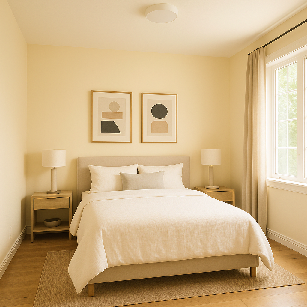
For a restful retreat, use Happy 212 as the main wall color in bedrooms. Its soft, neutral tone promotes relaxation and pairs beautifully with cozy bedding in whites, creams, or soft blues.
In kitchens, Happy 212 offers a neutral backdrop that complements both modern and traditional styles. Use it on walls, cabinetry, or even as an accent paired with white subway tiles and brushed nickel hardware for a clean, elegant look.
Happy 212’s subtle warmth is perfect for creating a spa-like bathroom. Pair it with crisp white trim, marble accents, and soft pastel towels for a serene and polished space.
Create a productive yet calming workspace by using Happy 212 in your home office. Its neutral tone minimizes distractions while providing a sophisticated backdrop for furnishings and décor.
If you have an open floor plan, Happy 212 serves as an excellent unifying color. Its adaptability allows it to transition seamlessly between different areas, making your space feel cohesive and balanced.
Happy 212 is more than just a neutral; it’s a color that adapts to your style and enhances your space.
View Colors Only by Brand (No Imagery):
Sherwin-Williams
|
Benjamin-Moore
|
Behr
|
Valspar
Live on the Eastern Slope of Colorado and looking for a local painting professional, check out all our painting services and reach out for a free estimate.
Copyright © 2026 : Wild Fox Painting Inc. : 12435 Mead Way, Littleton, CO 80125


