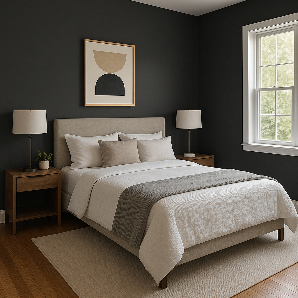
Benjamin Moore Twilight 2127-10 is a deep, dramatic, and enigmatic shade that exudes sophistication and timeless elegance. This rich black-infused navy offers a versatile and luxurious hue that transforms any space into a statement of style and refinement. With its dark and moody character, Twilight is perfect for creating depth, contrast, and a sense of intimacy in interiors.
Twilight 2127-10 is more than just a simple dark blue—it carries a subtle interplay of undertones that make it a unique and compelling choice. The base of this color is a deep navy blue, but it is enhanced by soft charcoal and black undertones. This combination gives Twilight its velvety richness and versatility, making it a strong contender for both modern and traditional spaces.
Depending on the lighting, Twilight can look almost black in dim settings, while its blue undertones shine through in brighter spaces. It’s a chameleon-like color that adds intrigue and personality to your design.
To maximize the impact of Twilight 2127-10, pair it with complementary and coordinating colors that enhance its depth and sophistication. Here are some suggestions:
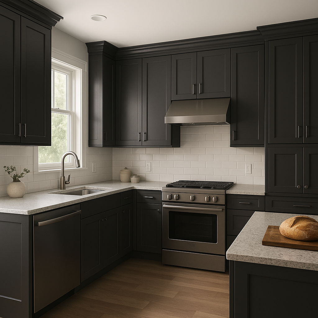
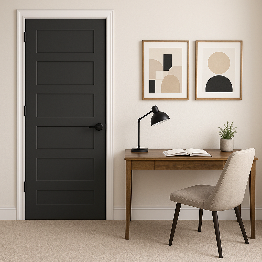
Twilight 2127-10 is a versatile color that can be used in a variety of design applications to set the mood and make a bold statement. Its adaptability allows it to shine in both residential and commercial spaces. Here are some ideas for incorporating Twilight into your design:
Keep in mind that Twilight’s appearance can shift depending on the lighting in your space. In dimly lit areas, it will appear more muted and closer to black, while in spaces with ample natural light, its blue undertones will become more prominent. To fully appreciate the nuances of this color, sample it on your walls and observe how it interacts with your lighting throughout the day.
Benjamin Moore Twilight 2127-10 is the ultimate choice for anyone seeking a bold,
View Colors Only by Brand (No Imagery):
Sherwin-Williams
|
Benjamin-Moore
|
Behr
|
Valspar
Live on the Eastern Slope of Colorado and looking for a local painting professional, check out all our painting services and reach out for a free estimate.
Copyright © 2026 : Wild Fox Painting Inc. : 12435 Mead Way, Littleton, CO 80125


