Benjamin Moore Pike's Peak (2127-50) is an elegant and versatile charcoal gray that effortlessly combines modern sophistication with timeless appeal. This medium-depth gray strikes a perfect balance between boldness and subtlety, making it an excellent choice for a variety of interior and exterior design applications. Whether you're looking to create a dramatic accent wall, a serene living space, or a refined exterior, Pike's Peak delivers a polished aesthetic that works beautifully in both residential and commercial settings.
One of the defining characteristics of Pike's Peak is its understated complexity, thanks to its cool undertones. This gray leans slightly toward blue, giving it a crisp and clean appearance that feels fresh and contemporary. The subtle blue undertone prevents it from appearing overly flat or dull, while still maintaining a neutral vibe that complements a range of color palettes. Depending on the surrounding lighting, Pike's Peak can shift subtly, offering a soft depth in natural light and a more dramatic, moody tone in artificial lighting.
Pike's Peak (2127-50) pairs beautifully with a variety of colors, allowing for creative and harmonious design possibilities. Here are some coordinating hues that enhance its versatility:
These coordinating colors can be used to create a dynamic palette that ranges from serene and understated to bold and dramatic, depending on the desired effect.
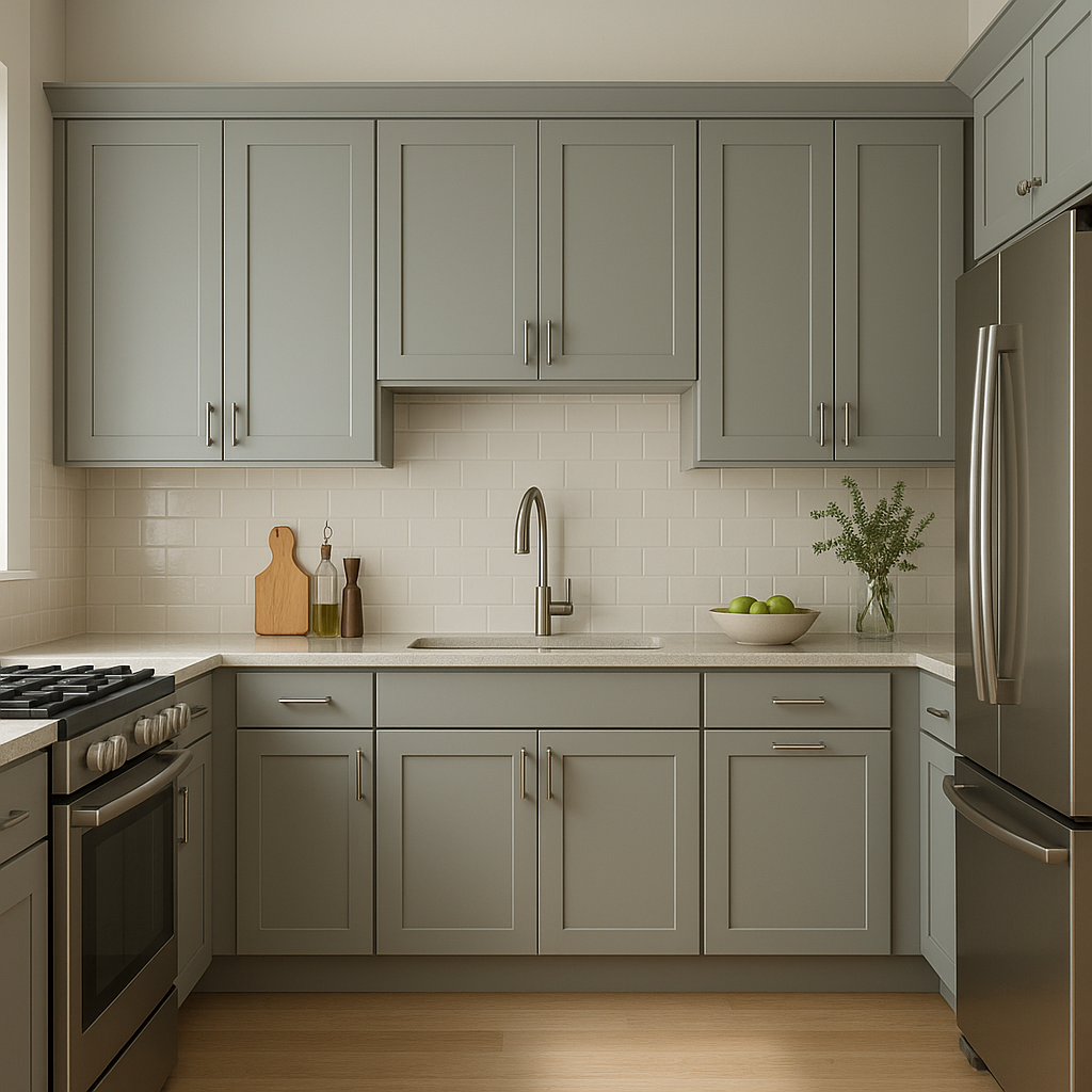
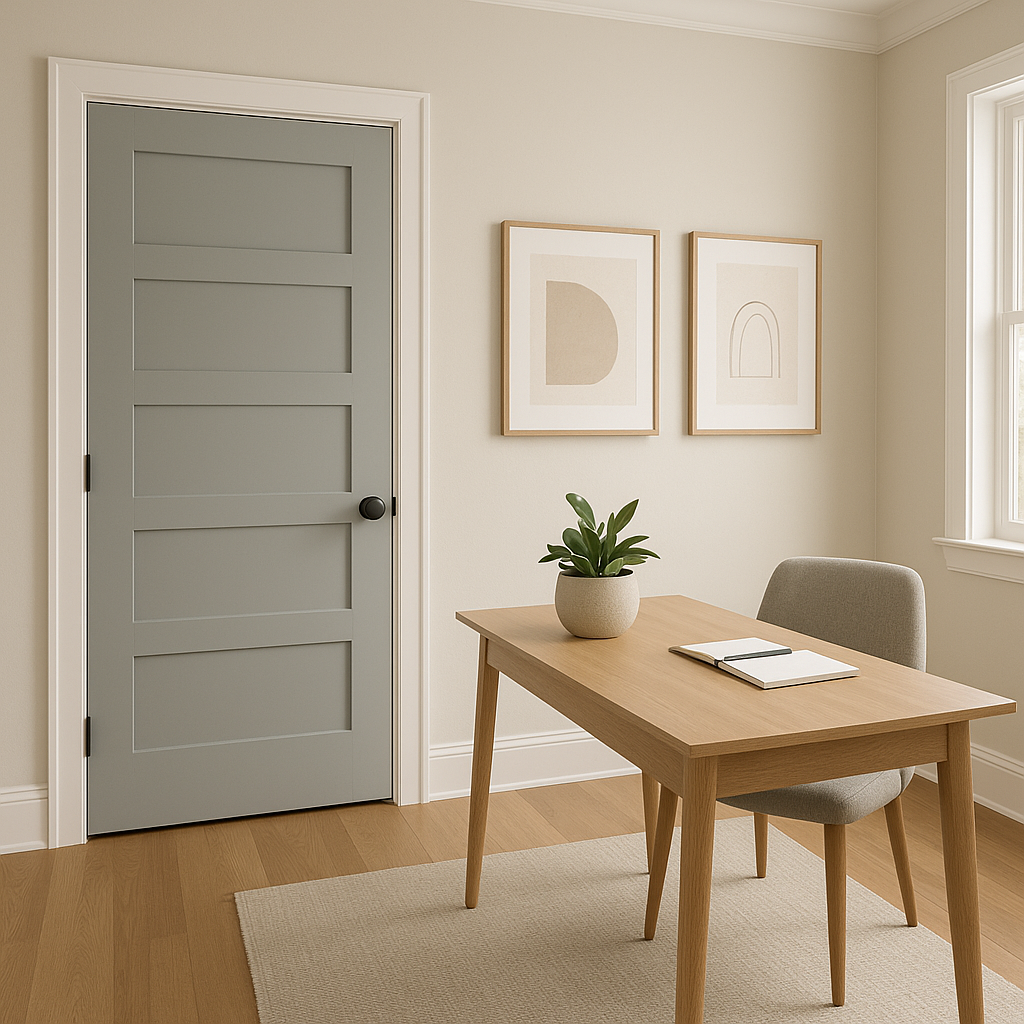
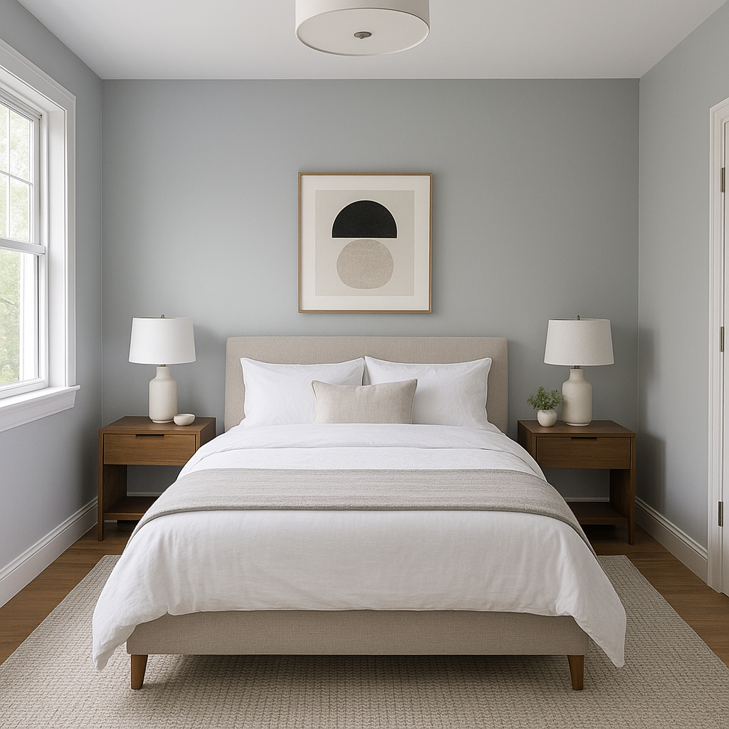
Pike's Peak is a highly adaptable shade that lends itself to a wide variety of design applications. Here are some ideas for incorporating this gorgeous gray into your home or commercial space:
As with any paint color, lighting plays a significant role in how Pike's Peak appears in your space. In rooms with ample natural light, the subtle blue undertones are more pronounced, creating a fresh and airy look. In dimmer spaces or artificial lighting, Pike's Peak takes on a deeper and moodier tone, adding drama and sophistication. Be sure to test this shade in various lighting conditions to ensure it aligns with your vision.
Benjamin Moore Pike's Peak (2127-50) is a versatile and refined gray that works across styles, from classic to contemporary. Its cool undertones, adaptability, and ability to pair seamlessly with a wide range of coordinating colors make it a go-to choice for designers and homeowners alike. Whether you’re seeking a neutral backdrop or a bold statement, Pike's Peak offers the perfect balance of sophistication and versatility to elevate any space.
View Colors Only by Brand (No Imagery):
Sherwin-Williams
|
Benjamin-Moore
|
Behr
|
Valspar
Live on the Eastern Slope of Colorado and looking for a local painting professional, check out all our painting services and reach out for a free estimate.
Copyright © 2026 : Wild Fox Painting Inc. : 12435 Mead Way, Littleton, CO 80125


